

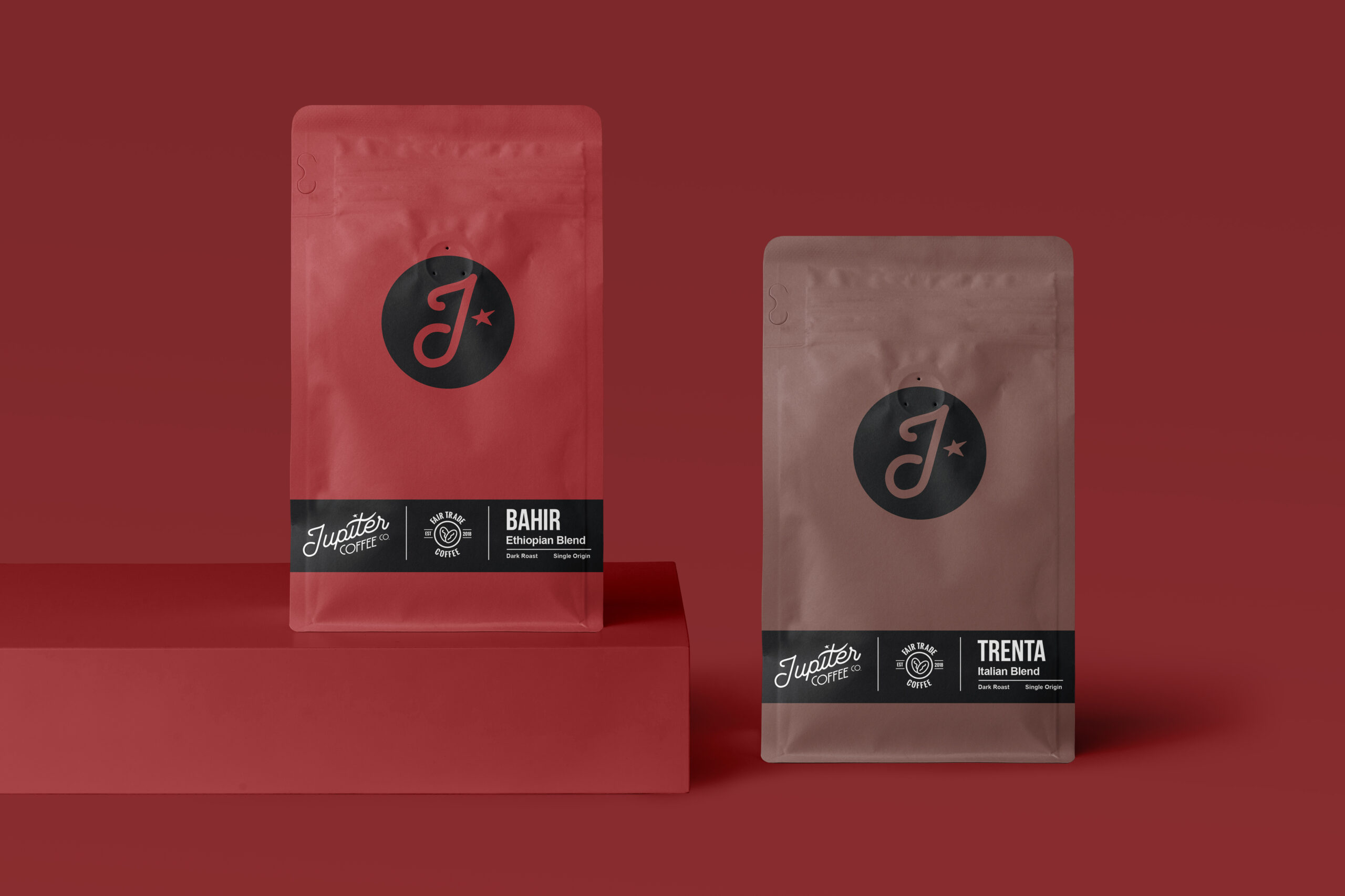
Jupiter Coffee
A rebrand for Jupiter Coffee Company: a new mark, wordmark and packaging system for its roasted coffee. The aim was an identity that feels modern and still crafted, one that can hold a growing range of blends on the shelf and carry through to the café.
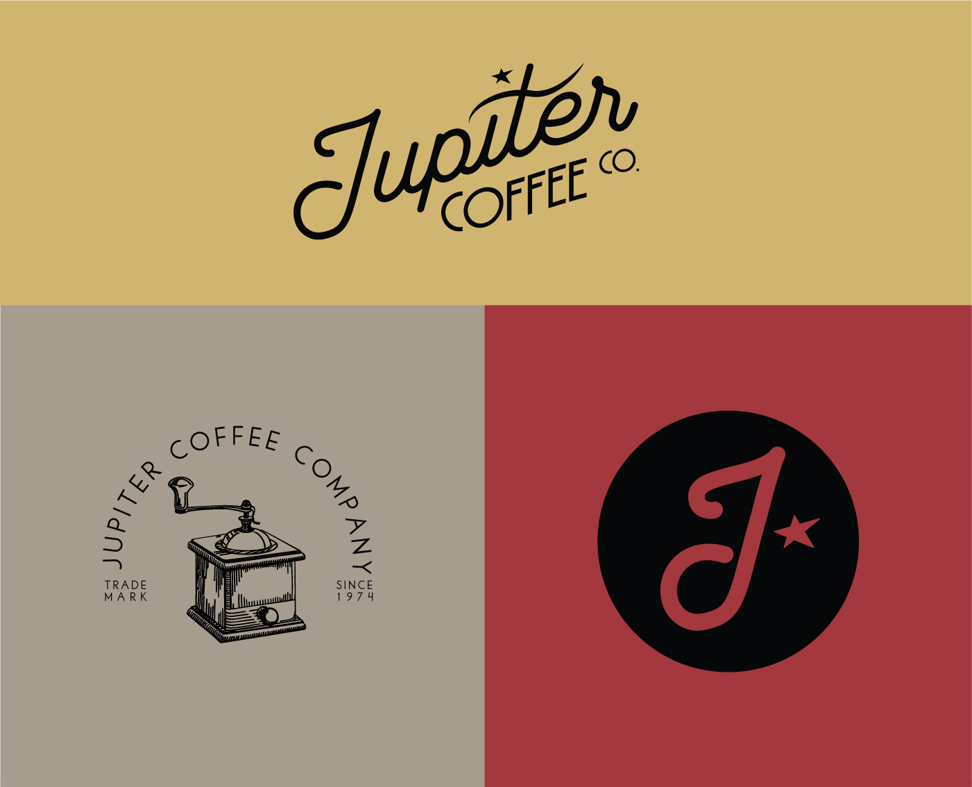
A star and a script
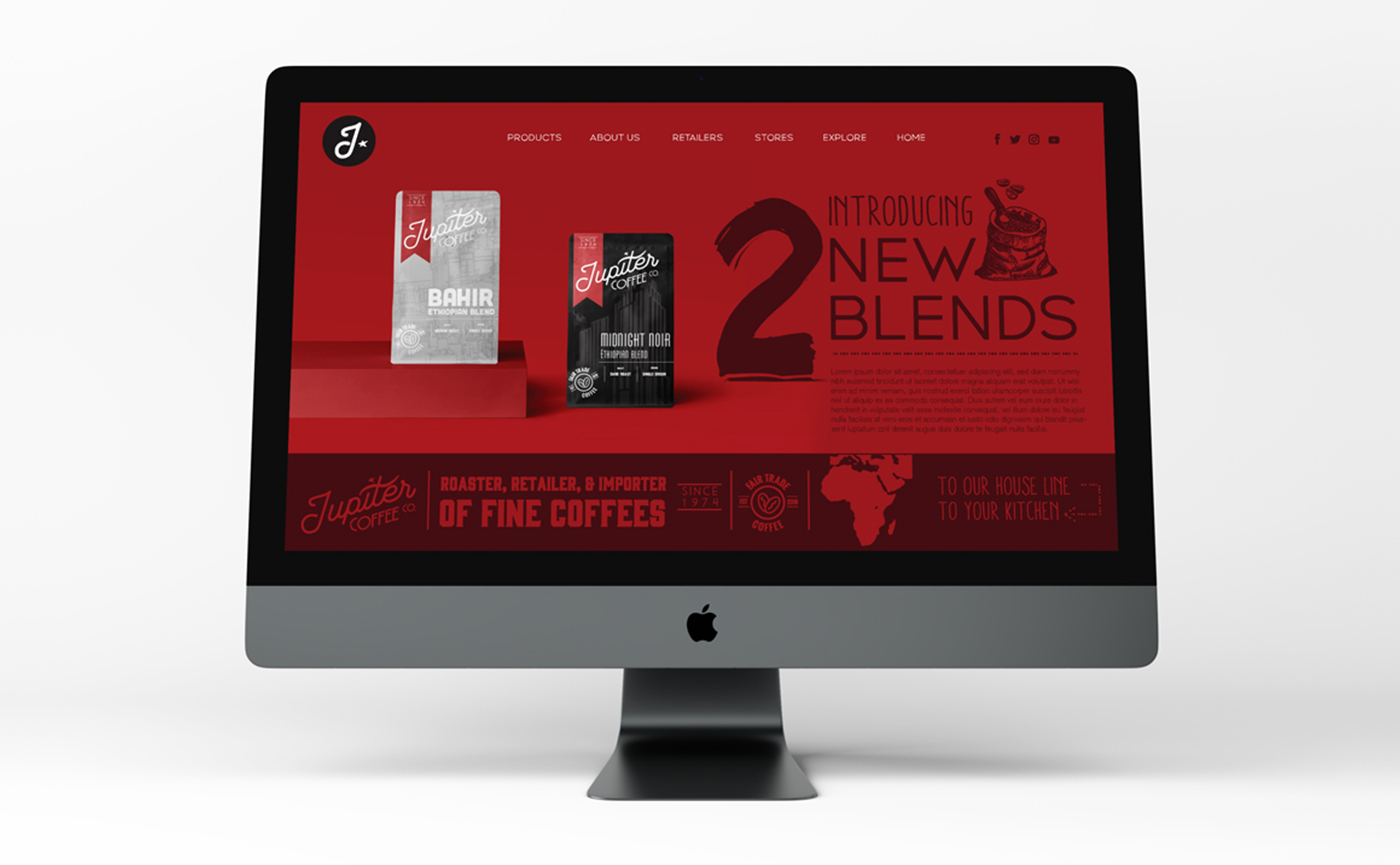
The mark is a J inside a circle with a single star, paired with a script wordmark that has a vintage edge. Deep red and kraft carry the bags, with the blend named in a simple block underneath, so the range reads as one brand rather than a row of different labels.
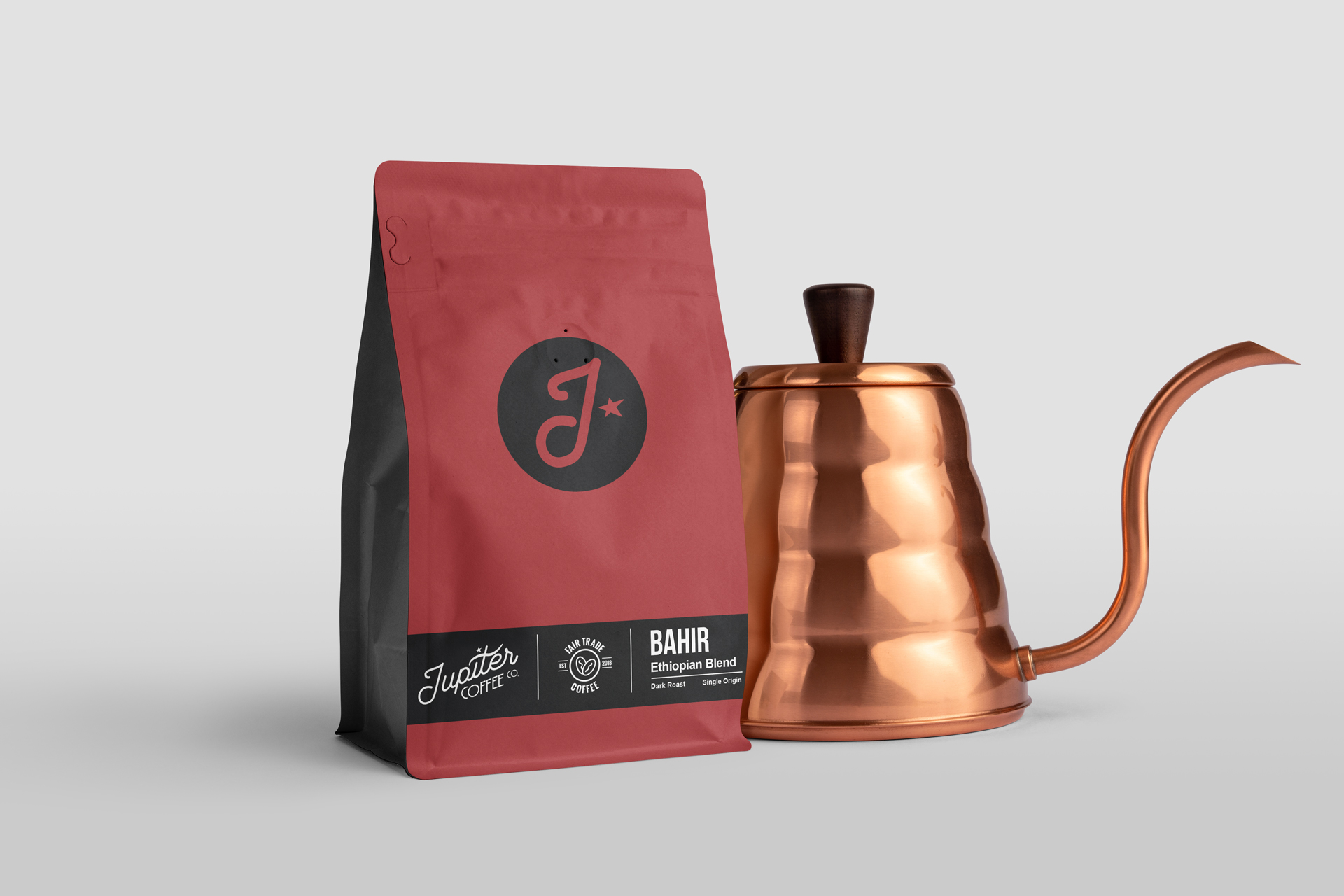
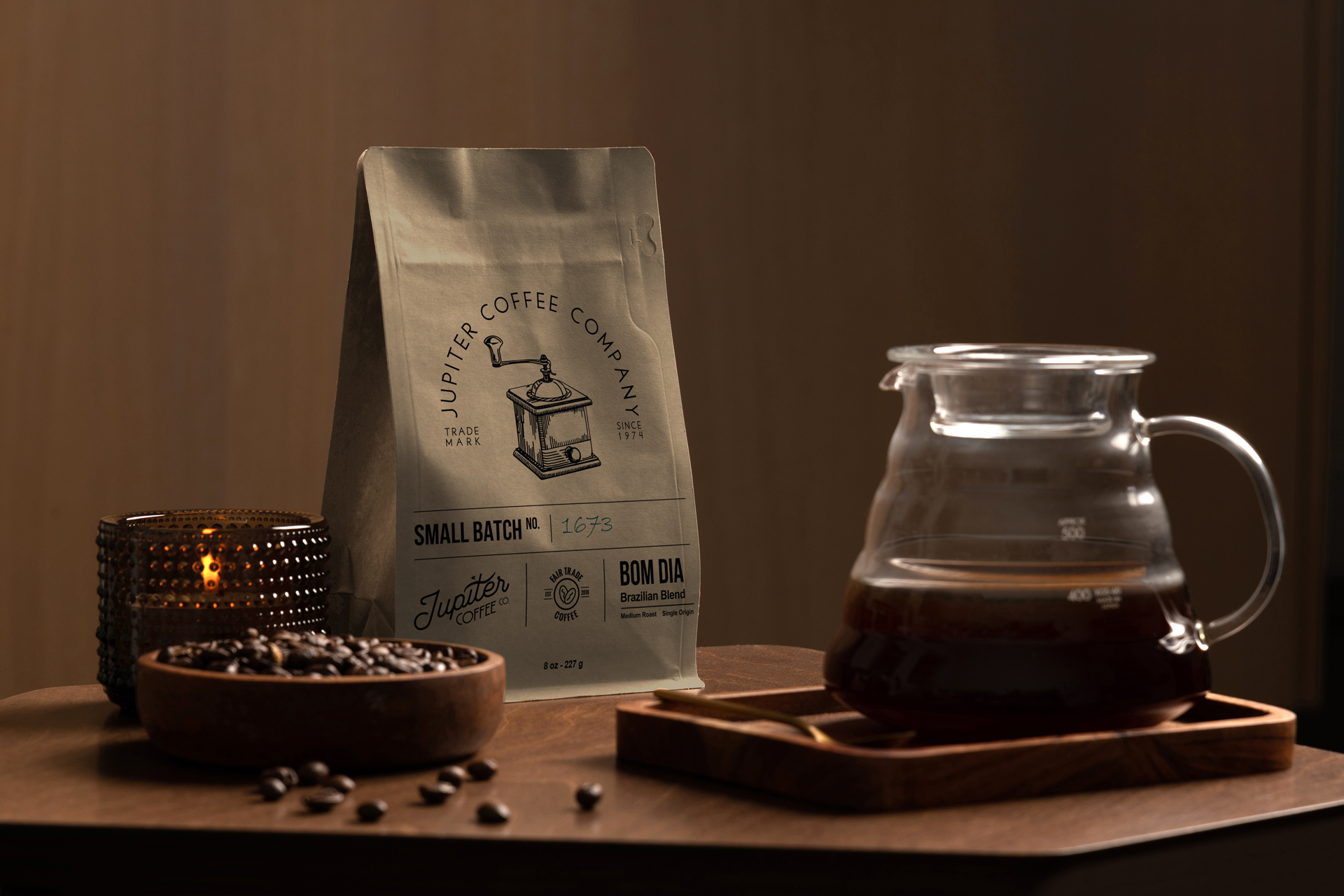

From bag to café
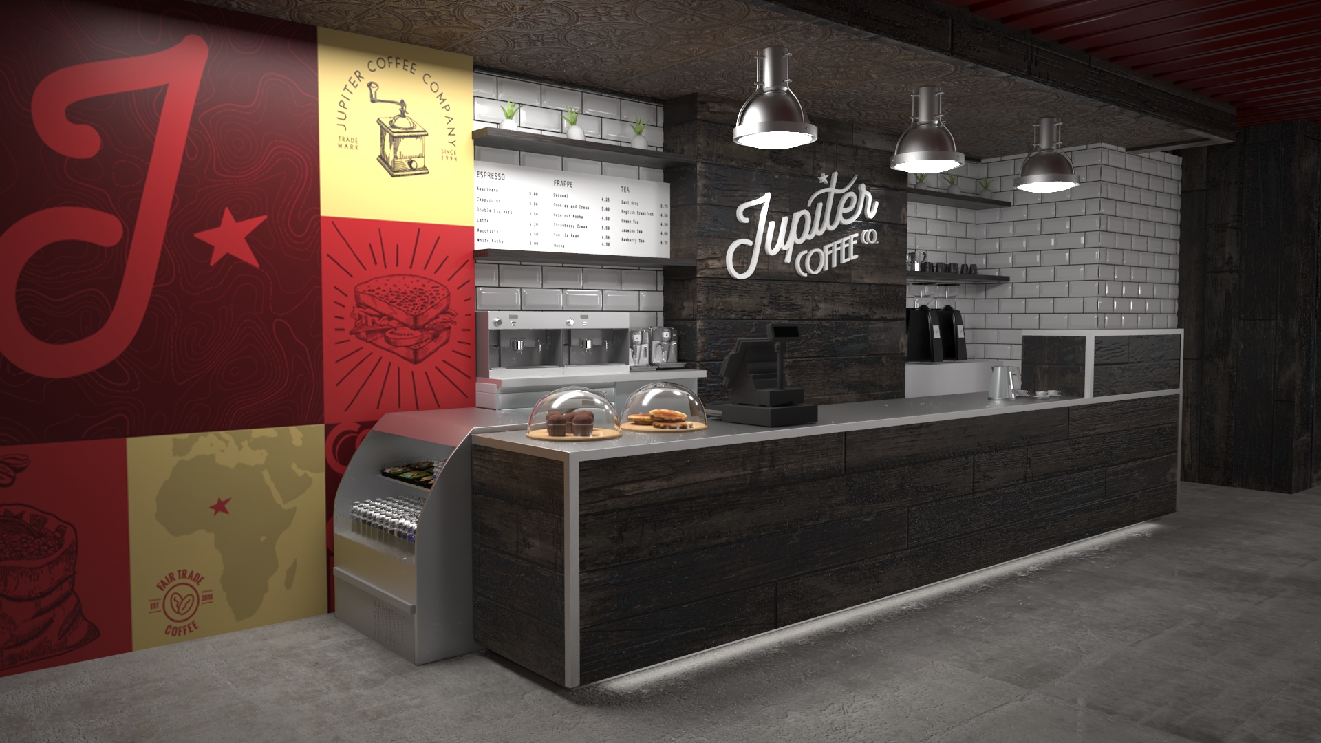
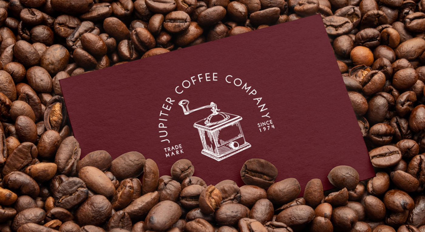
The identity runs through to the café: a brand wall in red and gold blocks behind the counter, and a set of hand-drawn illustrations of cups, grinders and sacks for menus and merchandise.

Have a product like this to launch?
Tell us what it is and roughly when you need it. We reply within two working days.
Start a project ↗