

Most conversations about websites start with traffic: how to get more people to visit. It matters. But every visitor costs something to win, whether in advertising, content or time spent on social media, and the design of your site decides what happens once they arrive. A site that turns two visitors in a hundred into customers instead of one has doubled the return on everything that brought them there.
That is what conversion-focused design means. It is not tricks or pressure. It is removing every reason a willing customer has to leave.
Give every page one job
Before designing a page, decide what it is for. The home page introduces the brand and sends people towards products. A product page sells one product. A where-to-buy page gets someone to a shop. When a page tries to do everything, visitors do nothing.
The home page: clear in five seconds
Someone arriving for the first time should know within a few seconds what you sell, who it is for and what to do next. That usually means your product, shown large, a plain sentence about it, and one obvious way forward. Clever headlines that need a second read cost you visitors who do not give you one.
The product page does the selling
This is the page that matters most, and the one most often treated as a template. A strong product page has:
- Photos that answer questions: the product on its own, in a hand for scale, in use, and the back of the pack.
- A name and a one-line promise that says what it is and why it is good.
- Size, options and price shown plainly, with the add-to-basket button visible on a phone without scrolling.
- What is in it: ingredients, materials or specifications, written as text.
- How to use it, briefly, especially if the product is new to people.
- Real reviews, if you have them.
- Delivery and returns information near the button, not hidden in a footer link.
Remove friction at checkout
Every extra step loses people. Allow guest checkout. Offer express payment options. Show delivery costs early rather than springing them at the last moment. Ask only for the information you need.
Trust that is earned
Visitors look for reasons to believe you: reviews, the shops that stock you, press coverage, a clear story about who makes the product. Use what is real and leave out what is not. Invented testimonials and inflated claims are easy to spot and hard to recover from.
If you sell in shops, a store finder sells too
For many food and drink brands, the website’s job is to send people to a shelf, not a basket. A clear, current where-to-buy page is a conversion page. Treat it like one.
Measure, then adjust
Look at where people leave. If many visitors reach product pages but few add to basket, the product page needs work. If many add to basket but few finish, look at checkout. Change one thing at a time, and give each change long enough to show a result.
An example
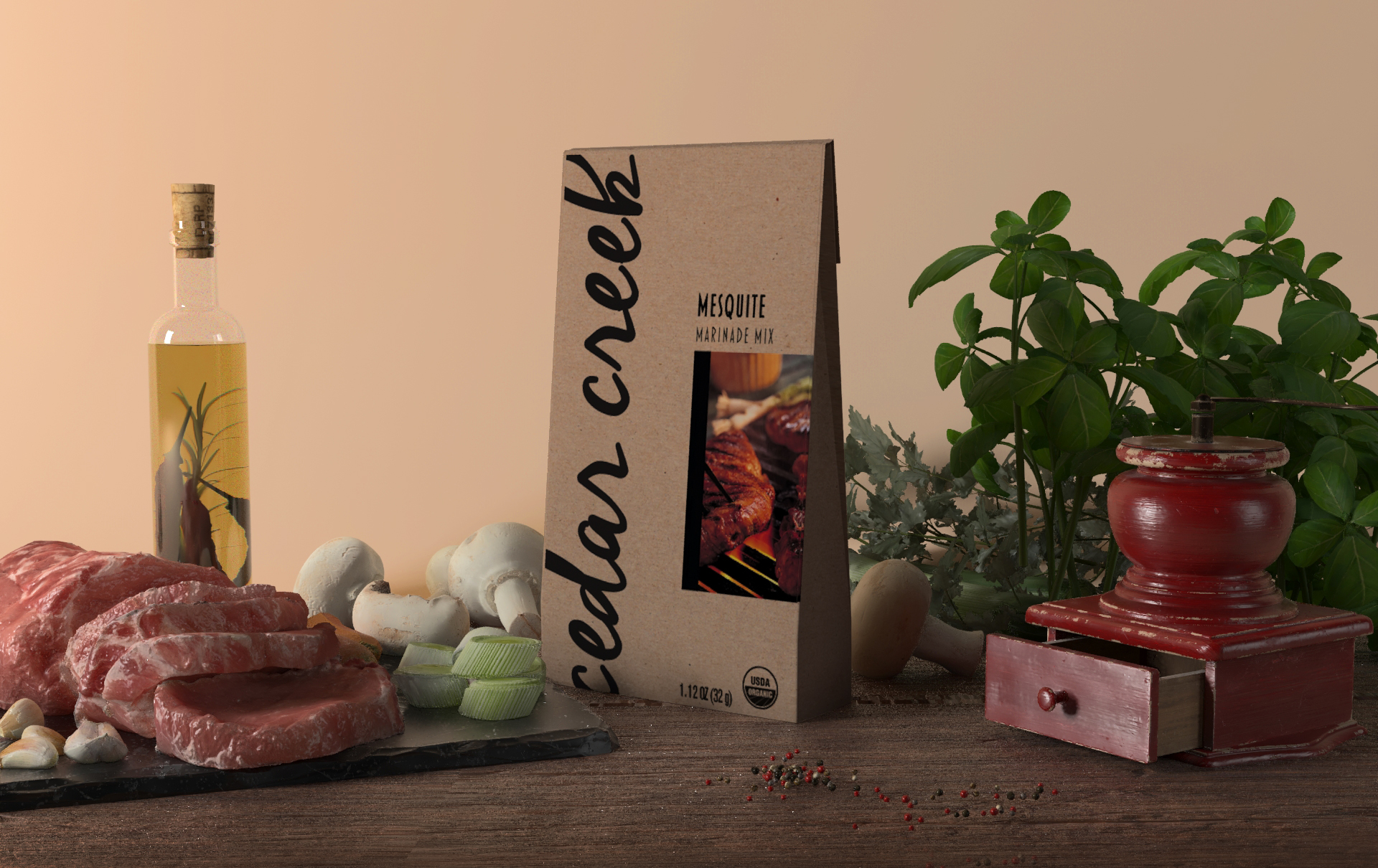
On the website we designed for Cedar Creek, the home page opens on a kitchen scene with all four seasoning packs in view. Under each pack sits a small tag with the blend’s name, and each tag goes straight to that blend’s page. A visitor can go from a first look to the product they want in a single tap.
If your website brings people in but does not turn them into customers, let’s talk.