

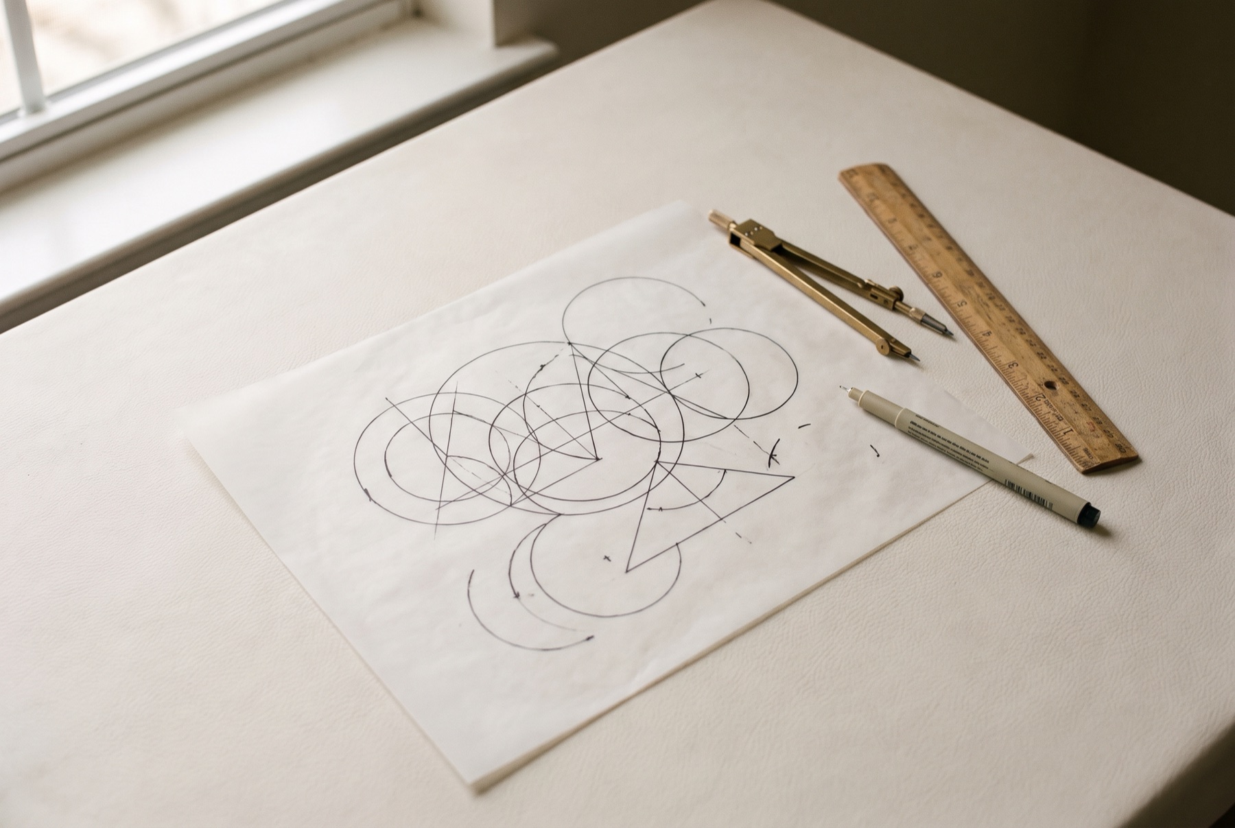
A logo is not the whole brand, but it is the most visible, most repeated part of it. It appears on everything from packaging and signage to social avatars and invoices. A great logo makes recognition easy for years. A weak one creates friction every time it is used.
Qualities shared by great logos
1. Simplicity
Simple logos are easier to recognise, remember and reproduce. Complexity rarely survives small sizes, embroidery, single-colour printing or a quick glance.
2. Distinctiveness
A great logo looks like it belongs to one business only. If it could be swapped with a competitor’s without anyone noticing, it is not doing its job.
3. Relevance
The logo should feel appropriate for the business and its audience. That does not mean it must depict the product — many of the best logos do not — but its style should suit the brand’s personality.
4. Versatility
It must work everywhere: large and small, colour and black-and-white, print and screen, light and dark backgrounds. Many strong identities include several versions — a primary logo, a simplified mark, a horizontal version — for different uses.
5. Timelessness
Trends date quickly. Great logos avoid effects and styles that will look tired in a few years.
6. Memorability
A clear idea, executed simply, sticks in the mind.
7. Ownership
A logo should be original and, ideally, legally protectable.
An example
The Velomelodic mark is a single line with one stroke weight and rounded corners, tracing a waveform through a V and an M. It is simple, specific to the business, and works at 16 pixels on a plug-in interface as readily as across a T-shirt.
Common beginner mistakes
Too much detail
Fine lines, small text and intricate illustrations disappear at small sizes.
Too many colours
A logo should work in one colour. If it relies on colour or gradients to be understood, it will struggle in many applications.
Following trends
Trendy effects can make a logo feel current today and dated tomorrow.
Being too literal
A bakery does not need a loaf of bread in its logo. Literal illustrations are often generic and limit future growth.
Poor typography
Default fonts, awkward spacing or too many typefaces make a logo look amateur. Typography deserves as much care as any symbol.
Designing in isolation
A logo needs to be judged in context — on packaging, a storefront, a phone screen — not floating on a white background.
Copying others
Inspiration is natural; imitation creates legal and reputational risk.
Skipping the system
A logo without colour rules, clear space and minimum sizes will be used inconsistently.
Logo is not brand
A logo is a signature. It gains meaning through the experiences people associate with it. Even the best logo cannot make up for a weak product or inconsistent experience — but a well-designed logo makes a strong brand easier to recognise.
How to judge your logo
- Shrink it to a social avatar. Does it still work?
- Print it in black only. Is it still recognisable?
- Put it next to competitors. Does it stand out?
- Show it to someone briefly, then ask them to sketch it. Can they?
If your logo is not passing these tests, get in touch.