

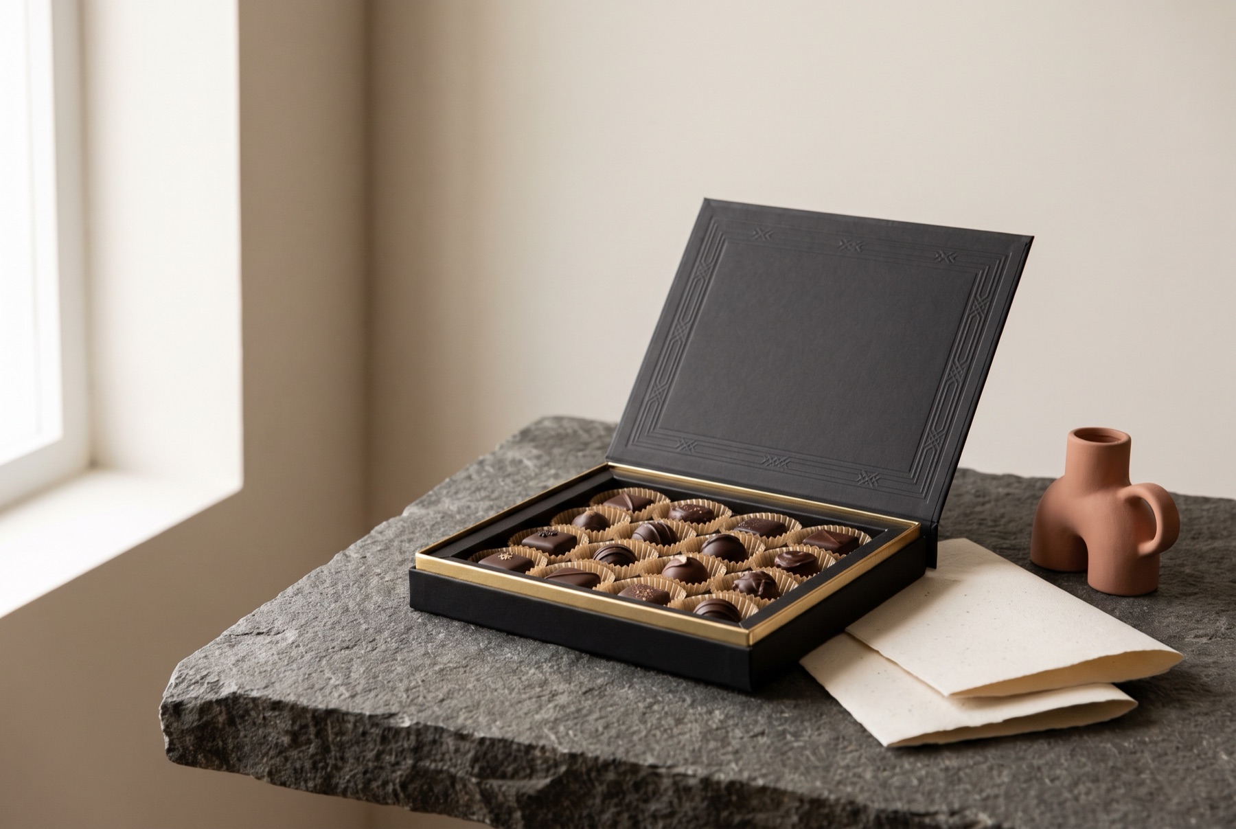
A premium food product needs premium packaging, or shoppers will not believe the price. But “premium” is not the same as expensive. It is a combination of signals that shoppers read instantly — and many of them cost very little.
What shoppers read as premium
Restraint
Premium packaging says less. Fewer claims, fewer colours, more space. Space signals confidence: the brand does not need to shout. A crowded front panel reads as discount, no matter what is inside.
Typography
Type is one of the strongest quality signals there is. Well-chosen, well-spaced typefaces — used consistently and at a considered scale — feel crafted. Default fonts, awkward spacing and too many typefaces feel careless.
A clear story
Premium products usually have a reason to be premium: an ingredient, an origin, a process, a family recipe. Packaging that tells that story simply makes the price feel justified.
Considered colour
A limited palette, used with intent, almost always looks more expensive than a rainbow. Muted or deep colours, combined with one confident accent, are a common premium approach — but the right answer depends on your category.
Materials and finish
Touch is part of perception. Uncoated papers, textured labels, matte finishes, foil, embossing and debossing all signal care. You do not need all of them. One well-chosen finish, applied in the right place, does more than several.
Honest imagery
Premium food photography shows the real product, beautifully lit, without exaggeration. A clear window can do the same job.
Where to spend and where to save
- Spend on the parts that are touched and seen first: the front label, the closure, the material of the primary pack.
- Save on what nobody notices: inner components, shipping cartons, the back of a carton.
- Use stock structures — standard jars and bottles — and invest in labels and finishes instead of custom tooling.
- Limit special finishes to one or two elements, like the logo.
Premium does not mean austere
Premium packaging can be warm, playful or nostalgic. The redesign of Greg’s Frozen Custard used distinct pastel colours for each flavour and combined modern typography with vintage elements. The result feels considered and special, without losing the warmth that a custard brand needs.
The key is coherence. Every element should feel like it was chosen on purpose.
Check it on the shelf
Premium is relative. Put your packaging next to the products you want to be compared with — and the ones you do not. If it sits comfortably among the brands at your price point, you are there.
The short version
Say less. Choose type carefully. Tell one true story. Use colour with restraint. Pick one finish and use it well. Show the real product. And make sure every detail looks intentional.
If you are developing a premium food product and want packaging that earns its price, let’s talk.