

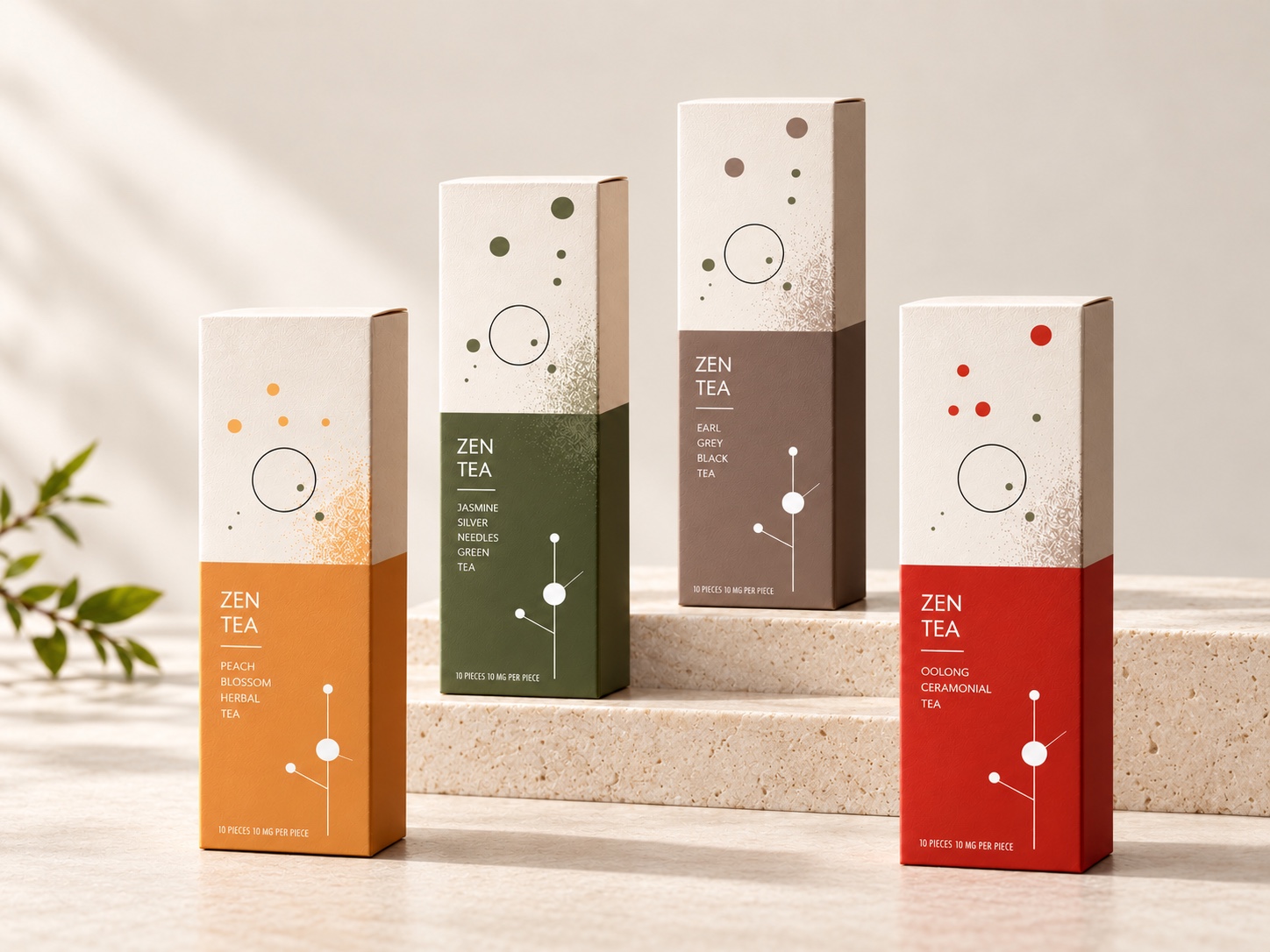
Zen Tea
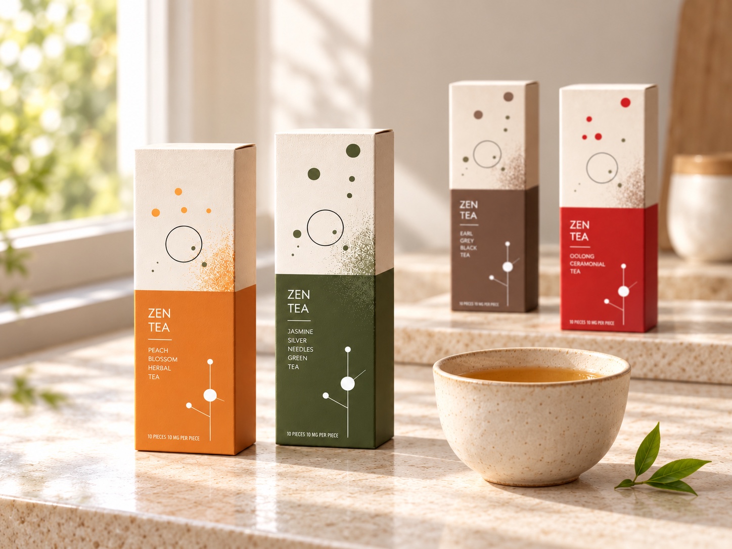
Packaging and a brand standards manual for a range of four teas: peach blossom herbal, jasmine silver needles green, Earl Grey black and oolong. The cartons are tall and narrow and split in two — a warm ivory upper half that stays the same across the range, and a lower half in the colour of the tea.
Graphic language
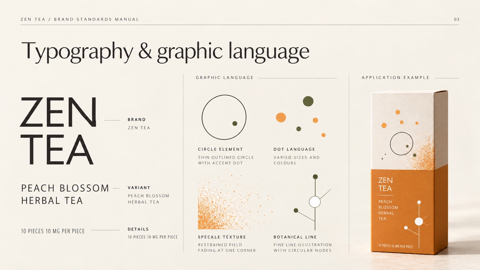
The graphic language is four small things used with restraint: a thin outlined circle with an accent dot, a scatter of dots in varied sizes, a field of speckle fading from one corner, and a fine botanical line with circular nodes. Together they suggest steam, leaf and blossom without drawing any of them.
Palette and photography
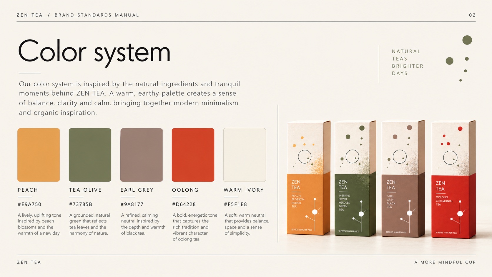
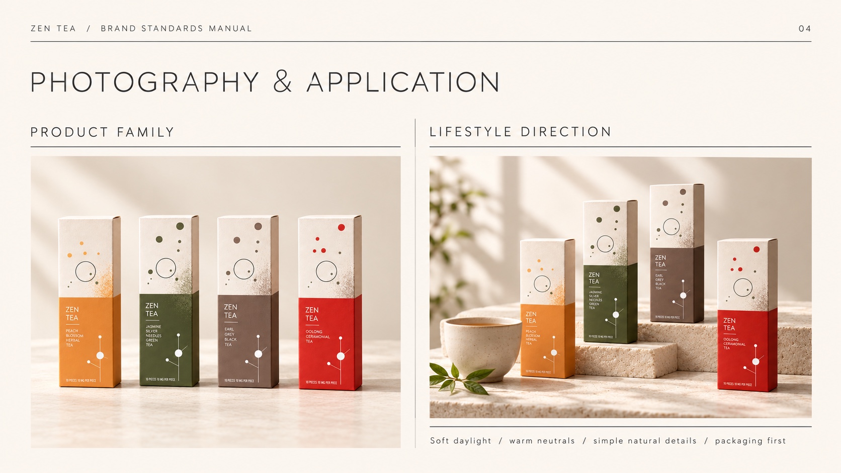
The palette takes its names from the range — Peach, Tea Olive, Earl Grey and Oolong on a ground of Warm Ivory — and the photography direction keeps to soft daylight, warm neutrals and simple natural details, with the packaging first.
Have a product like this to launch?
Tell us what it is and roughly when you need it. We reply within two working days.
Start a project ↗