

Seasons Milk Tea
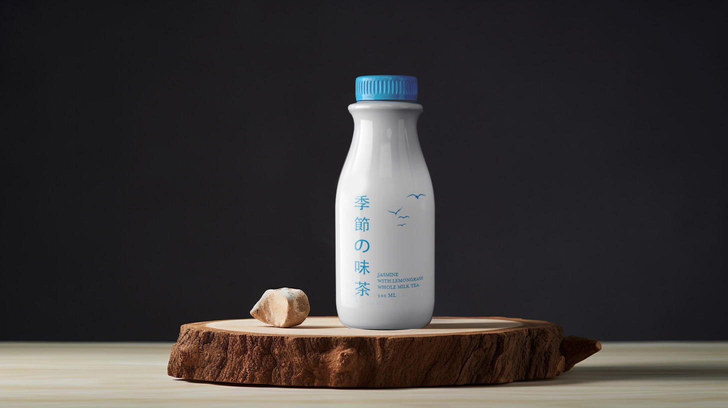
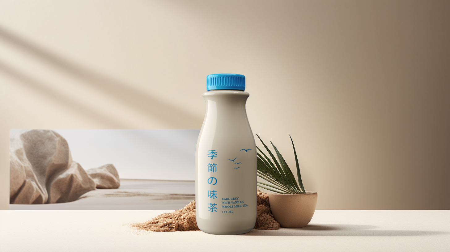
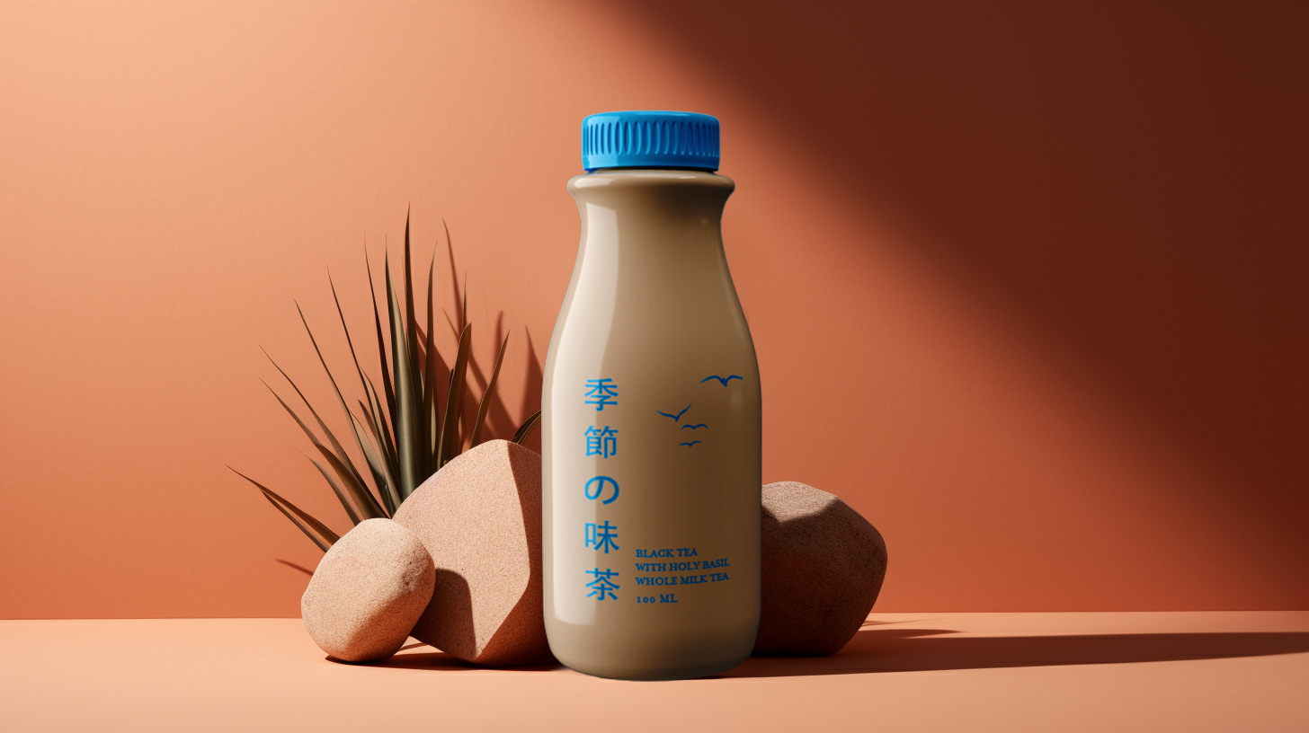
Packaging for Seasons, an artisan line of whole milk teas for Yoshi Hansa. The design is deliberately quiet: muted colours, one simple illustration and bilingual flavour names, to signal a premium, natural product without saying so on the label.

Bilingual by design
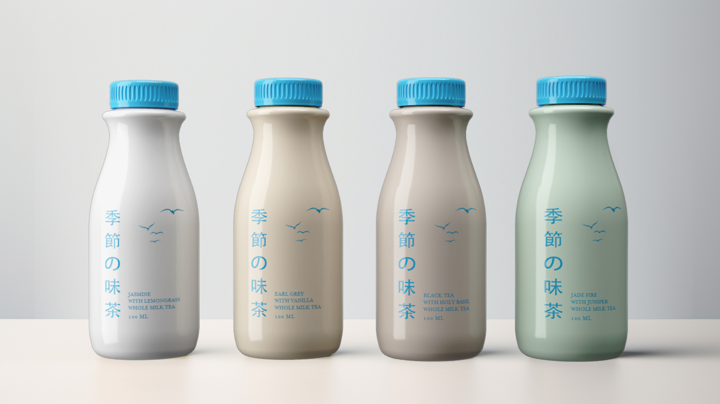
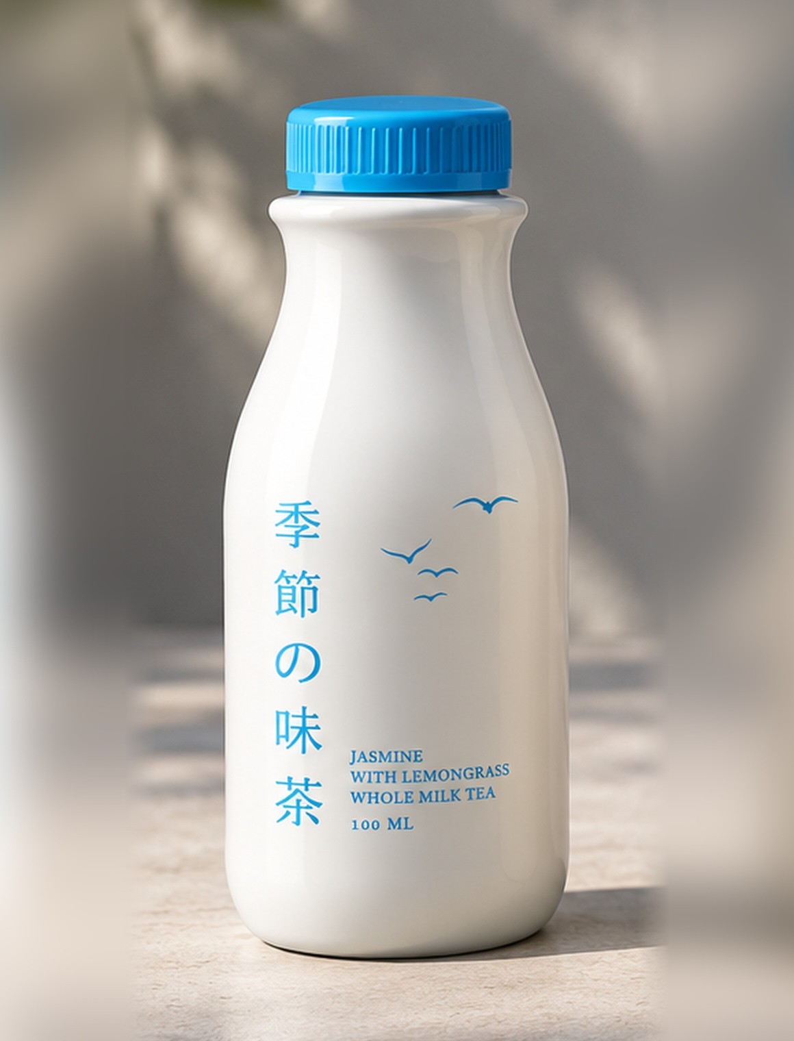
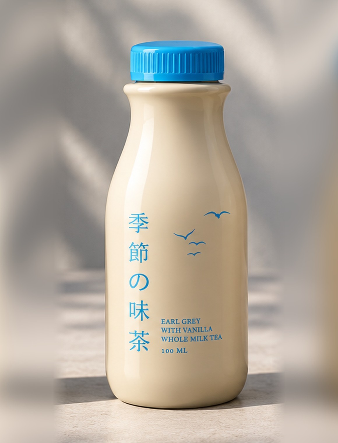
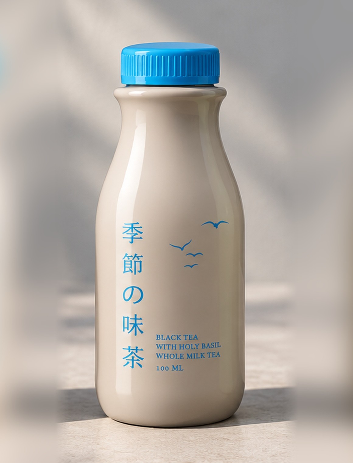
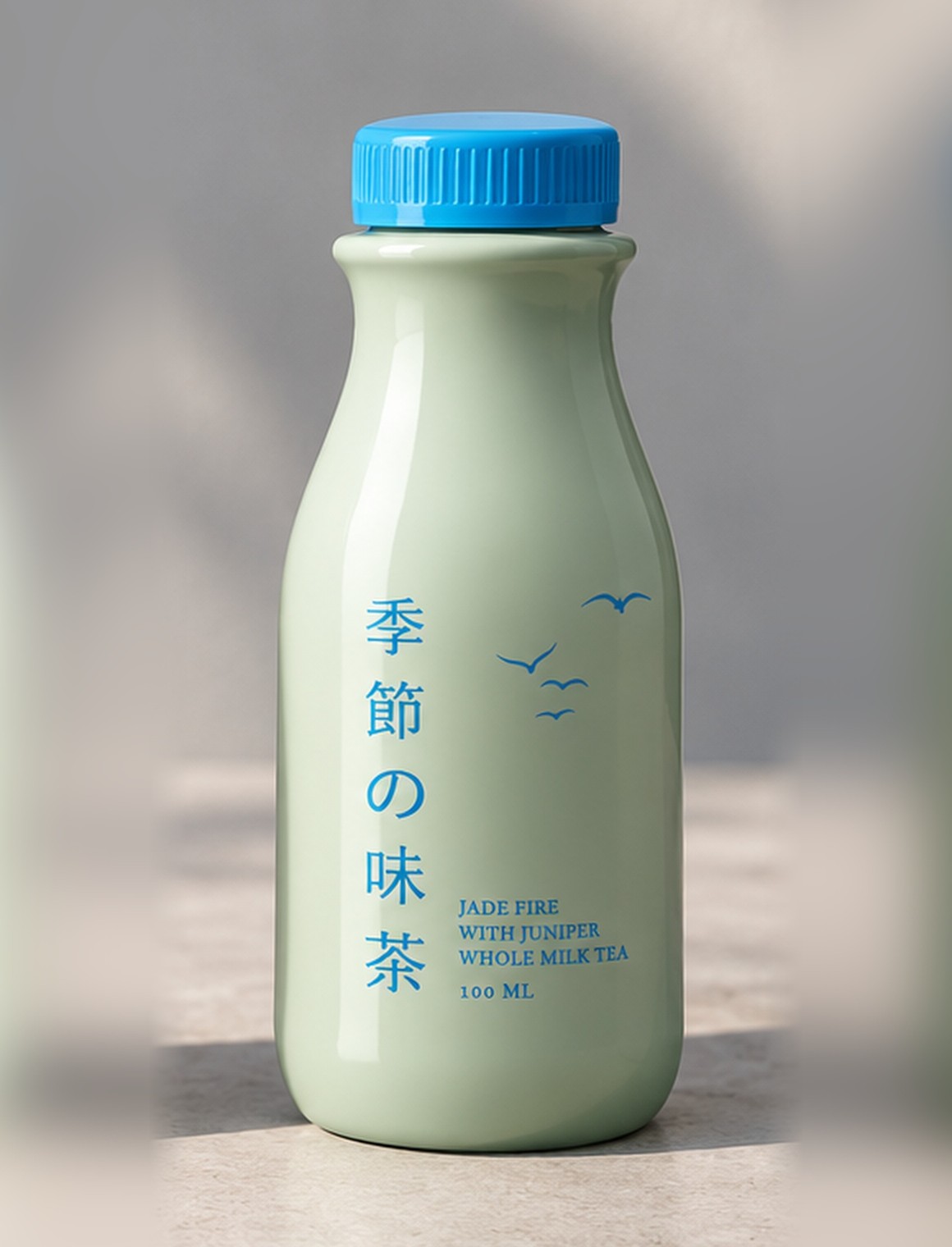
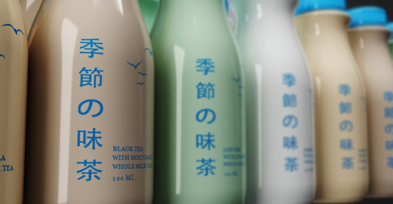
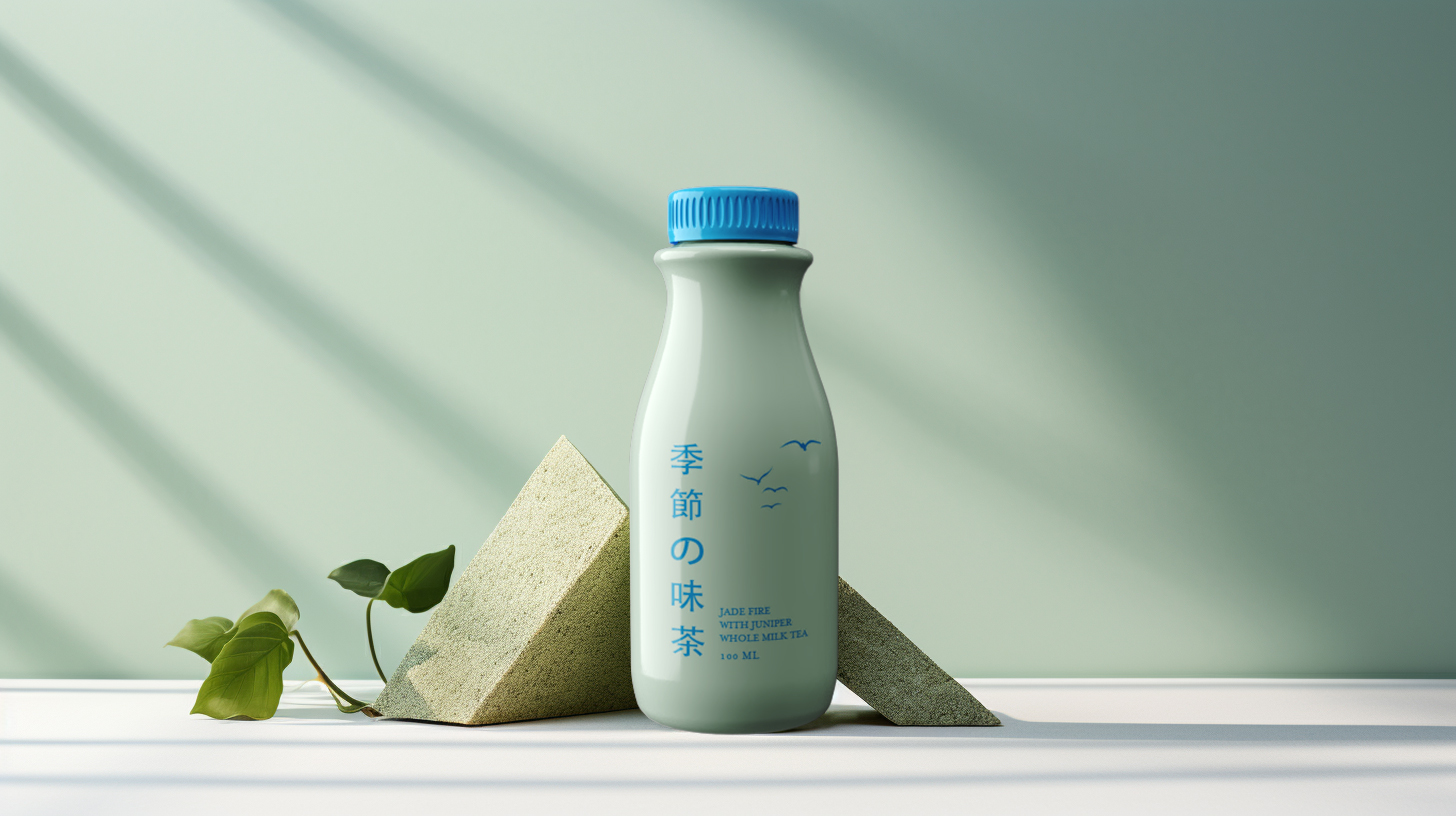
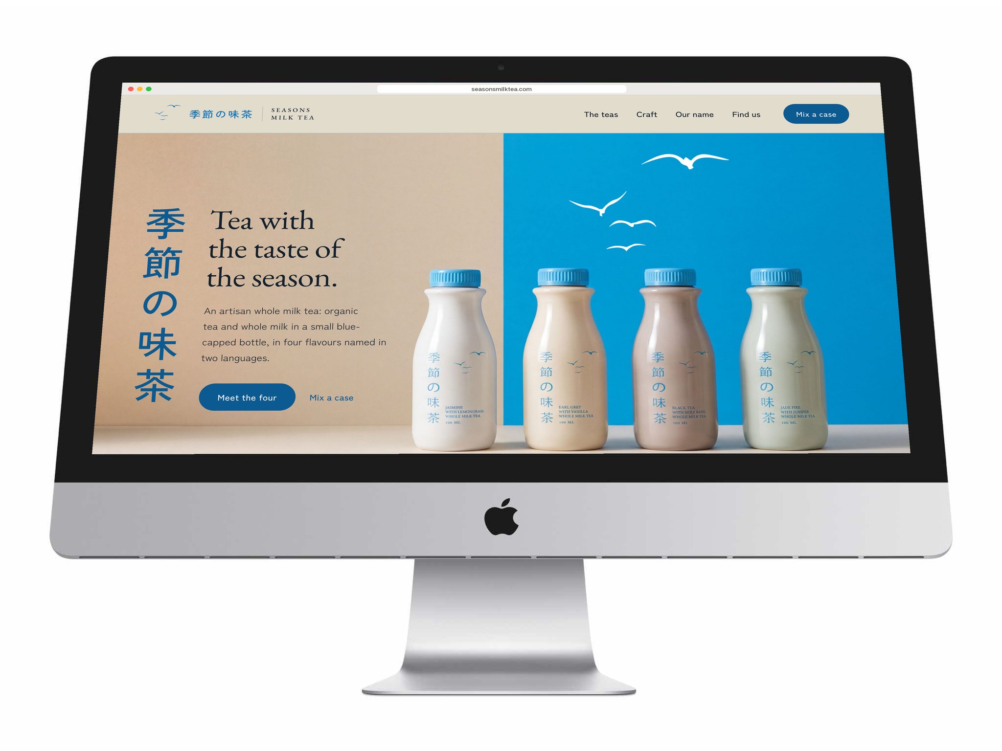
Each bottle carries its name in vertical Japanese, 季節の味茶, set like a line of calligraphy down the front, with the flavour in English small beneath it. A drawing of birds in flight is the only illustration; the range changes colour bottle by bottle, from milk white to matcha green, under the same blue cap.
Four teas, one bottle
The colour of the bottle is the colour of the tea: milk white for Jasmine with lemongrass, ivory for Earl Grey with vanilla, taupe for Black tea with holy basil, sage for Jade Fire with juniper. One cap, one drawing, one line of Japanese; only the colour and the English name change.
Mix a case, in 3D
- Twelve slots, any mix of the four
- Drag to turn it; pick a bottle up
- Built from the packaging artwork
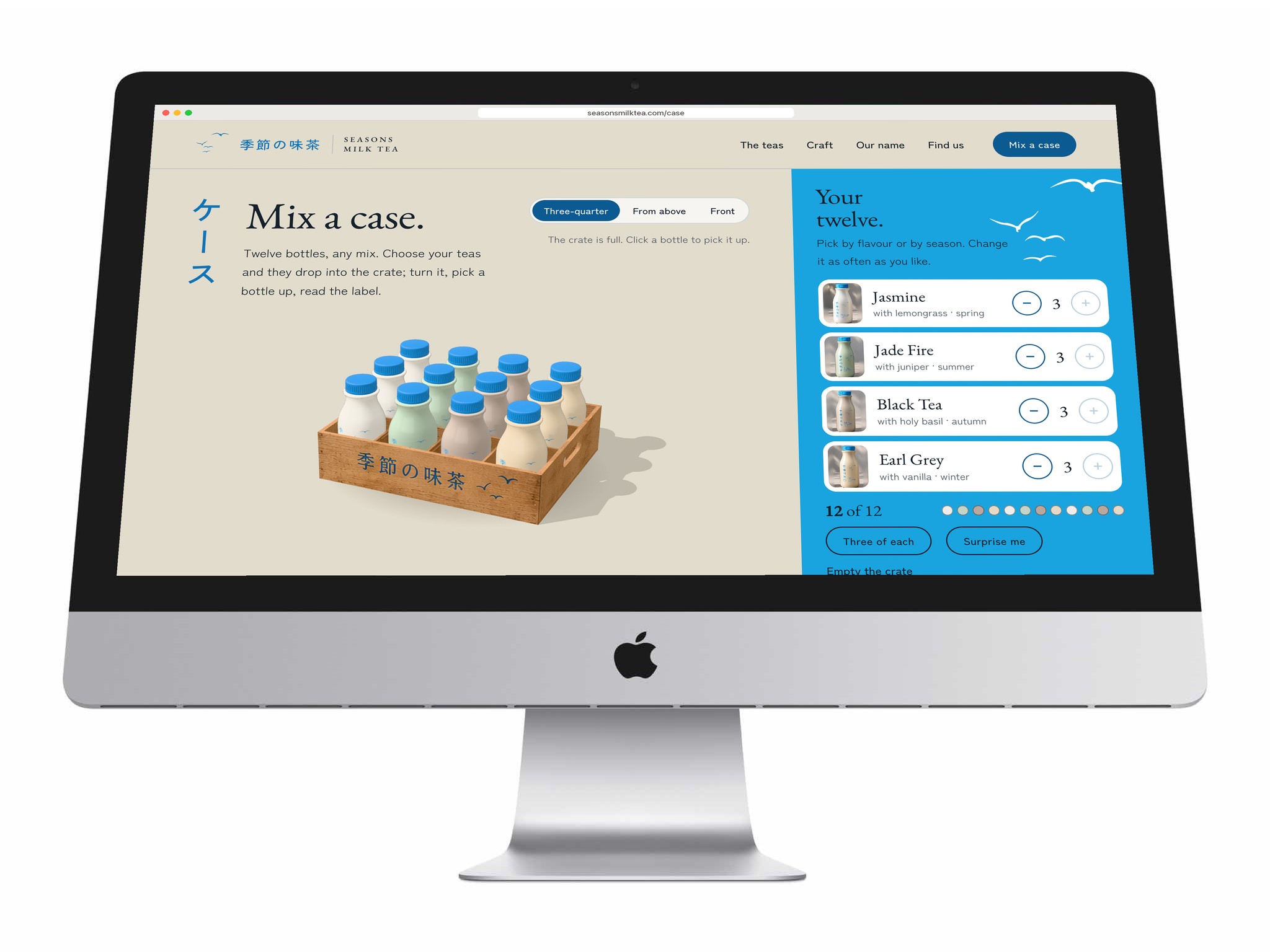
On the website a case of twelve is built in three dimensions. The bottle is turned from its silhouette in the product photography, each label’s artwork is wrapped around it, and the crate’s printed front comes from the crate photograph, so what you handle on screen is the packaging itself.
Choose your teas and the bottles drop into the crate, back row first. Drag to turn it, look from above, or pick a bottle up to read its label, then put it back or take it out. Where a browser can’t draw 3D, the crate photographs stand in.
Have a product like this to launch?
Tell us what it is and roughly when you need it. We reply within two working days.
Start a project ↗