

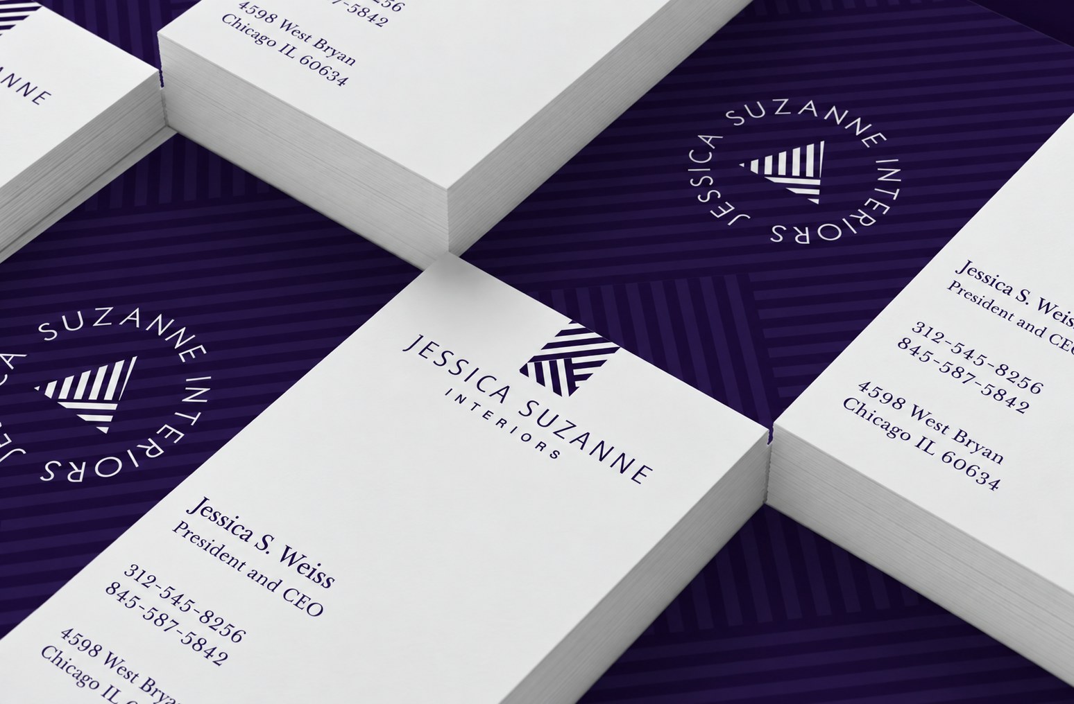
Jessica Suzanne Interiors
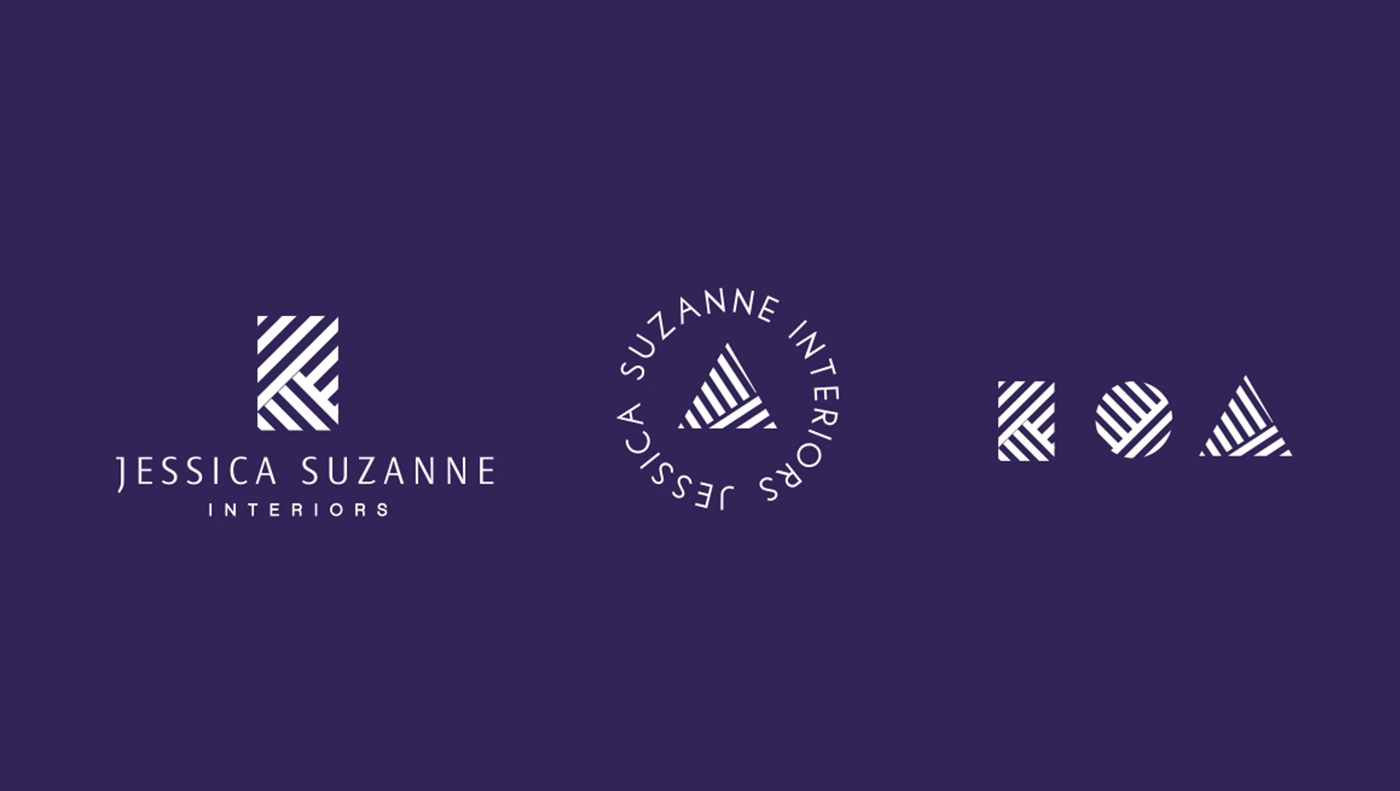
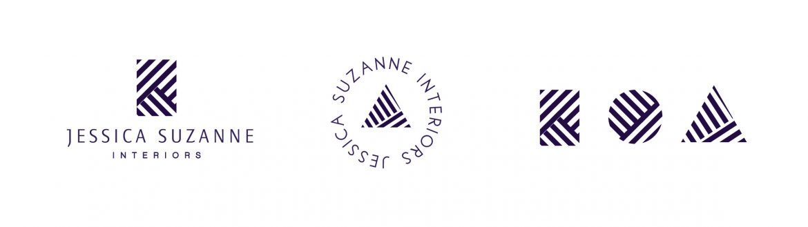
An identity for a Chicago interior design practice, drawn from the thing the work is actually made of: pattern. Every mark in the system is built from the same diagonal rule — a square, a circle and a triangle, each filled with a weave that reads as parquet, as herringbone, as textile, depending on where it lands.
Three marks, not one
That gives the practice three marks rather than one. The lockup carries the name, the circular seal works where a signature is wanted — a wax stamp, an envelope flap, a card back — and the three geometric marks run as a set across pattern, tube labels and collateral without ever needing the wordmark.
Pattern as surface
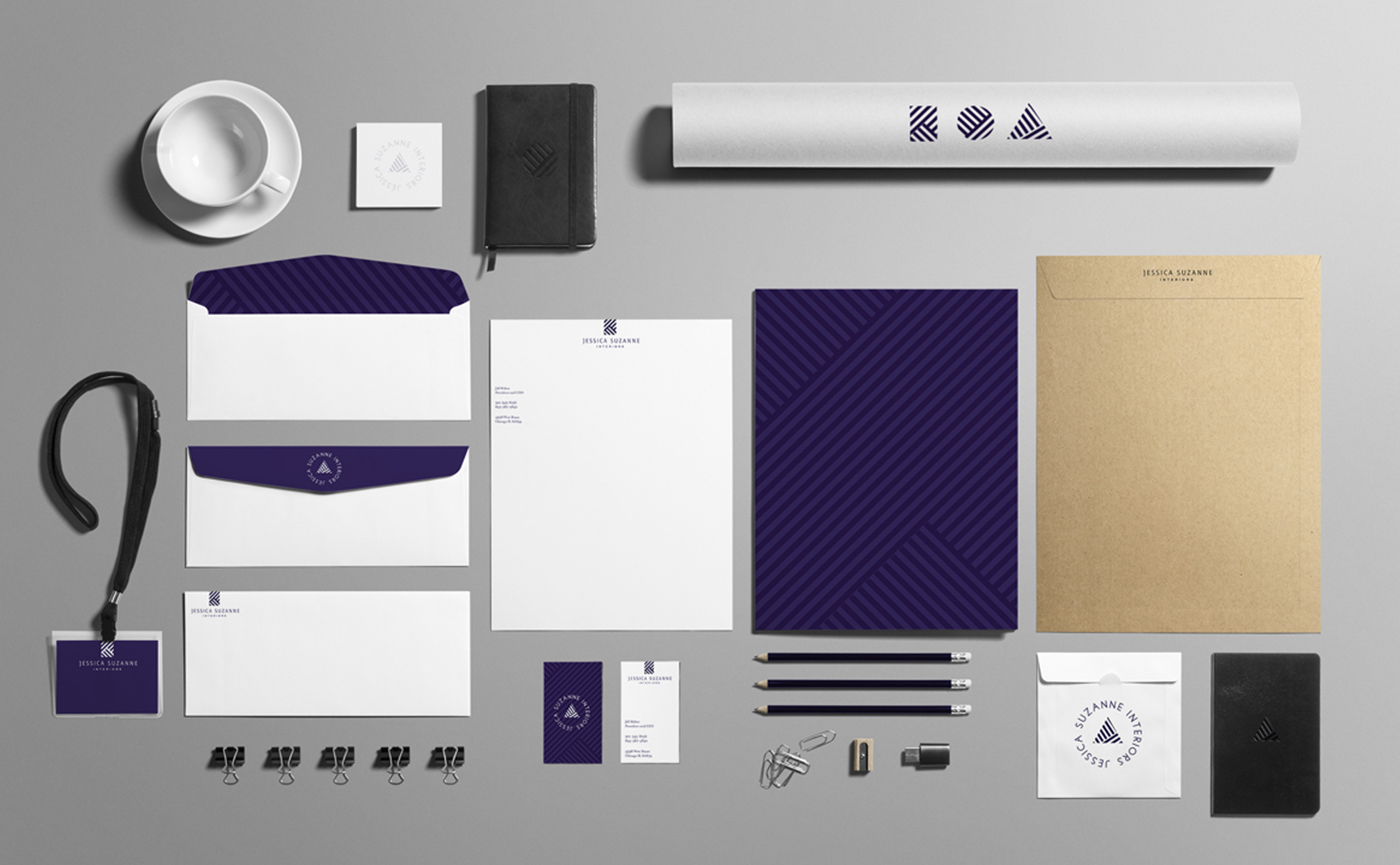
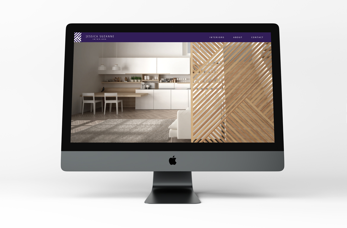
Deep aubergine and white throughout, with the pattern enlarged to become the surface itself on folder stock and envelope liners. The stationery runs from letterhead and cards to the lanyard and the mailing tube; a line-drawn icon set covers the practice’s four services; and the site uses the same weave as the divide between interior photography and the brand.

Have a product like this to launch?
Tell us what it is and roughly when you need it. We reply within two working days.
Start a project ↗