

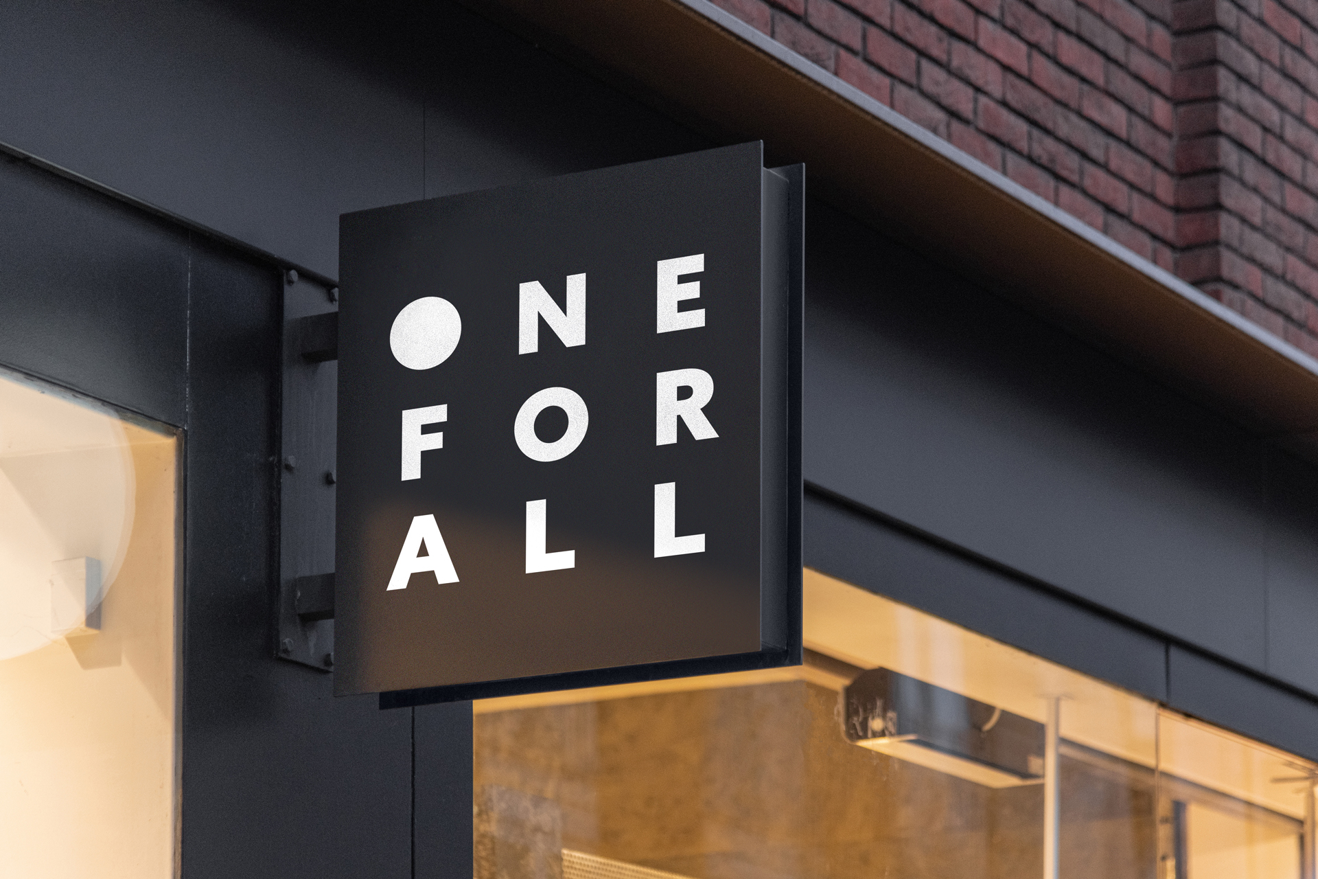
One For All
An identity for One For All, a fashion label out of New York. The name is stacked three letters to a line, so it sets as a square — and the O is filled in, a solid dot that turns the first letter into the mark.
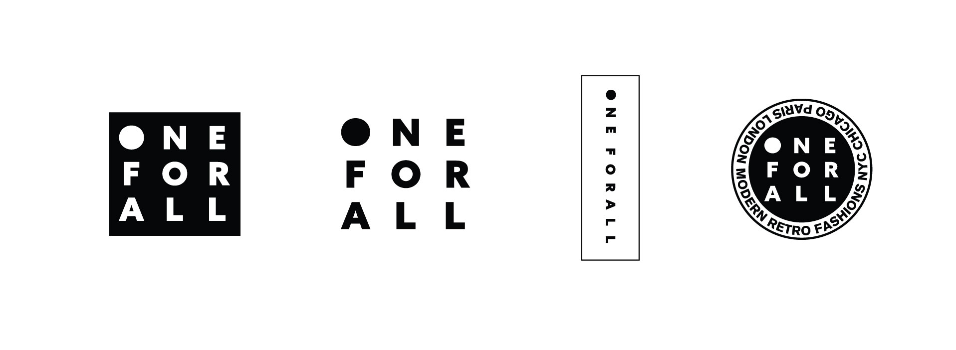
A grid that reshapes
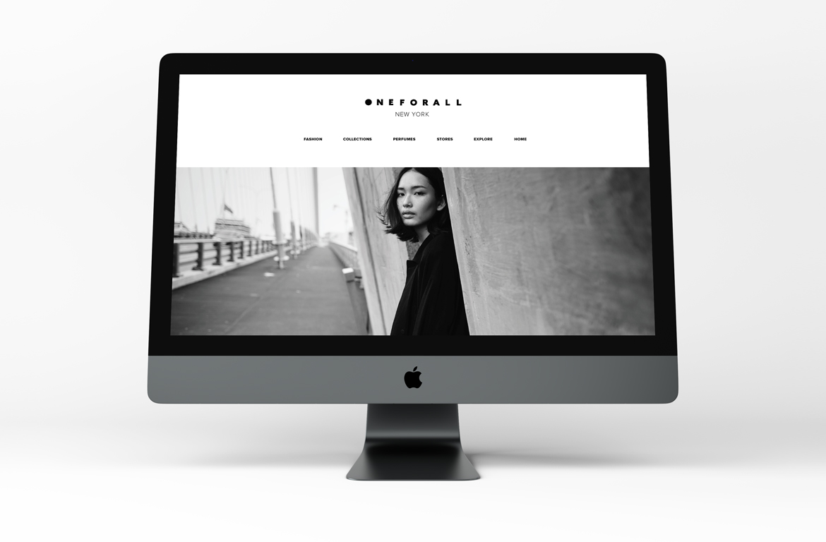
Because the wordmark is its own grid, it reshapes without being redrawn: the square for signs and labels, a single line for the site header, a vertical strip, and a roundel ringed with the label’s cities.
Black and white
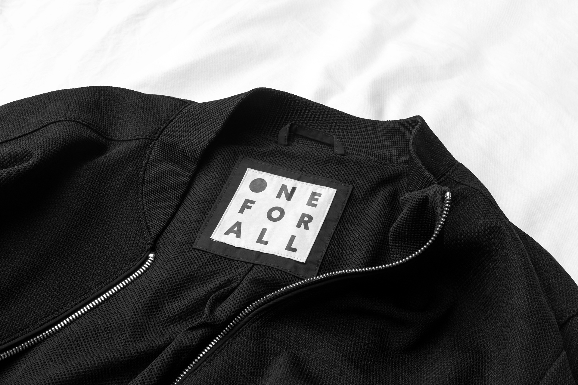
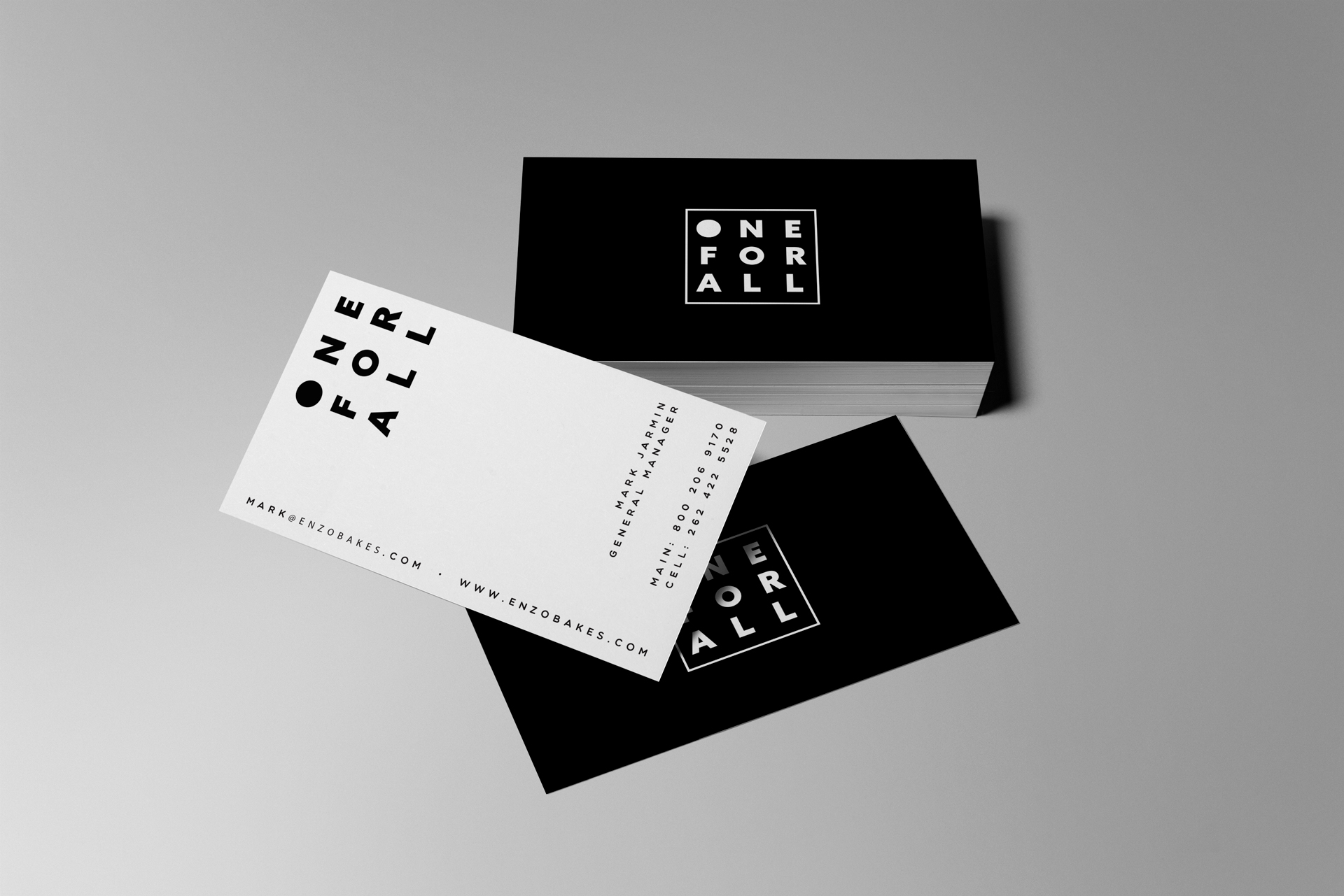
Everything is black and white. On a blade sign, a woven neck label, business cards and the website, the dot does the recognising.
Have a product like this to launch?
Tell us what it is and roughly when you need it. We reply within two working days.
Start a project ↗