

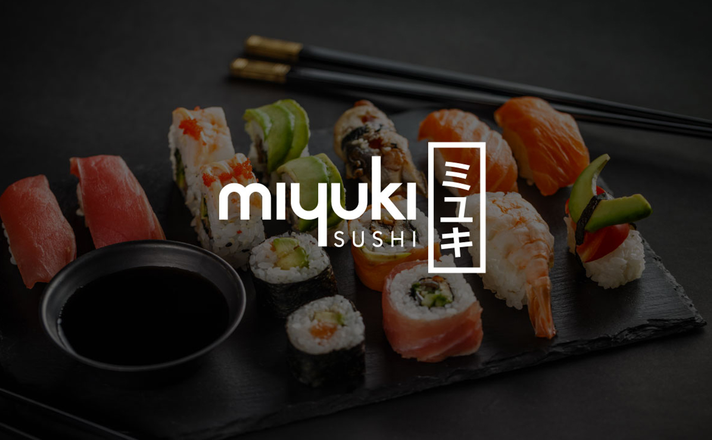
Miyuki Sushi
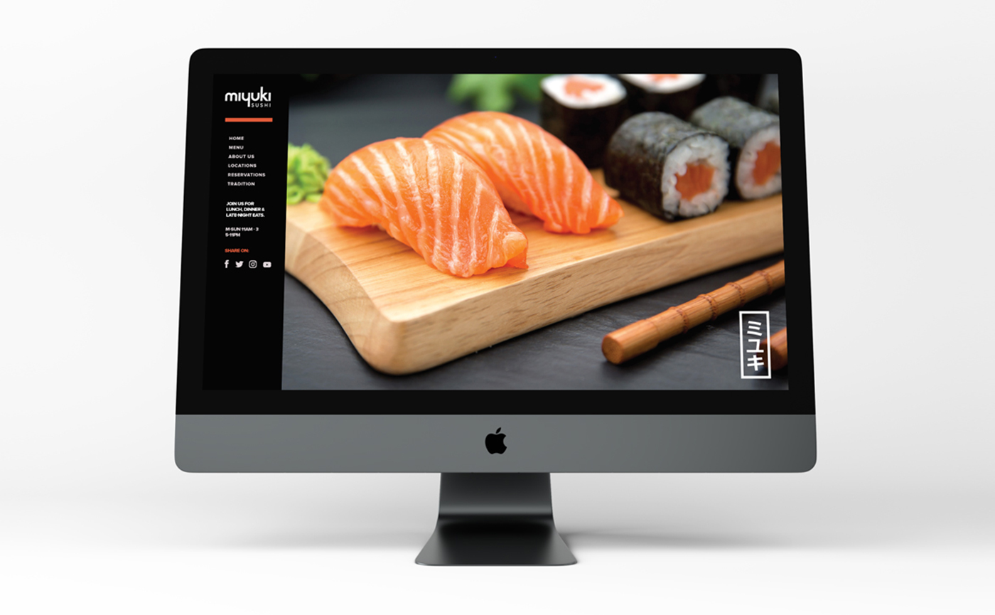
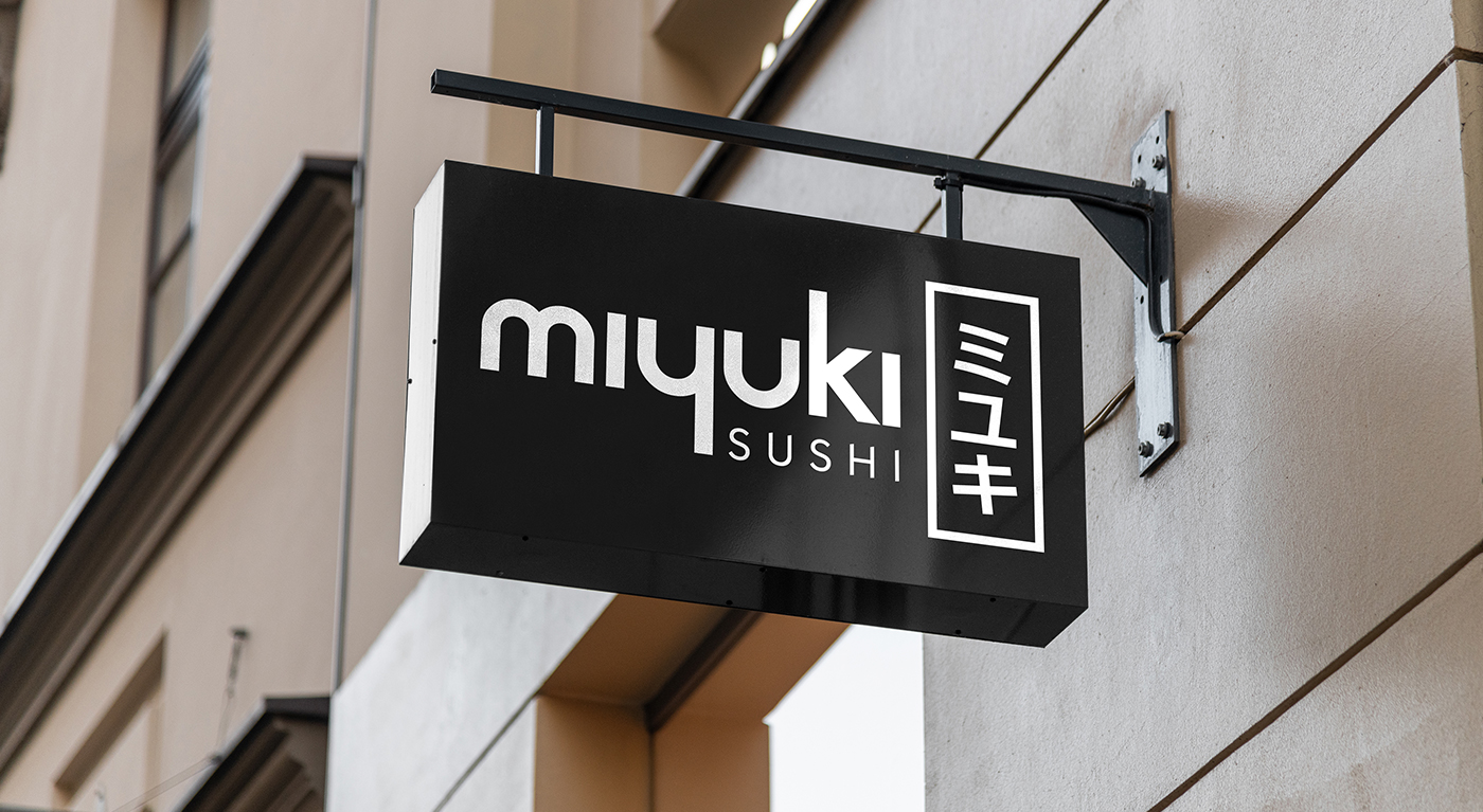
Branding for Miyuki, a sushi restaurant. The identity is minimal by intent, Japanese in its references and modern in its execution, and built to work across everything the restaurant puts in front of a guest, from the sign outside to the bag a takeaway order leaves in.
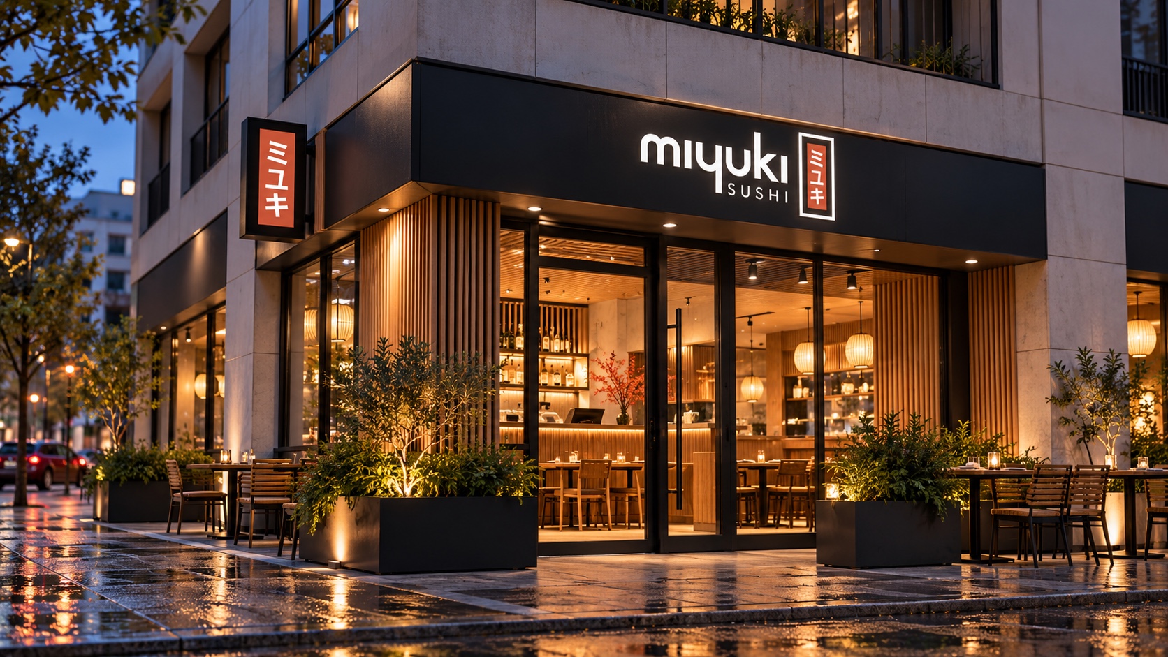
Two scripts, one mark
The wordmark sets miyuki in rounded lowercase beside the name in katakana, stacked in a red box like a seal. Either half can stand alone, which is how the same mark works on a takeaway bag and on a sign above the street.
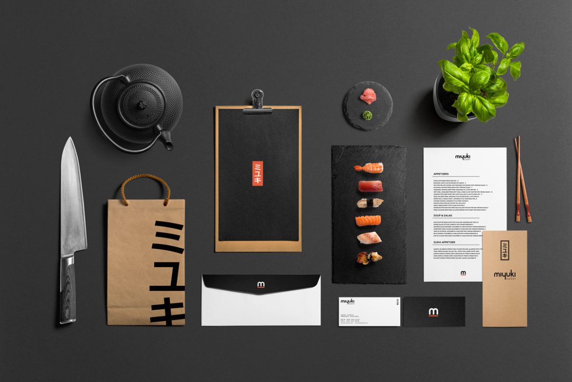
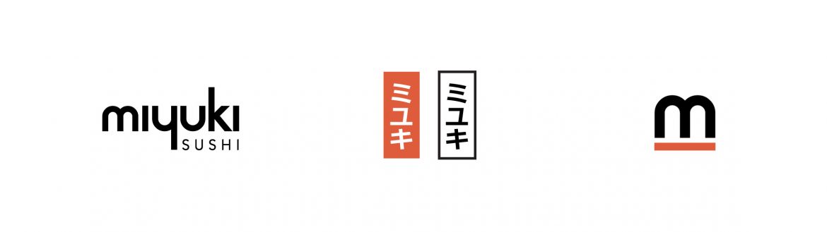
Black, white and one red
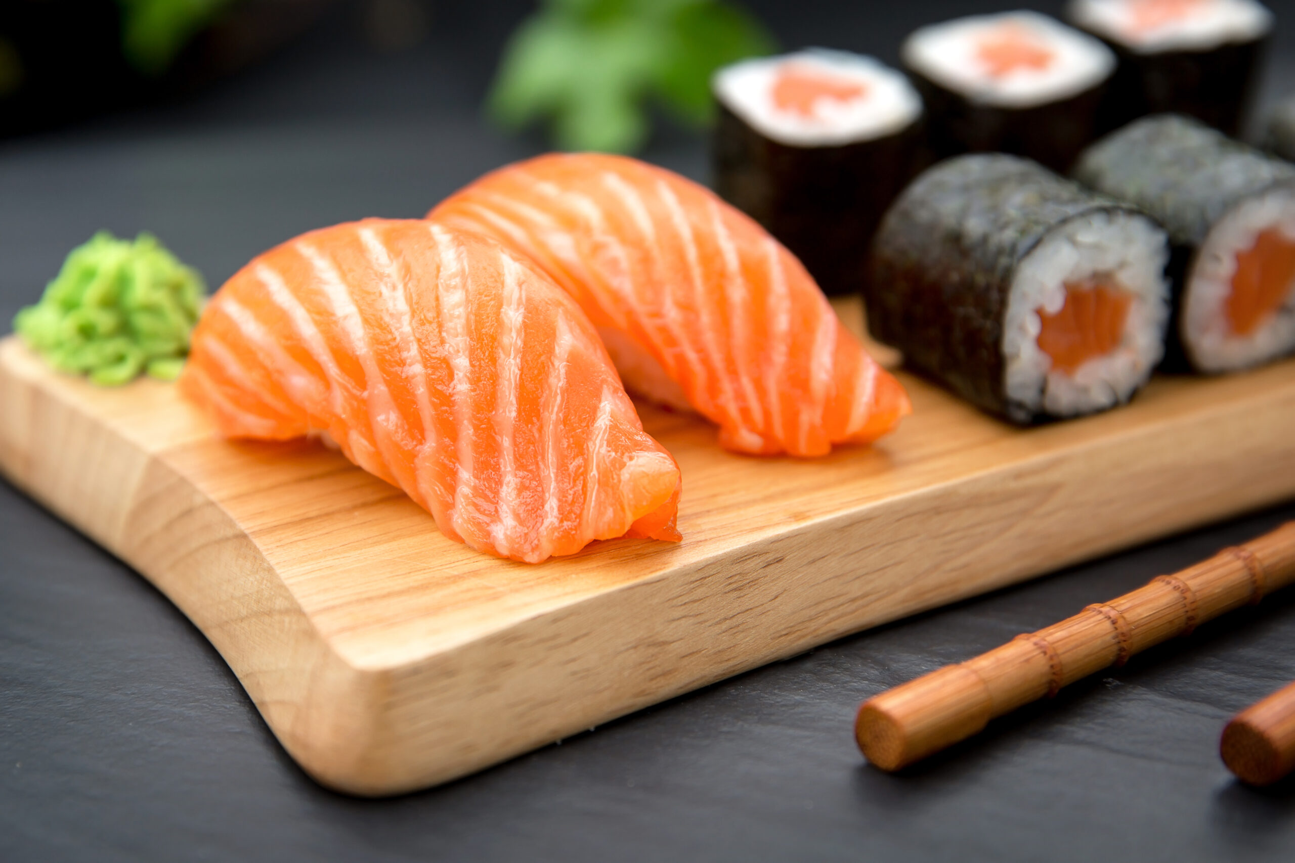
The palette is ink black, rice white and a single vermilion kept for the katakana seal. It leaves the colour to the food, on the menus, the packaging and the site alike.
Have a product like this to launch?
Tell us what it is and roughly when you need it. We reply within two working days.
Start a project ↗