

Theo’s Frozen Yogurt
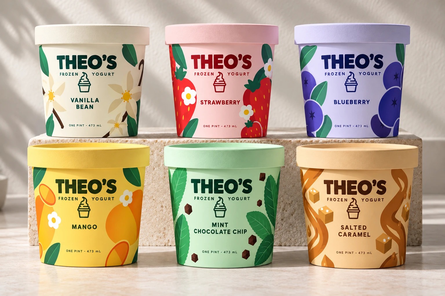
Brand identity, packaging and shop design for Theo’s Frozen Yogurt, a self-serve frozen yogurt shop with a line of pints. The idea is printed on the bottom of every pint: good things in every cup.
The brand
- Bright
- Playful
- Confident
- Approachable
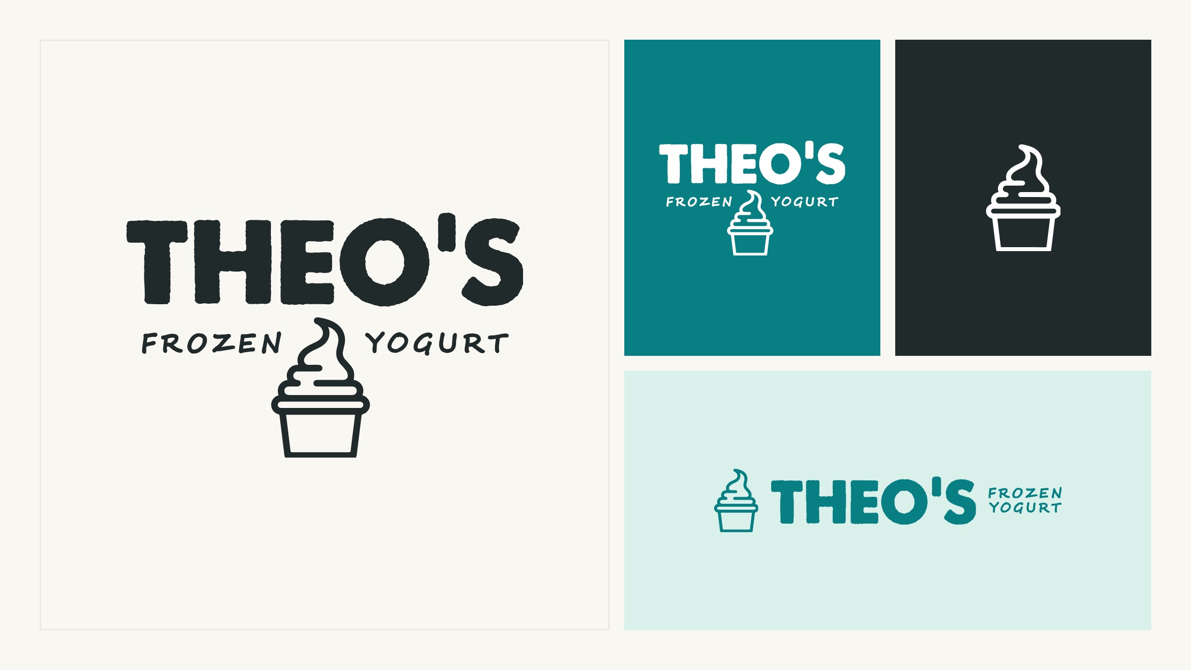
The brand standards set Theo’s out as friendly expression with Swiss-inspired discipline: strong grids, clean type and joyful color. The rounded wordmark and the cup are the only playful letters; everything around them is a clean geometric sans, set straight and kept tidy.
Warm white gives the space, dark ink does the reading, deep teal carries the shop, and the brighter colors are kept for the flavors.
The pint
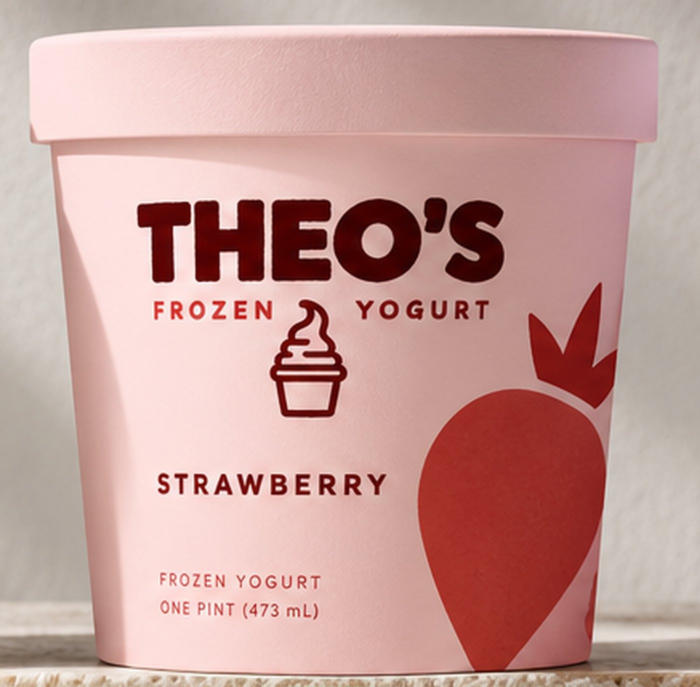
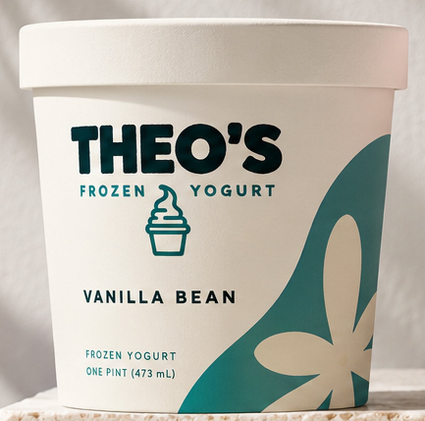
Six flavors, one layout. Every pint puts the same things in the same place, so the color and the graphic do the talking.
Roll over a part to find it on the pint.Tap a part to find it on the pint.
- 01The logo, in the upper thirdThe wordmark at the same size and in the same place on every pint.
- 02The descriptor beneath itFROZEN YOGURT, either side of the cup.
- 03The flavor name, set leftTracked capitals in the flavor’s own dark color.
- 04One big graphicA single flat shape per flavor, round the side, at the same scale on all six.
- 05Small print at the baseFrozen yogurt, one pint (473 mL).
- 06A matte lidIn the pint’s own color.
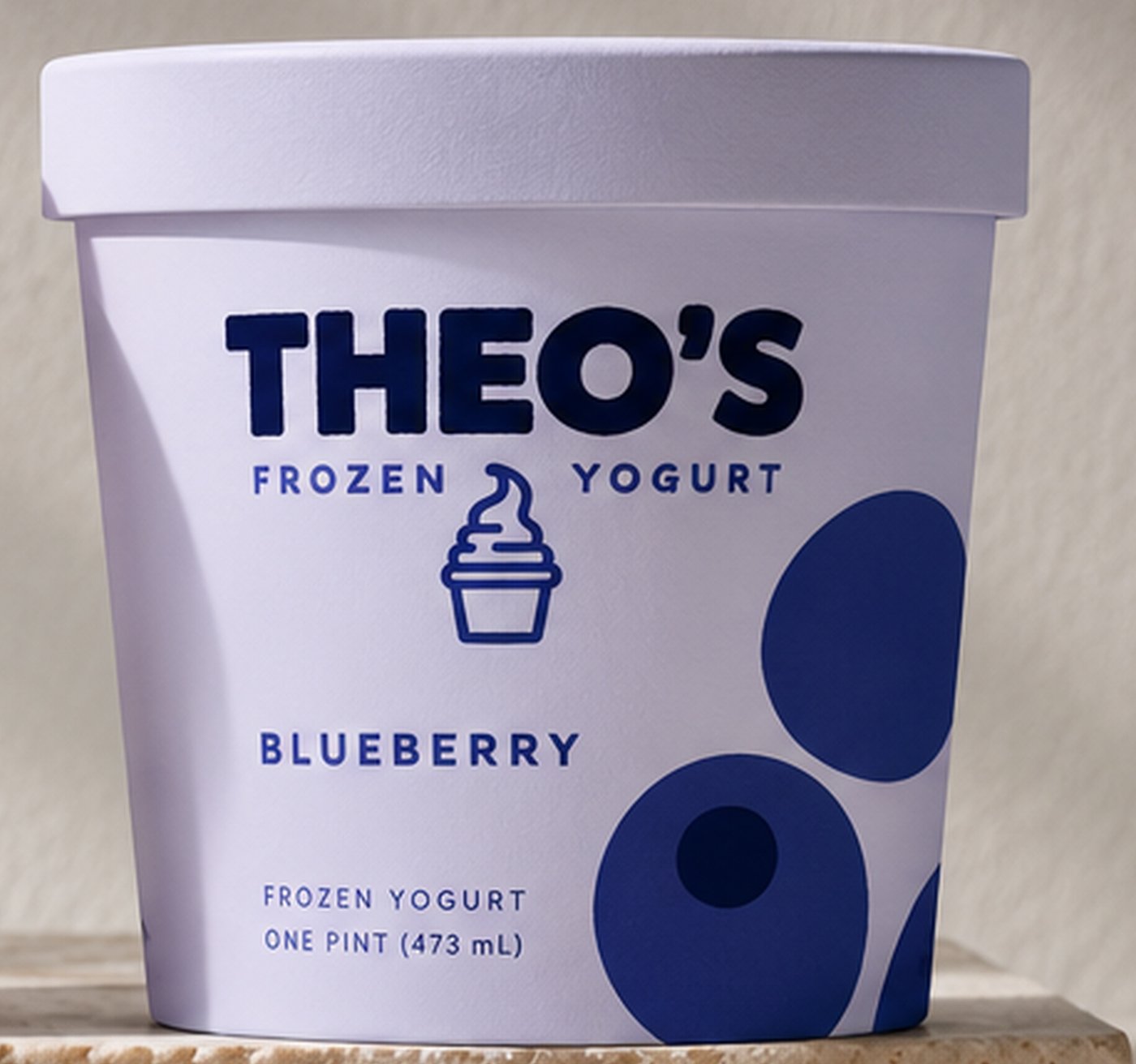
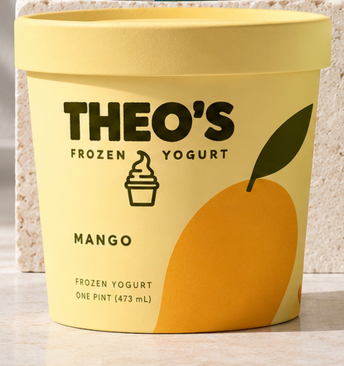
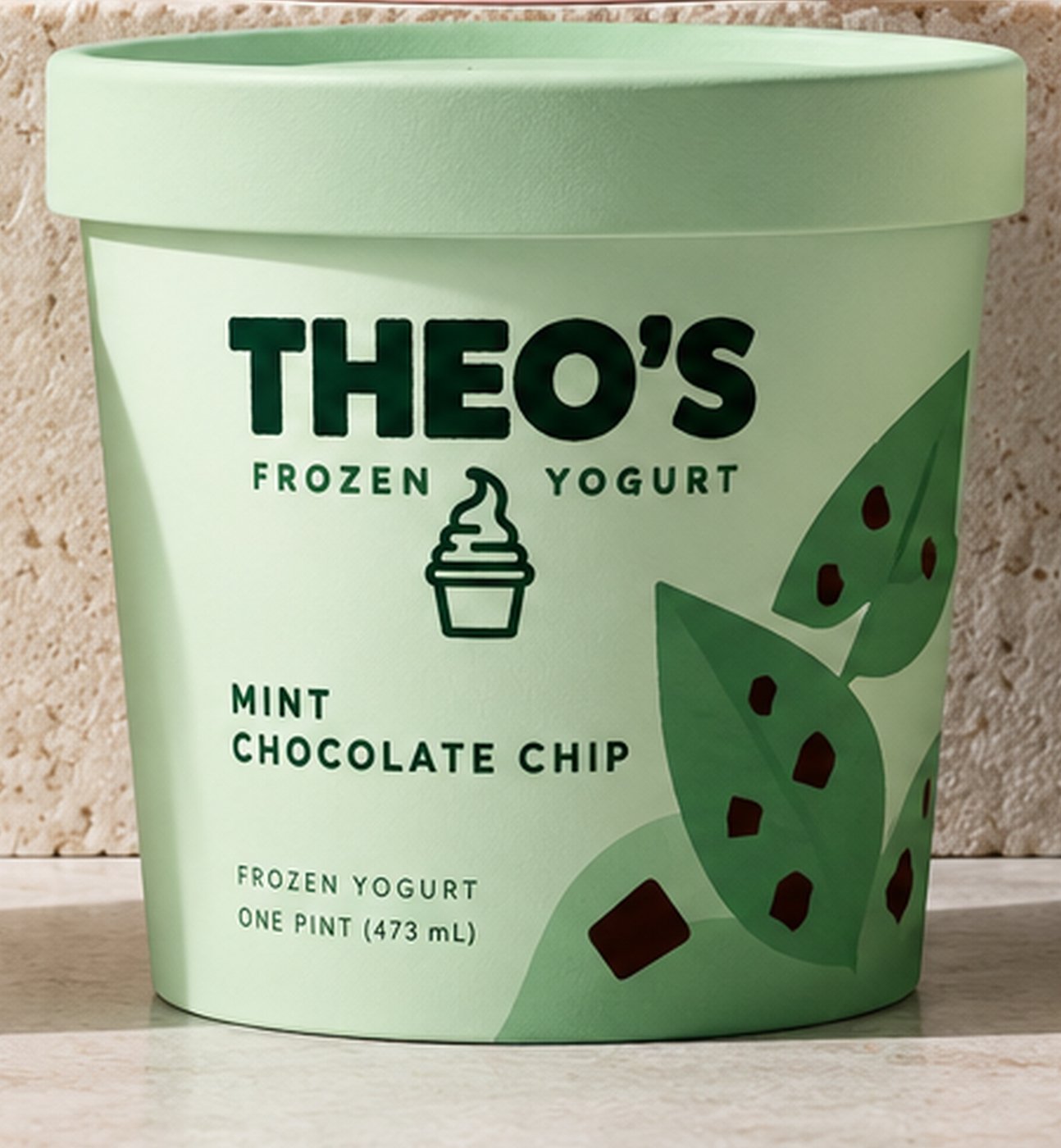
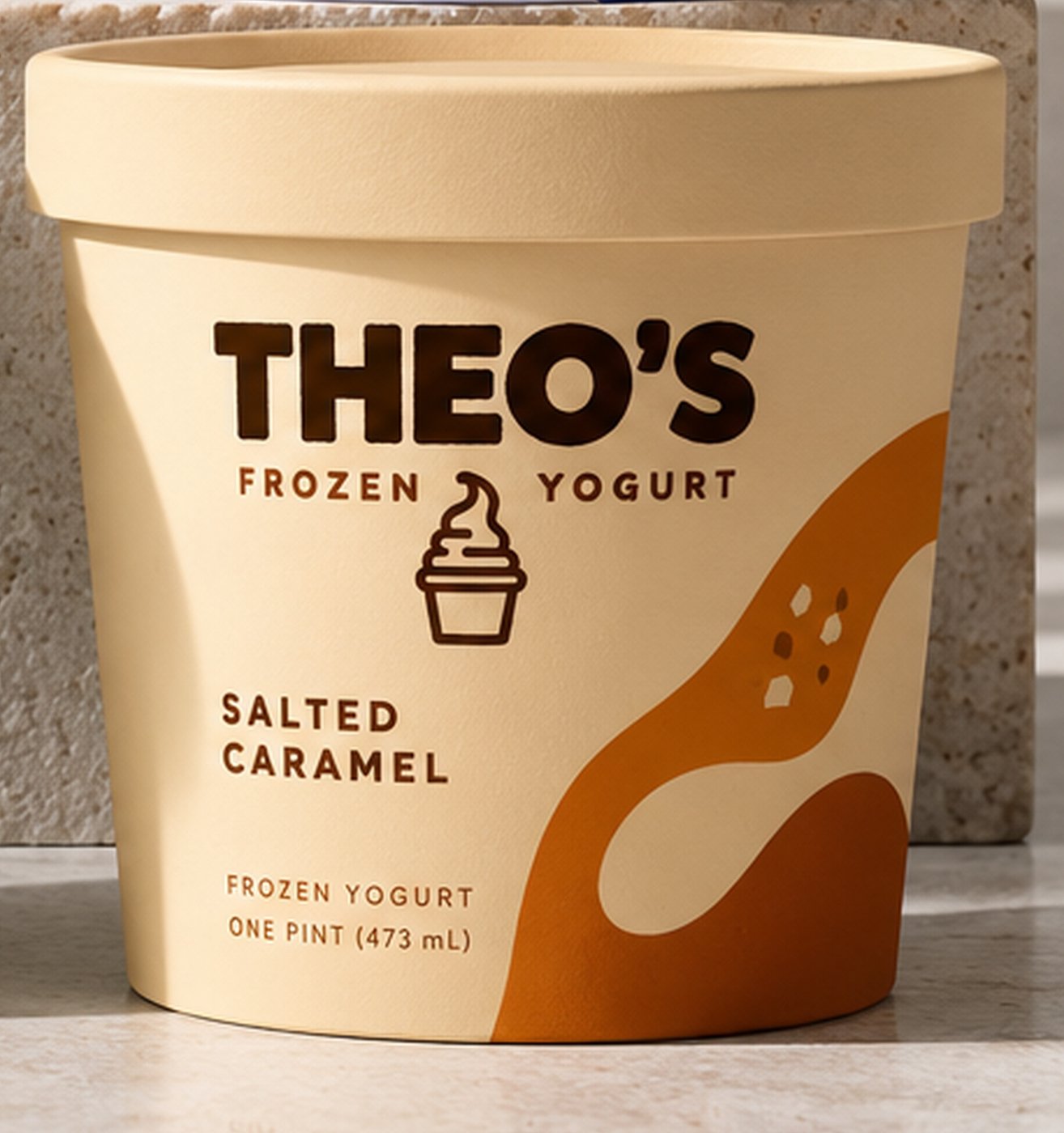
Six flavors
Vanilla bean, strawberry, blueberry, mango, mint chocolate chip and salted caramel. Each has one flat, oversized graphic (a flower, a berry, blueberries, a mango and its leaf, mint leaves with chips, a ribbon of caramel) drawn at the same scale and placed the same way round the pint.
Lids are matte, in the pint’s color or in teal with the cup in white, and the bottom of every pint says good things in every cup.
The shop
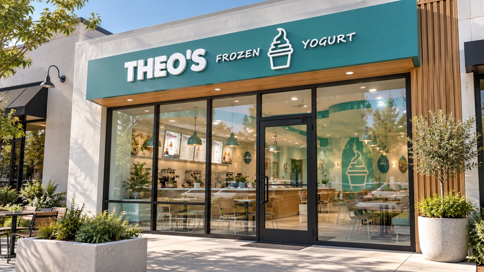
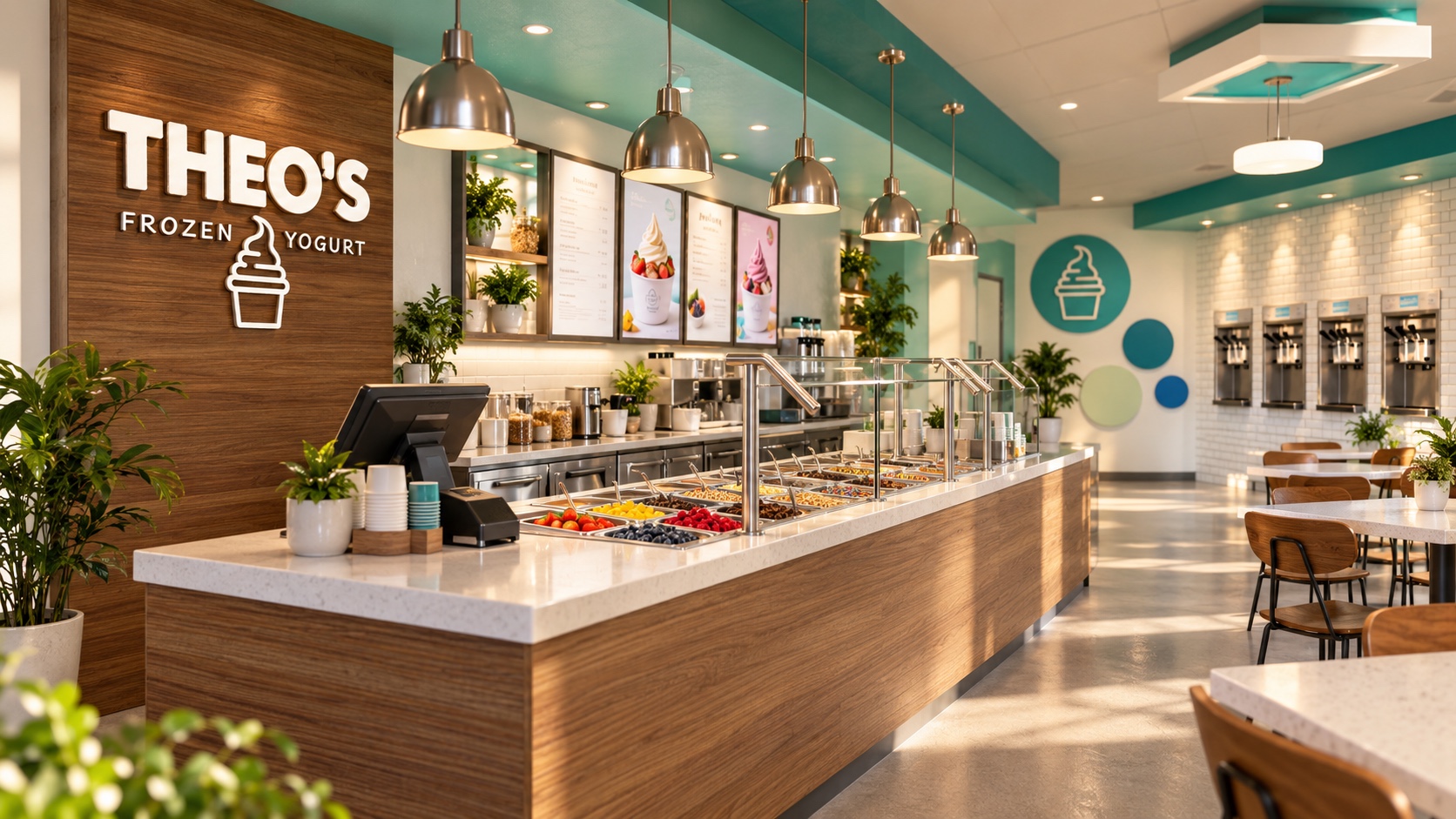
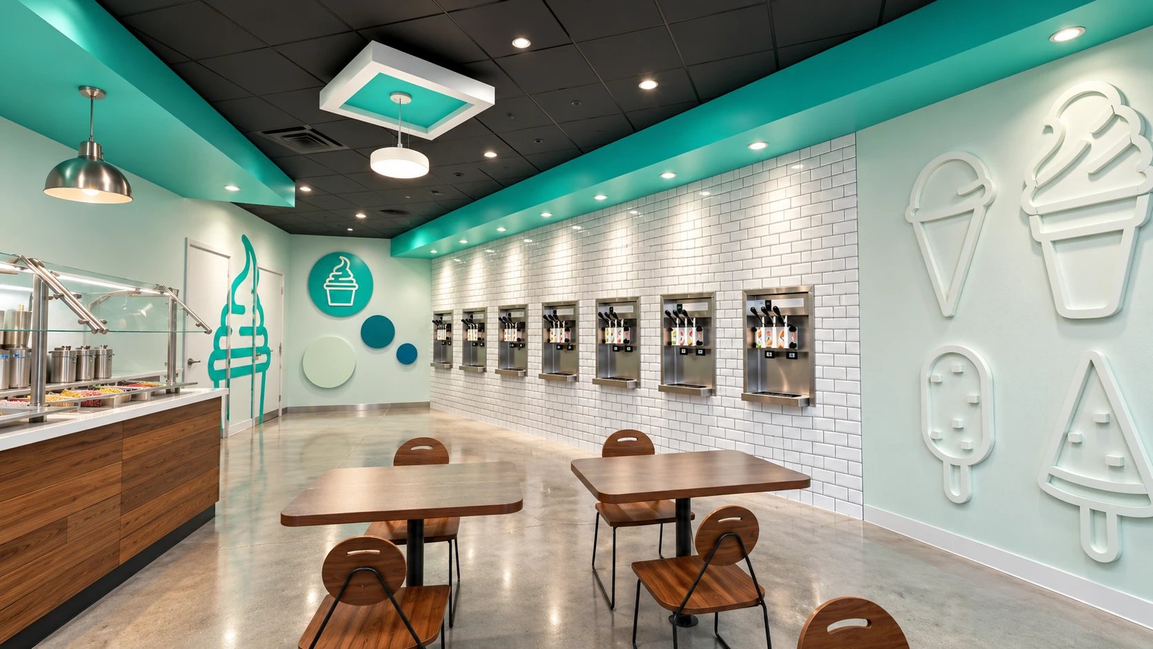
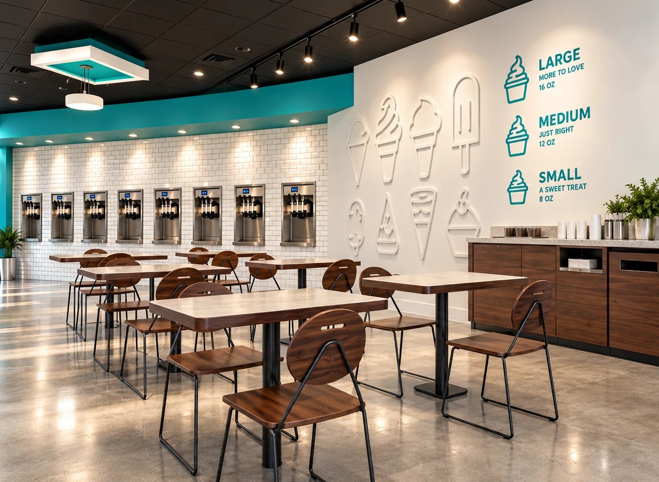
Inside, the room is three materials. White tile and pale walls carry the light; walnut fronts the counter and the wordmark wall behind it; and a teal runs along the soffits and round the ceiling clouds above the tables.
Service runs along one wall: the machines in a line on the tile, then the topping bar and the counter. On the dining wall a set of cones, cups and bars stands out in white relief beside a small, medium and large guide in teal: 8, 12 and 16 oz.
The website
- A hero that changes flavor in place
- A page for every flavor, in its own color
- The shop: the machines, three cups and the topping bar
- Our story: the cup, the lid and the colors
- A shop page for the pints
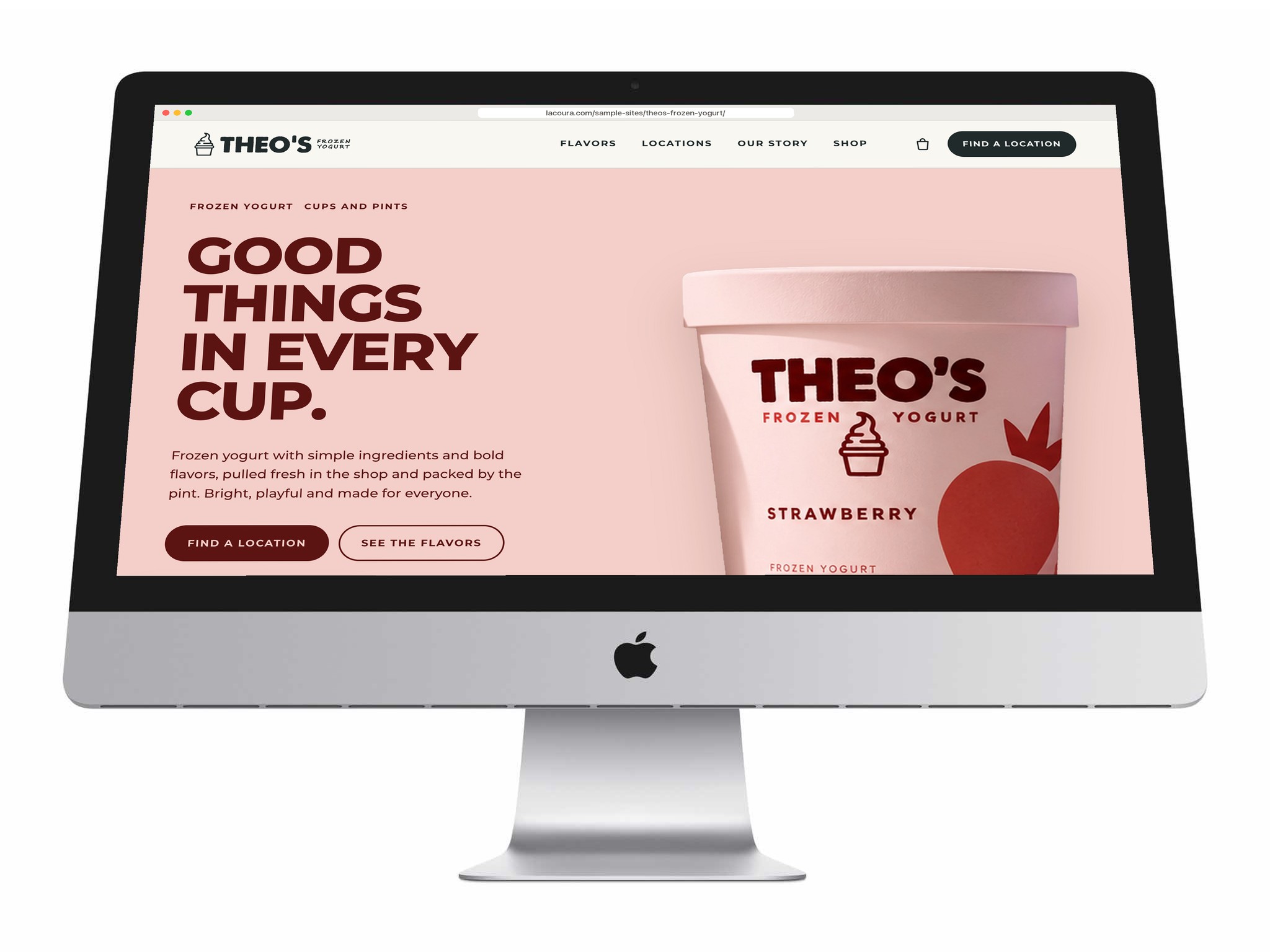
The website is built from the brand standards’ own website page: the headline, a pint on a flat pastel and a dark button to find a location. Each flavor brings its own color to the hero, its tile and its page, and six flavor buttons swap the pint and the color in place.
Around that the site keeps to the standards’ grid. Every section opens on a label and a hairline, the headlines are tight geometric capitals, and the pictures are the real pints and the real shop.
Have a product like this to launch?
Tell us what it is and roughly when you need it. We reply within two working days.
Start a project ↗