

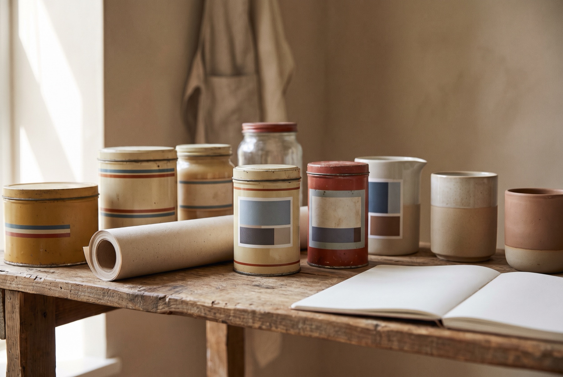
Nostalgia is powerful. Packaging that recalls an earlier era can make a product feel authentic, trustworthy and comforting. That is why so many brands — including brand-new ones — borrow from vintage design. Done well, it creates instant warmth. Done badly, it looks dated or like a pastiche.
Why nostalgia works
- Trust. Older-looking design suggests heritage and proven quality, even for new products.
- Emotion. It connects with memories of childhood, family and simpler times.
- Authenticity. In an age of mass production, traditional design suggests craft and care.
- Distinctiveness. In categories dominated by sleek, minimal design, a vintage approach can stand out.
Elements of nostalgic design
- Typography: hand-lettering, ornate serifs, condensed display type, scripts
- Illustration: engraving styles, vintage drawings, hand-painted imagery
- Colour: muted, faded or period-specific palettes
- Materials: kraft paper, textured labels, glass, tins
- Layout: badges, borders, seals and labels inspired by historical packaging
- Language: traditional phrasing, founding dates, family names
How to avoid looking dated
Combine old and new
The most successful nostalgic packaging blends vintage elements with modern clarity. Use a vintage illustration with clean, modern typography, or a traditional layout with a contemporary colour palette.
Be selective
Choose one or two nostalgic elements and let them lead. Using every vintage cue at once looks like a costume.
Keep information clear
Old-fashioned design should not compromise legibility or modern labelling needs.
Make it relevant
Nostalgia works best when it connects to something true about your product — a family recipe, a traditional process, a regional heritage. It feels hollow when it does not.
Respect the era
Research the period you are referencing. Authentic detail is more convincing than a generic “vintage” look.
Examples from our work
Zia Nina‘s sauces used vintage illustrations and clear messaging to emphasise their authentic Italian roots. The heritage look is grounded in a true story, and the clear layout keeps it modern.
Greg’s Frozen Custard combined modern typography with vintage elements and distinct pastel colours. The result feels nostalgic and fresh at the same time.
Is nostalgia right for you?
Nostalgic packaging suits brands with heritage, tradition or craft at their core. It may not suit products positioned around innovation, technology or cutting-edge performance. Start with your brand story, and let the design follow.
If you want packaging that feels timeless rather than old, get in touch.