

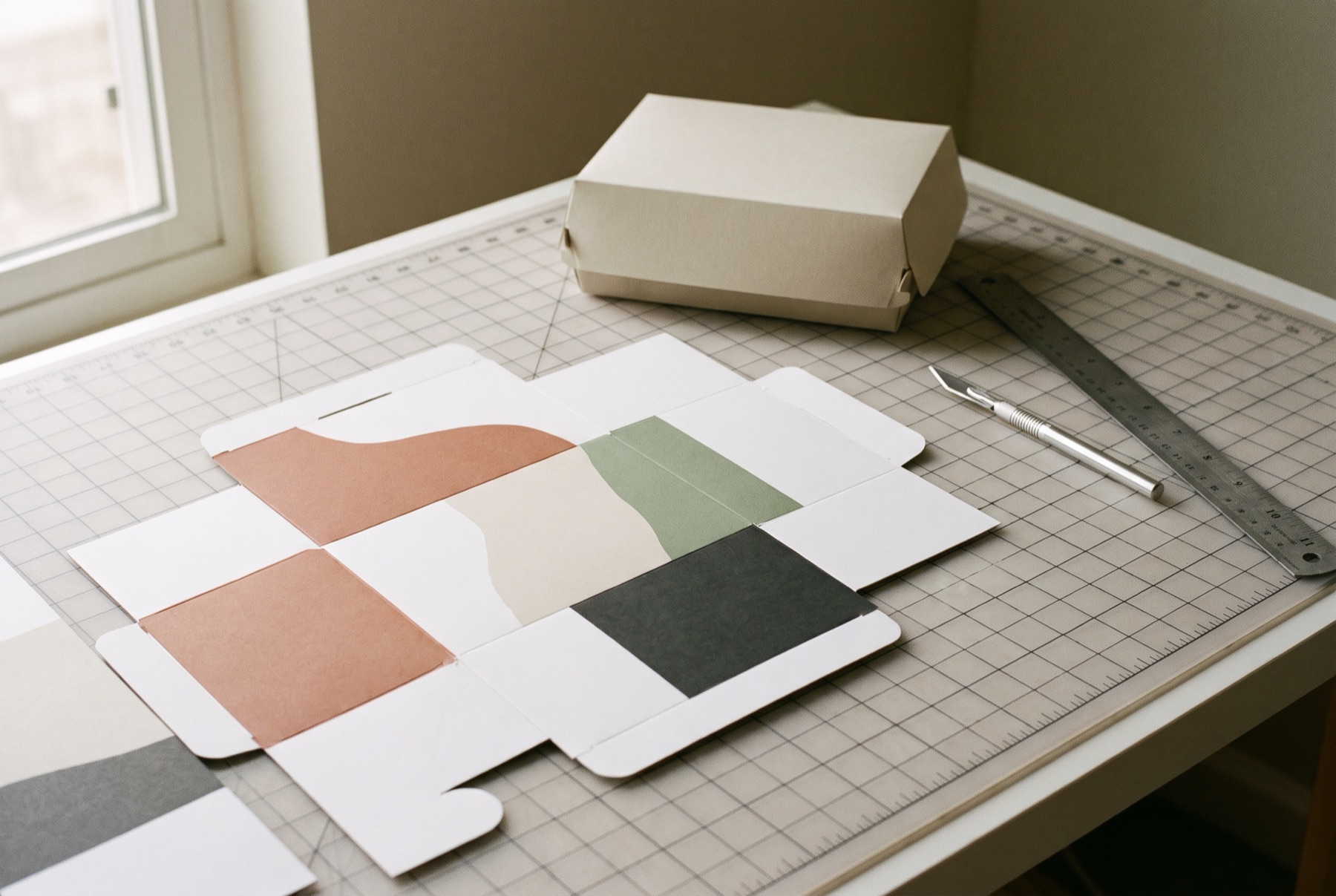
Food packaging has more jobs than almost any other kind of design. It protects the product, keeps it fresh, carries required information, survives shipping and handling, and still has to look good enough to eat in the couple of seconds a shopper gives it. Here is how to approach it.
Start with a clear brief
A good brief answers:
- What is the product, and who is it for?
- Where will it be sold? Grocery, specialty, convenience, online?
- Who are the competitors, and how do they look?
- What is the price point?
- What makes it different?
- What format and materials have been chosen?
- What is the budget for printing and production?
Respect the category — then find your angle
Every food category has visual conventions. Shoppers use them to navigate. A cereal should not look like a cleaning product. But following convention completely makes you invisible. The best food packaging works within the category’s expectations while owning one or two distinctive elements — a colour, a shape, an illustration style, a graphic device.
Make it appetising
Appetite appeal is central. Ways to achieve it:
- Show the food. Photography or a window, accurately representing the product.
- Use colour carefully. Warm colours often stimulate appetite; muted, natural tones signal wholesome and organic. Colour should match flavour cues.
- Suggest texture. Close-up photography, illustration or finishes that hint at crunch, creaminess or freshness.
The Dale’s Soda redesign leaned on a transparent aesthetic with bold, colourful fruit graphics. The clear approach made the natural, artisanal quality of the sodas visible at a glance — and the fruit did the flavour communication.
Build the hierarchy
The front panel needs a clear order:
- Brand — who makes it
- Product — what it is
- Variant — flavour, size or type
- Key benefit — one or two at most
Everything else belongs on the back or the side.
Plan for the range
Design as a system. Decide how flavours or varieties will be distinguished, what stays fixed across the range, and how the products look together on shelf. A consistent system builds a block of colour that is far more visible than single products.
Handle the mandatory information
Food labels carry required information — ingredients, allergens, nutrition panel, net quantity, manufacturer details and more, depending on where you sell. Requirements vary by country and category, so check current regulations or work with a specialist. Make space for this information from the start, rather than squeezing it in later.
Design for production
- Work from the exact dieline provided by your packaging supplier
- Prepare artwork with correct bleed, colour settings and print specifications
- Request physical proofs before a full run
- Check barcodes scan properly at final size
Test in context
Print a mock-up, put it on a shelf next to competitors, and look at it from a few metres away. Show it to shoppers. Adjust.
The short version
Brief clearly, respect the category, be distinct, make it appetising, keep a clear hierarchy, plan the range, handle compliance carefully, and prepare files properly for print.
If you have a food product that needs packaging, we would love to hear about it.