

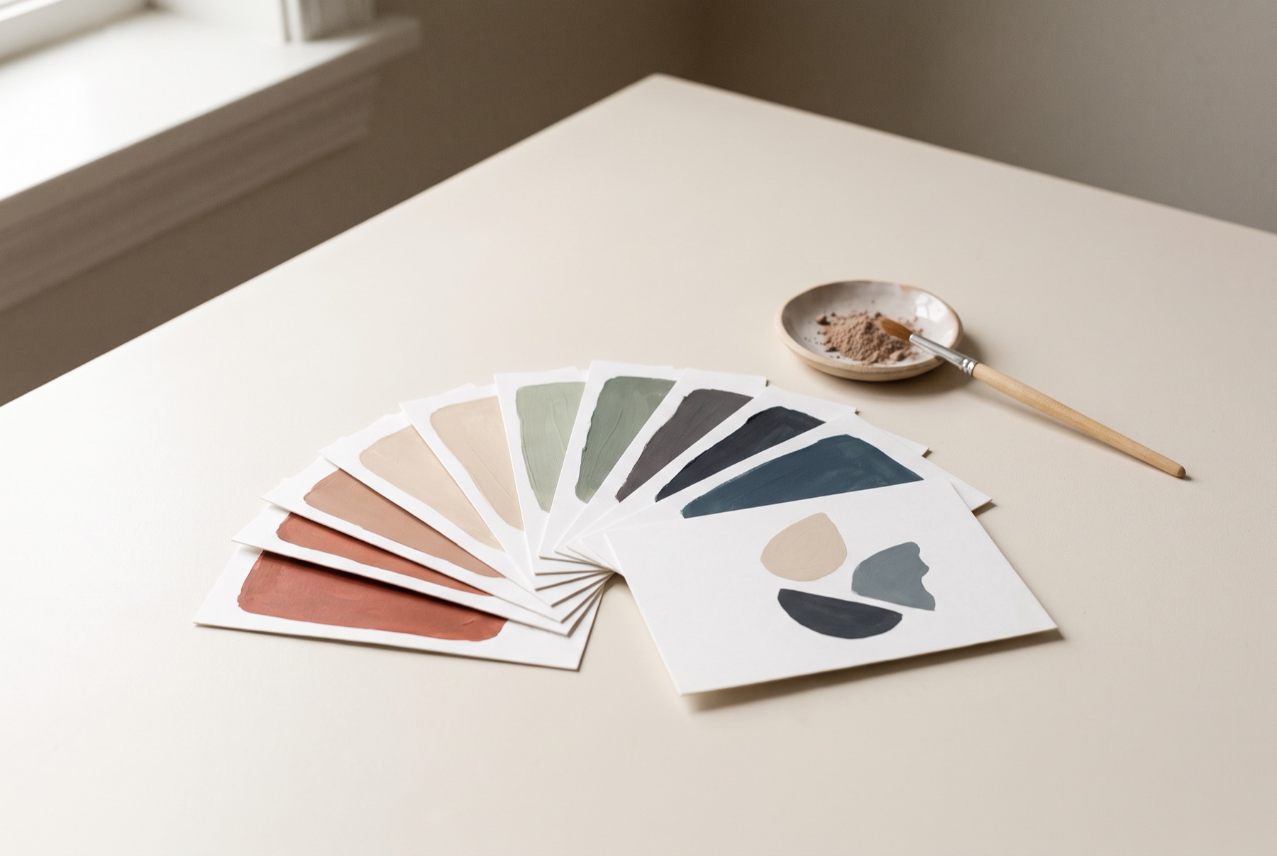
Colour is one of the most powerful tools in a brand’s kit. People often recognise a brand by its colour before they read a word. A well-chosen palette makes you memorable, sets the mood, and helps customers navigate your products. A poorly chosen one blends in, clashes or falls apart the moment it hits a different material.
Here is a practical approach.
1. Start with your brand, not your favourite colours
Before you look at a single swatch, revisit what your brand stands for. Write down a few words that describe its personality — calm, bold, playful, refined, natural, technical. Colour should express these, not your personal taste.
2. Understand what colour communicates
Colours carry associations, though they vary by culture and context:
- Warm reds and oranges feel energetic, appetising and urgent
- Yellows feel optimistic and attention-grabbing
- Greens suggest nature, health and freshness
- Blues feel trustworthy, calm and dependable
- Purples suggest creativity or luxury
- Black reads as sophisticated, strong or premium
- Muted and earthy tones feel natural, crafted and calm
Use these associations as a starting point, not a rulebook.
3. Study the competition
Lay out your competitors’ colours. If every brand in your category uses green, a green palette will make you invisible. Sometimes the right move is to stand apart; sometimes it is to use a category colour in an unexpected way.
4. Build a structured palette
A useful brand palette usually has:
- A primary colour — the one people will associate with you
- One or two secondary colours that support it
- Neutrals — for backgrounds, text and space
- An accent for highlights and calls to action
For product ranges, add a system of variant colours, each with a defined role.
5. Check it works everywhere
A colour that looks beautiful on screen may print dull on uncoated paper or shift dramatically on kraft. Test your palette:
- On screen and in print
- On coated and uncoated stocks
- At small and large sizes
- For legibility and contrast, especially text on coloured backgrounds
6. Specify it precisely
Define each colour for every medium:
- Pantone for spot colour printing
- CMYK for process printing
- RGB and HEX for screens
Write these into your brand guide so every printer, web developer and sign maker gets the same result.
7. Use it consistently
A palette only builds recognition when used consistently over time. Decide rules — which colours lead, which support, how much of each — and stick to them.
An example
The Seasons Milk Tea range uses muted colours, simple illustrations and bilingual flavour naming. The restraint is the point: the soft palette conveys a premium, organic product, while each flavour is still distinct on shelf.
Helpful tools
Free tools can help you explore palettes, generate harmonies and check contrast for accessibility. Use them for exploration — but make final decisions by looking at real printed samples next to your packaging and in context.
If you would like help building a colour system for your brand, get in touch.