

Dale’s Soda
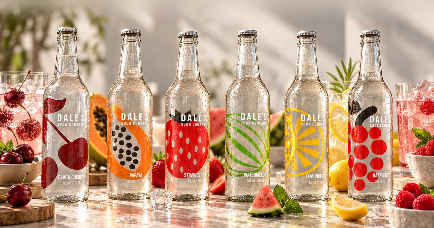
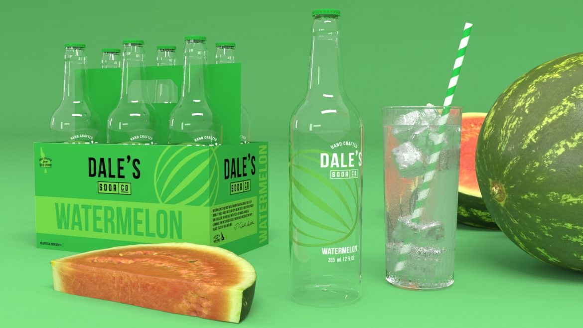
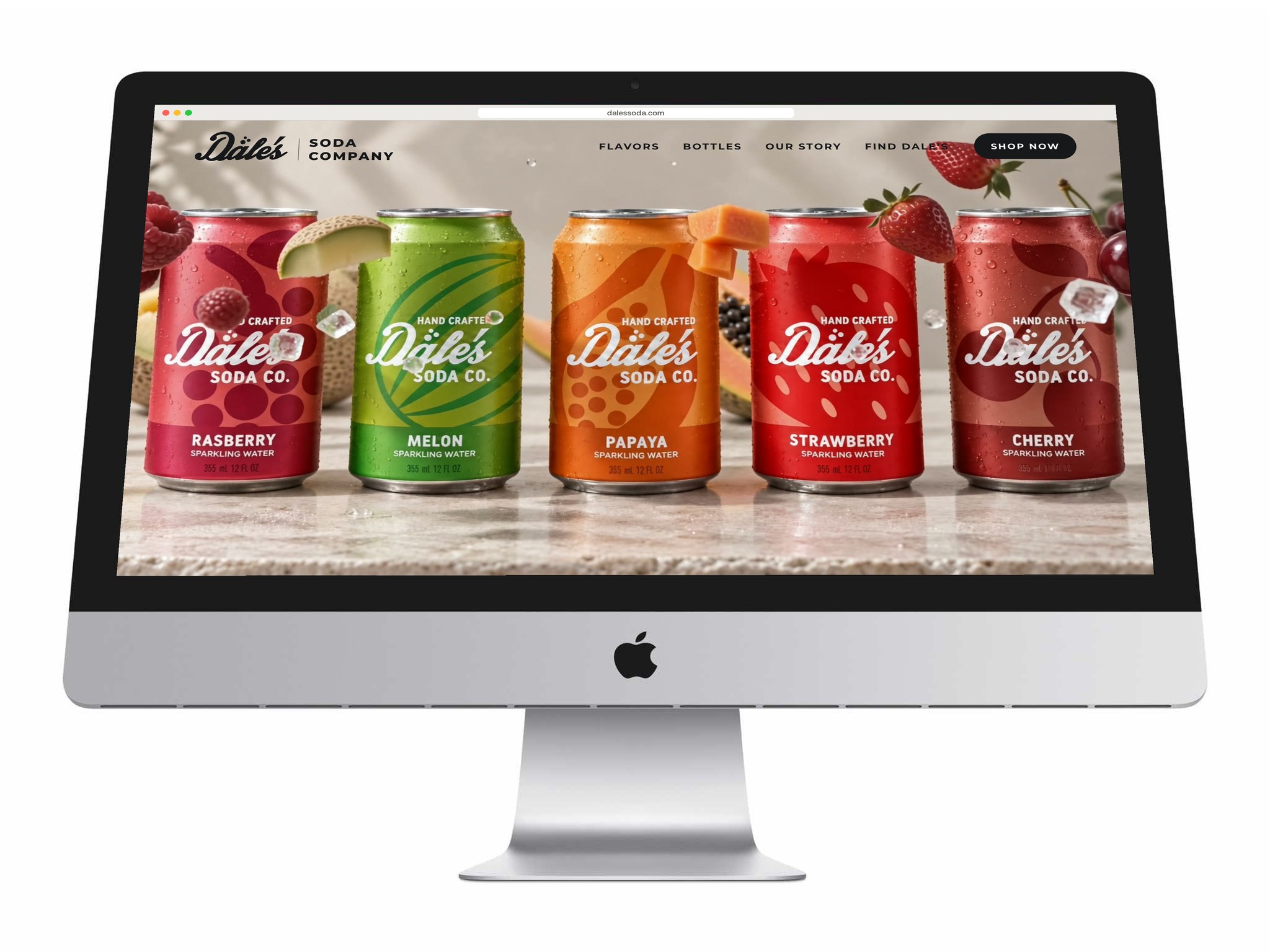
Packaging for Dale’s Soda Company’s fruit sodas, across bottles, cans and six-pack carriers. The design leans on transparency, clear glass and bold, flat fruit graphics, so the natural ingredients are the first thing a shopper sees.
Fruit you can see through
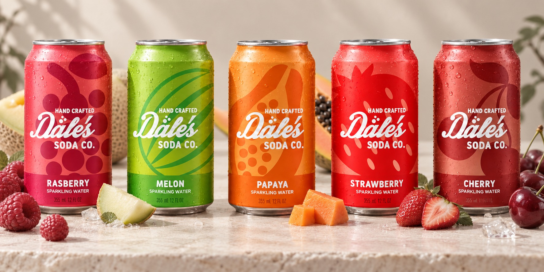
The bottles are clear glass printed with one large, flat fruit graphic each, so the colour of the soda and the shape of the fruit do the labelling. The cans carry the same fruit as a tone-on-tone pattern behind a hand-lettered script, with the flavour set plainly underneath.
A colour for every flavour
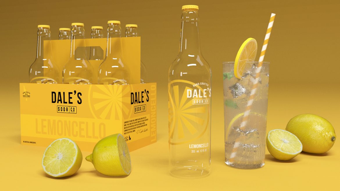
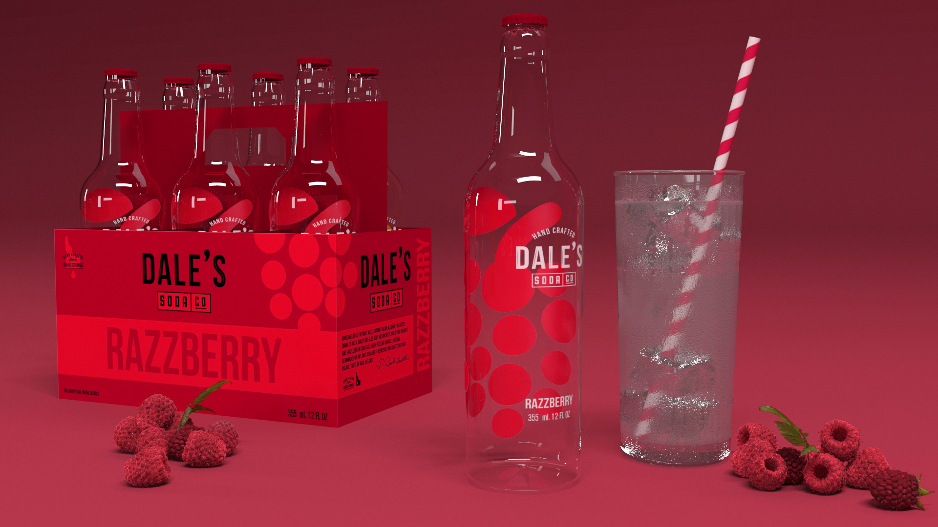
Six-pack carriers take one bold colour per flavour, lemon yellow, raspberry red, watermelon green, so the range stacks into a run of colour on the shelf.
Have a product like this to launch?
Tell us what it is and roughly when you need it. We reply within two working days.
Start a project ↗