

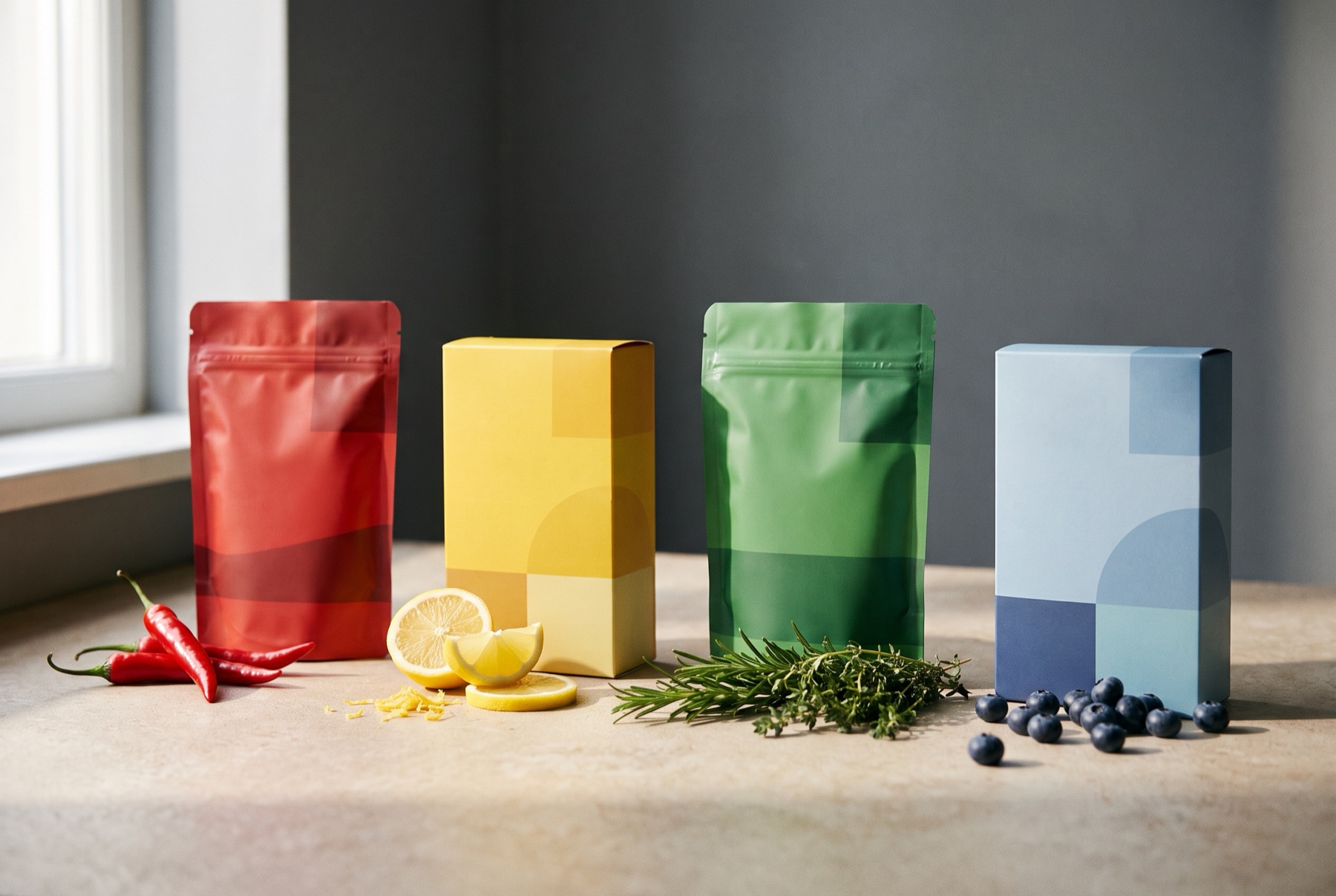
Before we taste anything, we have already formed expectations about it — and colour does a lot of that work. It tells us what flavour to expect, how fresh something is, how healthy, how indulgent. For food brands, restaurants and anyone designing around food, colour is not a matter of taste. It is part of the product.
Colour sets flavour expectations
Shoppers associate certain colours with certain flavours, and they notice when packaging contradicts them. Red suggests strawberry or cherry, yellow suggests lemon or banana, green suggests lime, mint or apple, brown suggests chocolate, coffee or caramel. Break those associations and you risk confusing people — or making a product seem to taste “wrong”.
That is why many ranges assign colours to flavours. It helps shoppers find what they want, and it primes the experience before the pack is opened.
Warm colours and appetite
Warm colours — reds, oranges and yellows — are widely associated with energy and appetite. They are common in fast food and snacks because they feel lively and grab attention. Used carefully, they make food feel generous and inviting.
Natural tones and wholesomeness
Greens, browns, creams and muted earth tones suggest natural, organic and less processed. Kraft paper, uncoated stocks and earthy palettes are common for products positioned around health and simplicity.
Dark and deep colours
Black, deep navy, burgundy and dark green often signal indulgence, sophistication or premium quality. They work well for chocolate, coffee, spirits and specialty products.
Pastels
Soft pastels suggest gentleness, sweetness and nostalgia. They work beautifully for desserts, bakery and dairy — and can feel refined rather than childish when paired with strong typography.
Colour in restaurants
Colour shapes dining experiences too. Warm, low lighting and rich tones encourage lingering. Bright, saturated colours suggest speed and energy. Signage, menus and packaging all contribute to the impression.
When we created the Truva identity for a Turkish pizza restaurant, colour was central to marrying traditional Turkish elements with a contemporary design approach. The vibrant palette carried across every touchpoint — packaging, signage and the space itself — so the experience felt consistent from the street to the takeaway box.
Cultural context matters
Colour meanings are not universal. If you sell in different markets or to diverse communities, check how your palette is read. A colour associated with celebration in one culture can signal something quite different in another.
Practical tips
- Match colour to flavour where shoppers have strong expectations
- Use a consistent colour system across a range
- Check how colours reproduce on your actual materials
- Make sure the food looks real — over-saturated photography sets expectations the product cannot meet
- Test with shoppers to see what they expect from your colours
If you want help choosing colour that works as hard as your recipes, get in touch.