

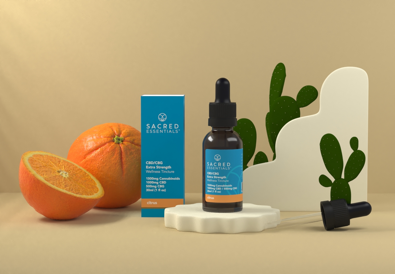
Sacred Essentials
Packaging and brand architecture for Sacred Essentials, a CBD company with three lines to carry: CBD, CBD with THC, and skin care. The brief was to make the brand feel more premium and more natural while keeping it clearly therapeutic, and to stay recognisable to the customers who already knew it.
One house, three lines
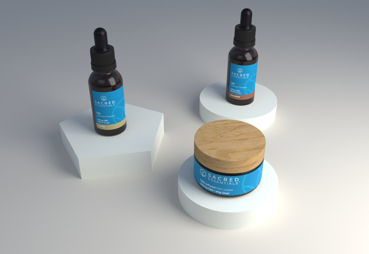
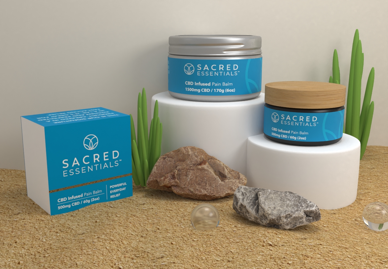
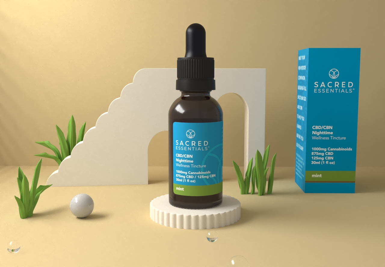
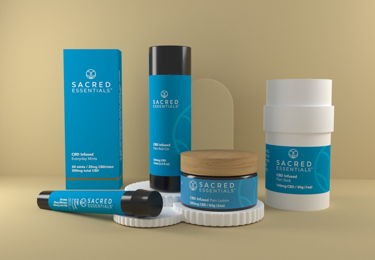
The architecture had to hold three products without them drifting apart: CBD, CBD with THC, and skin care. Every line keeps the same blue label, the same circular leaf mark and the same type, and changes only what it must, so a shopper reads the brand first and the line second.
Natural, but therapeutic
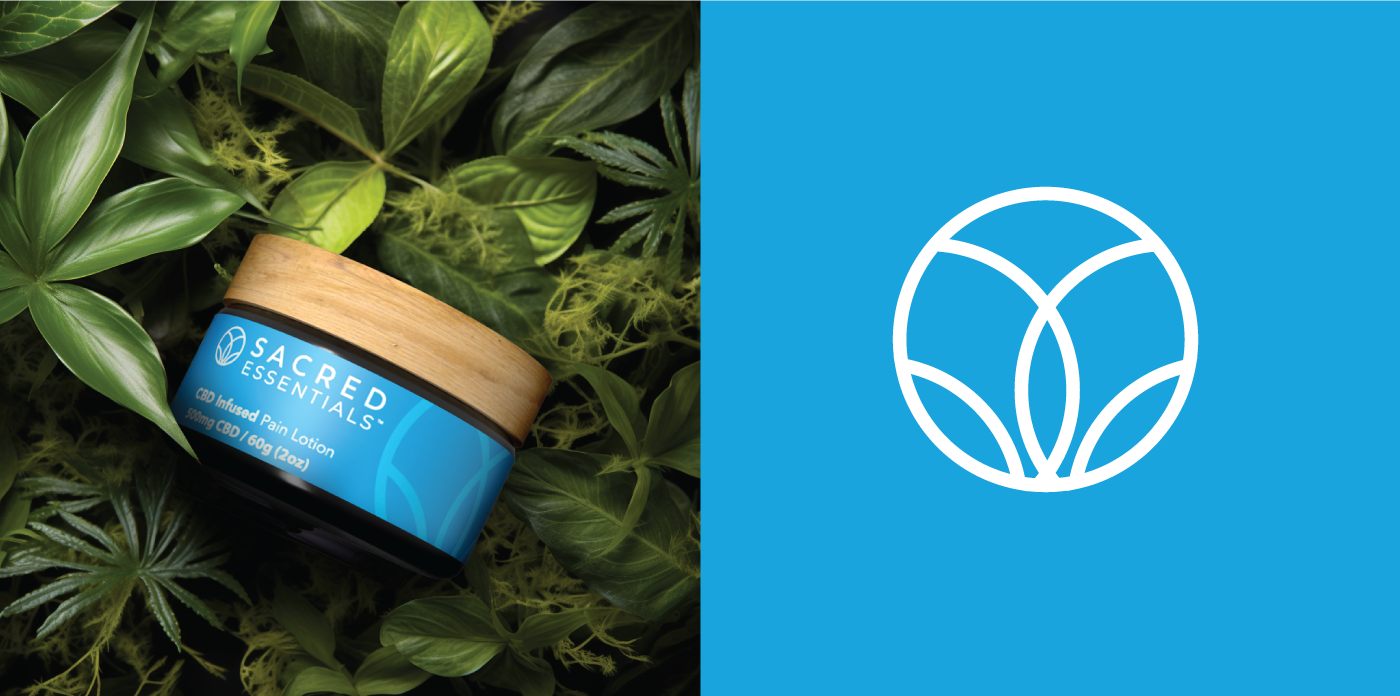
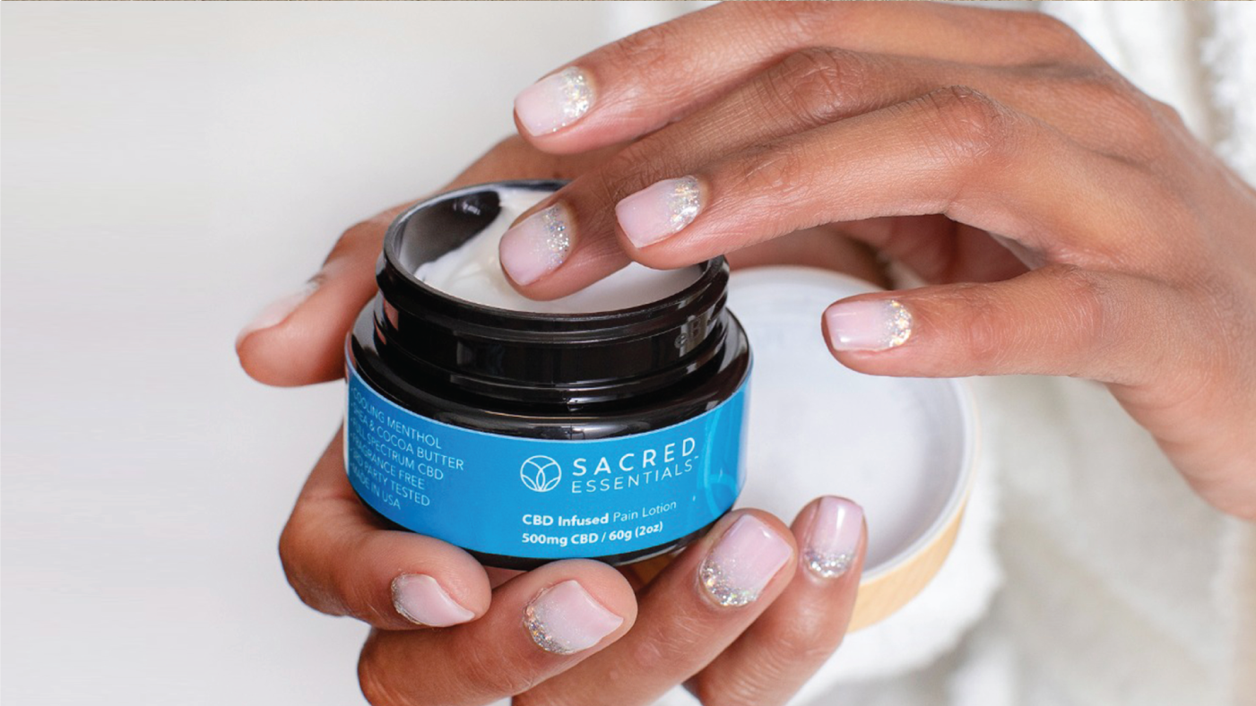
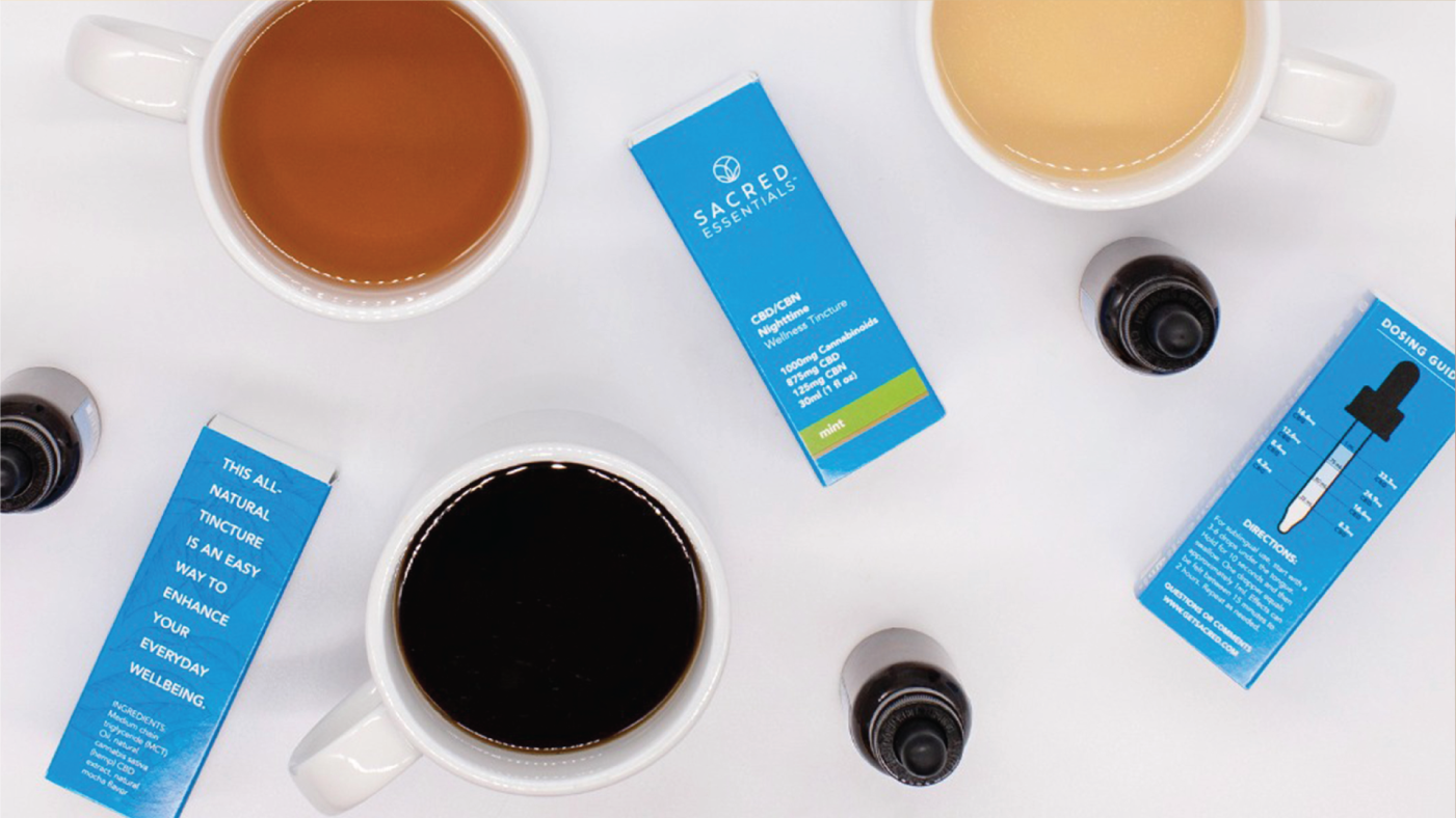
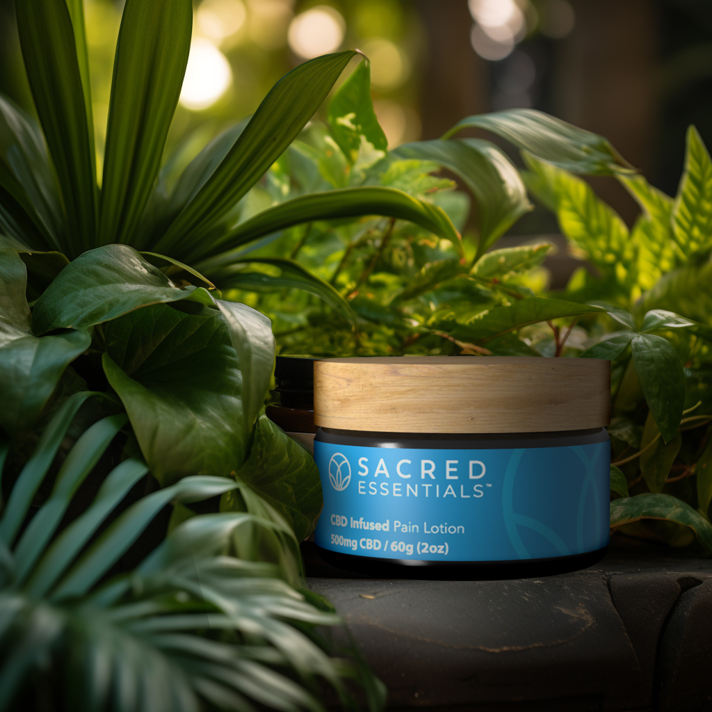
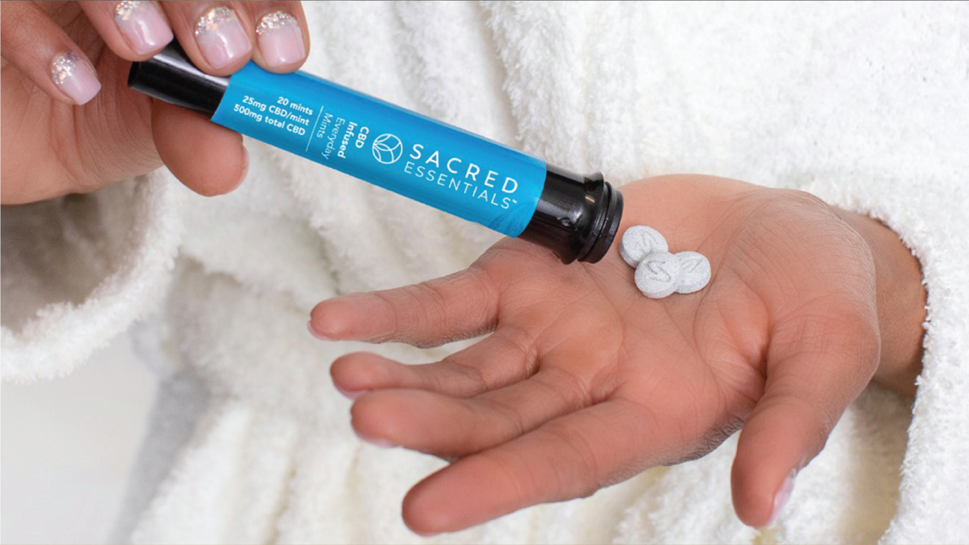
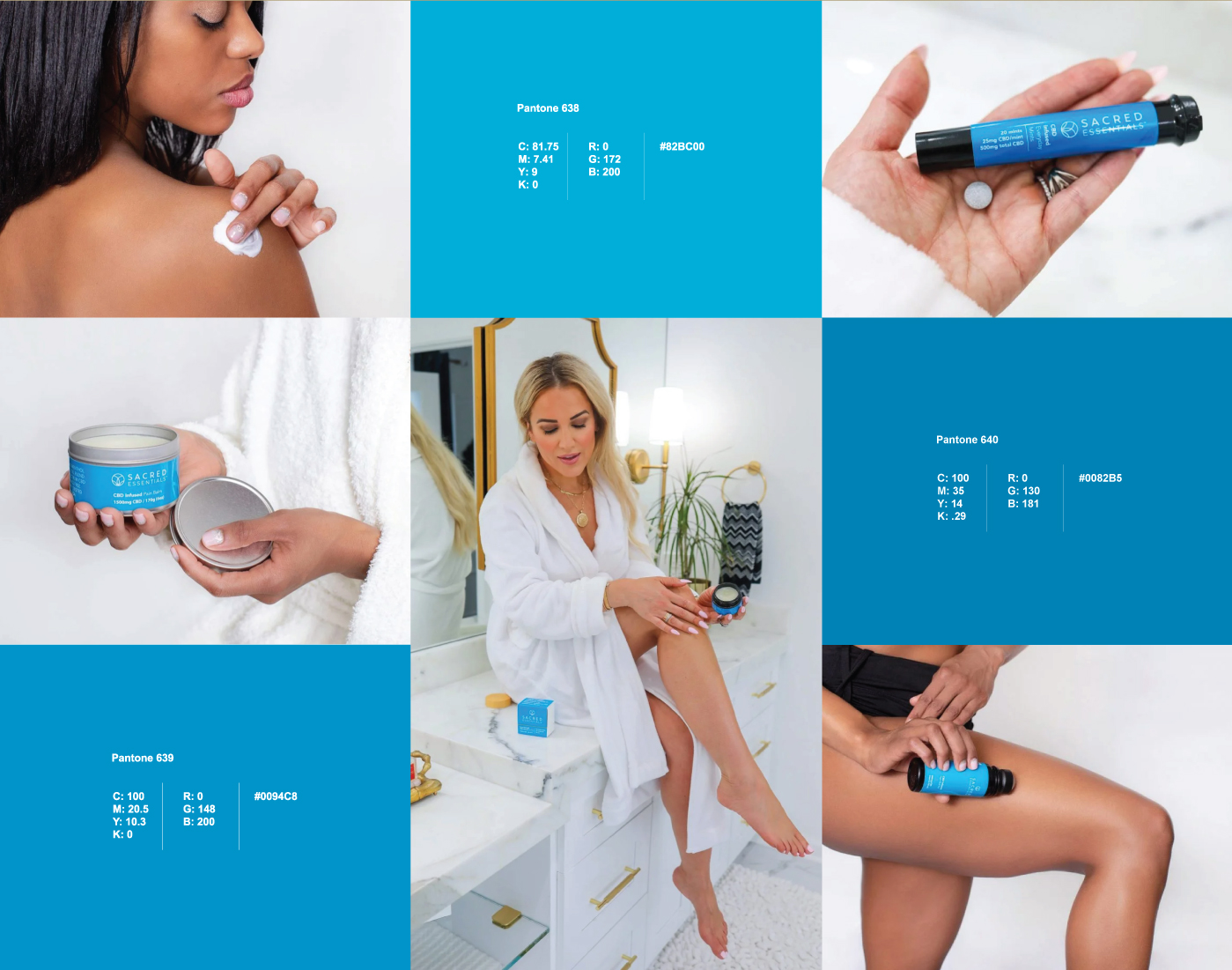
A clean cerulean blue does the clinical work and the materials do the natural work: a wooden lid on the balm jar, amber glass on the tinctures, fine botanical line drawings on the cartons. The photography sets the products among plants, citrus and sculpted plinths in warm daylight, closer to an apothecary than a dispensary.
Have a product like this to launch?
Tell us what it is and roughly when you need it. We reply within two working days.
Start a project ↗