

Every January brings a new round of web design trend lists. Most of what they describe is a look: a typeface everyone suddenly uses, a style of illustration, a colour of the year. Looks come and go, and following them is how websites date quickly.
A more useful test for any trend is simple. Does it help a visitor understand what you sell, trust you, or buy from you? If it does, it is worth considering. If it only makes the site look current, it will stop looking current soon enough.
Worth following
Real photography, used generously
Customers have learned to spot stock imagery instantly. Photographs of your actual product, in real settings, used large and edge to edge, do more for a product brand than any graphic device. If you invest in one thing, invest in pictures.
Pages that load fast on a phone
Plenty of visits happen on a phone with a patchy signal. Google measures how quickly the main content appears, how fast the page responds when someone taps, and whether things jump around as it loads. A lighter site is better for customers and for search. Compress images, cut scripts you do not need, and test on a real phone, not only on a fast office connection.
Type with personality, set to be read
Brands are carrying their own typefaces onto the web, and that is a good thing: the website should look like the packaging. But personality cannot cost legibility. Body text needs to be large enough, with comfortable line lengths and strong contrast.
Motion that does a job
Movement tied to scrolling can show a product in a way a still image cannot: a pack opening, ingredients coming together, a can turning. Used once, in the right place, it is memorable. Used everywhere, it becomes a wait. Good motion also respects the setting some visitors use to reduce animation.
Answers written as text
Ingredients, sizes, materials, care instructions, where to buy, shipping times. Writing these out clearly helps the person deciding whether to buy, and it helps search engines and AI assistants understand and recommend you.
Accessibility as a starting point
Readable contrast, sensible headings, descriptive image text and a site that works with a keyboard. These are no longer extras. They make the site better for everyone.
Use with care
- Heavy 3D and video backgrounds. They can be spectacular, and they can be slow. Use them when the product is the show, and always give a still fallback.
- Dark themes. Right for some brands, wrong for food that needs to look fresh and bright.
- Giant type-only openings. A bold headline can be strong, but a product brand that hides its product below the fold is leaving its best asset unseen.
- AI chat assistants. Useful only if they answer accurately from your real information. A confident wrong answer about an allergen is worse than no assistant.
Skip
- Scroll-jacking that takes control of the page away from the visitor
- Custom cursors and gimmicks that follow the mouse
- Pop-ups in the first few seconds, before anyone knows what you sell
- Autoplaying sound
- Decoration for its own sake: effects that add nothing a customer needs
The trend that never dates
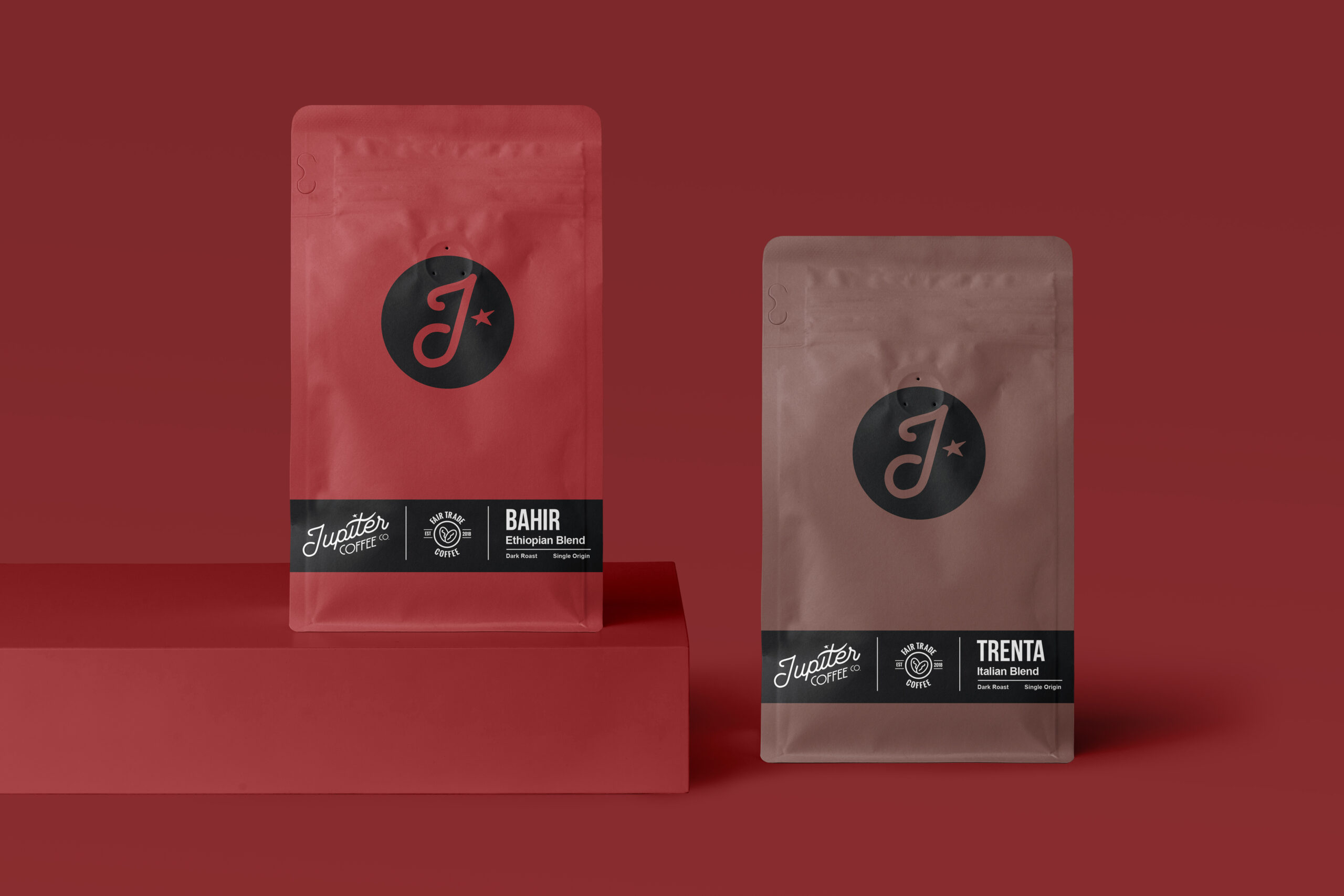
The one direction that never goes out of style is a website that looks and feels like the rest of your brand. Someone who has picked up your pack should recognise your site instantly, and the other way round.
On the website we designed for Dale’s Soda, the home page opens on the five cans filling the screen. As you scroll, the fruit and ice lift off the table while the cans stay put, sharp and readable the whole time. The motion exists to show the product, which is the only good reason for it.
If your website is due a rethink, let’s talk.