


Food Garden Market
A full identity and store programme for an organic market in Brooklyn. The mark is a circle of intersecting stems — a garden read as a single form — built to survive everything a grocery store asks of a logo: a storefront sign, a coffee cup, a price label two centimetres wide, and a moss wall behind the produce.
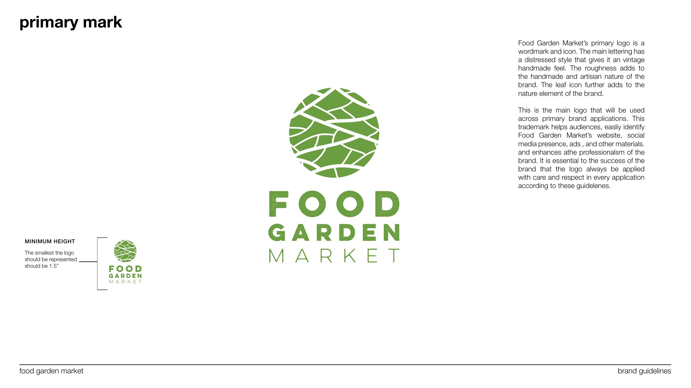
A brand book that reaches the shelf
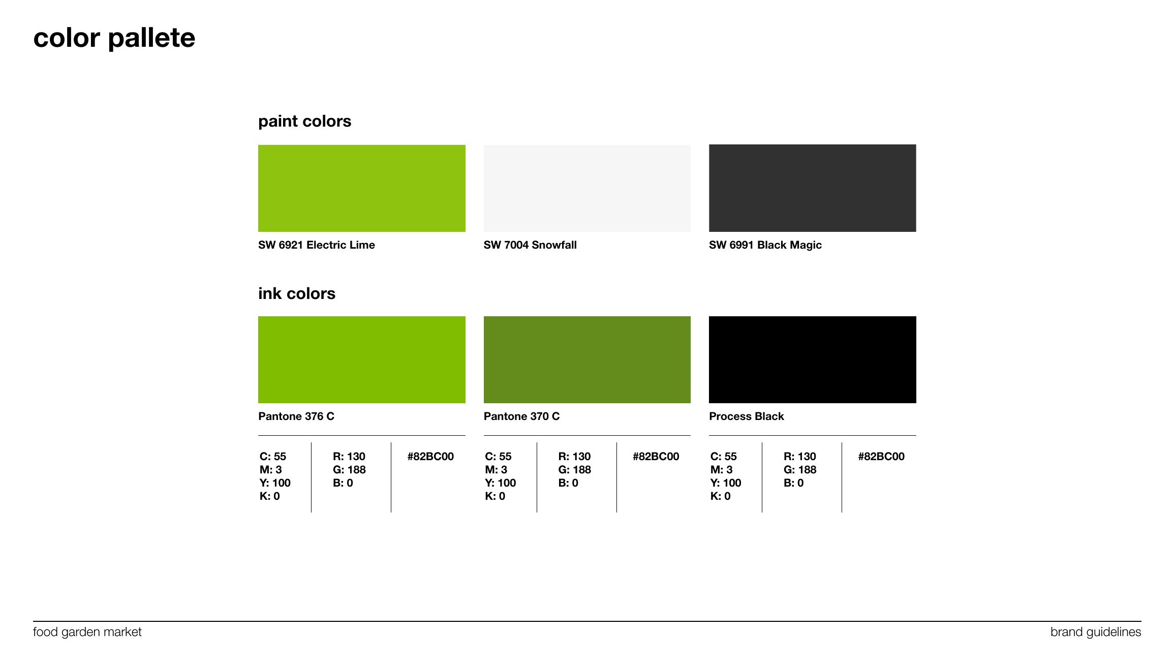
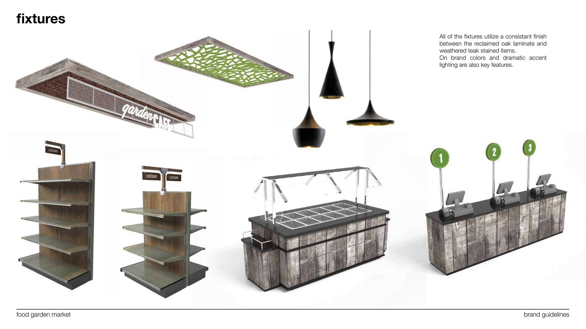
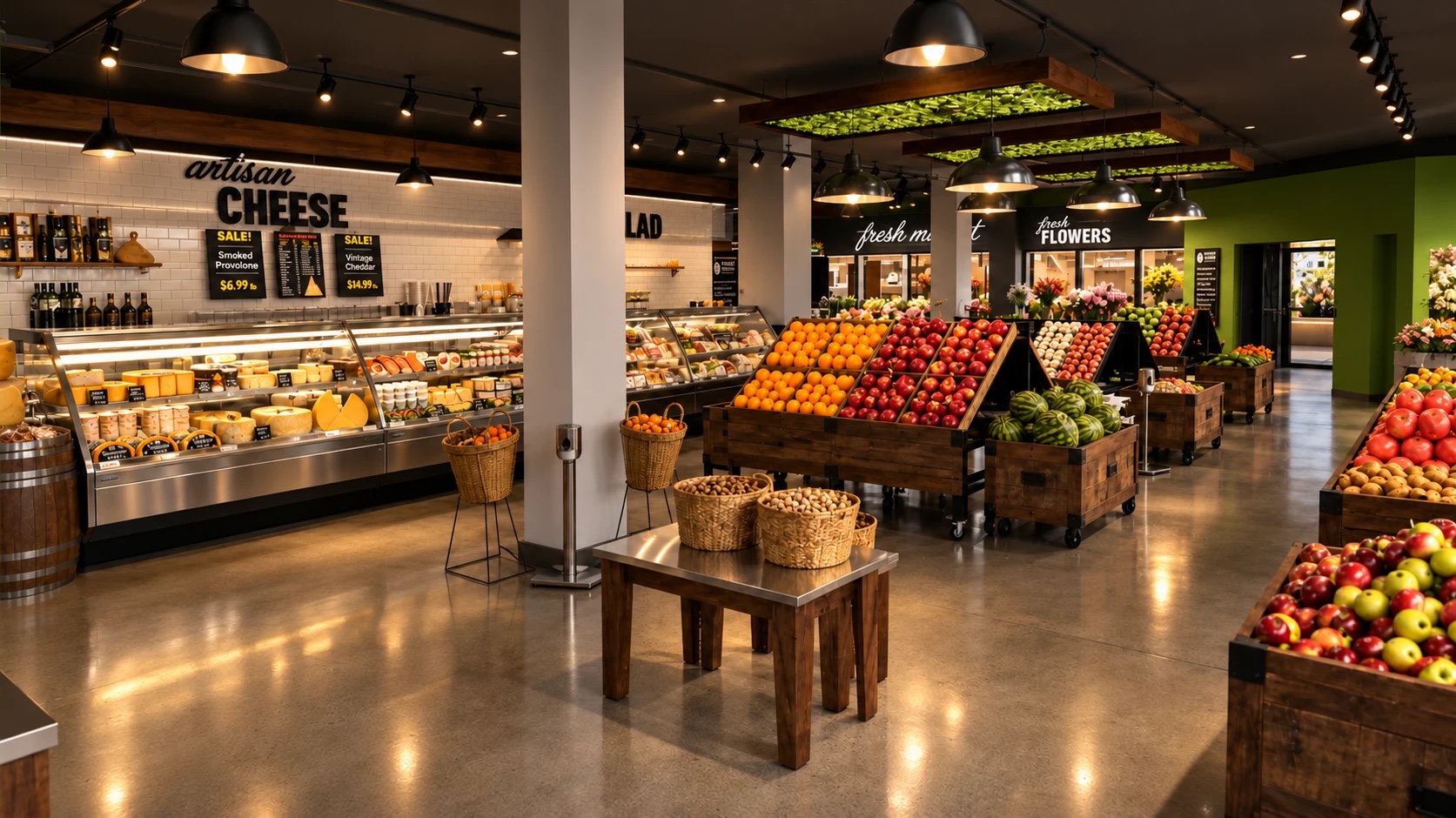
The guidelines cover the parts most brand books skip. Paint and ink colours specified to Sherwin-Williams and Pantone rather than described. A materials palette — faux brick, emerald subway tile, raw steel, weathered teak, expanded mesh — so the fit-out and the packaging come from the same vocabulary. Fixture drawings, zone schematics and elevations, because in retail the shelf IS the brand.

One place
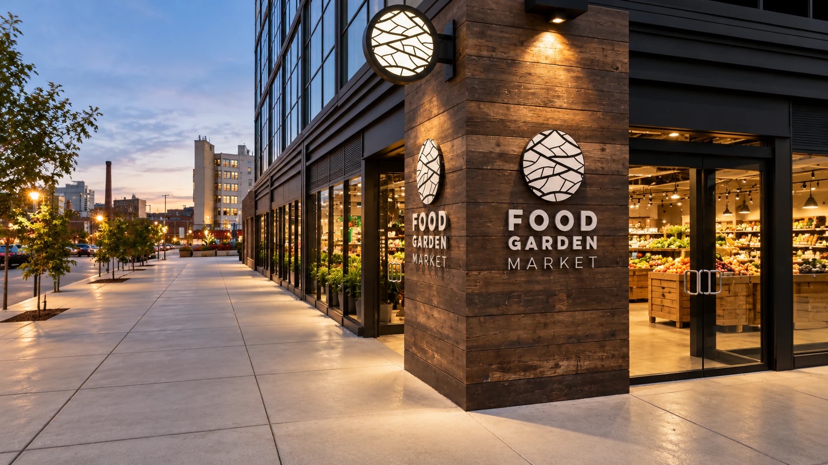
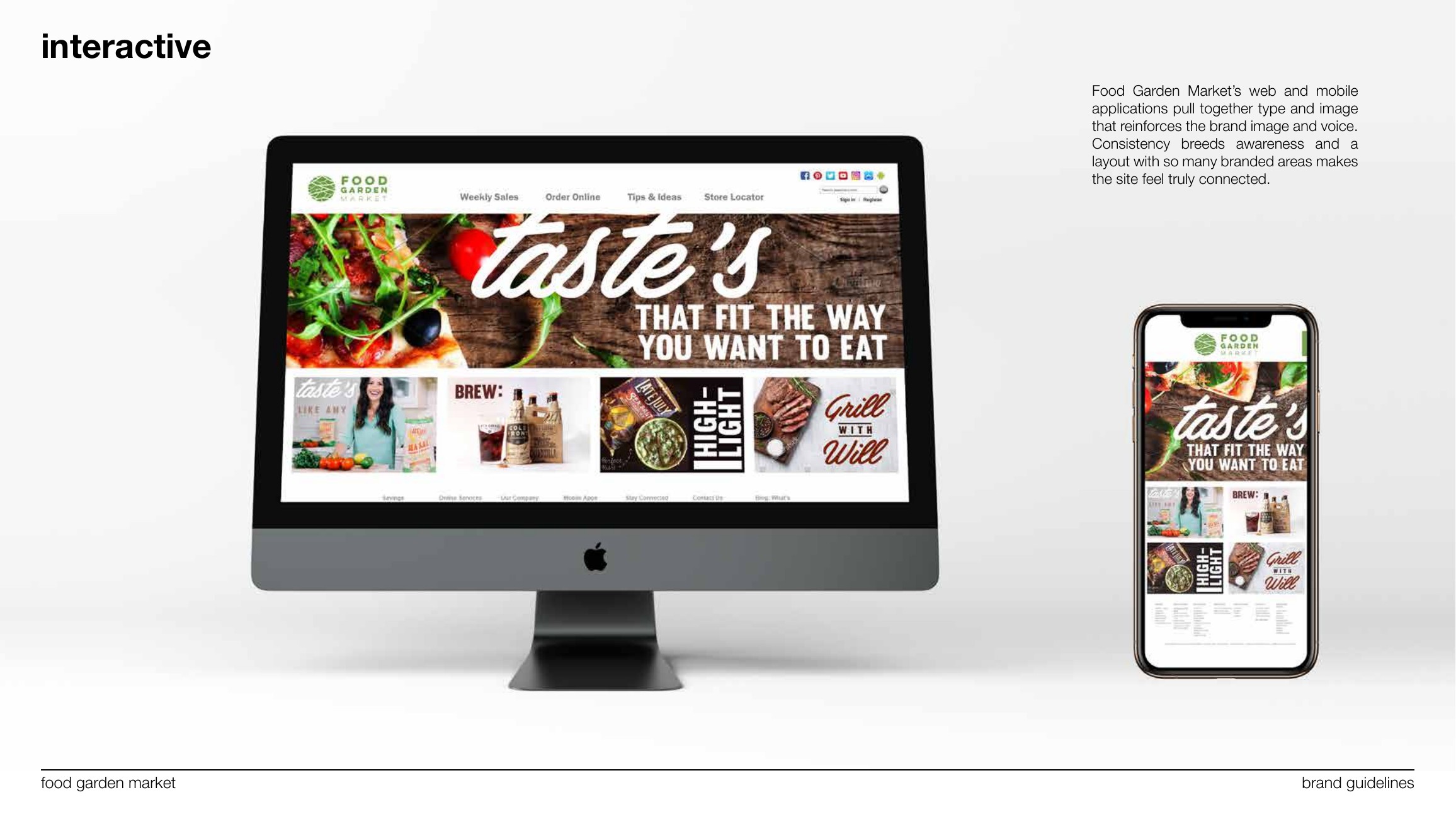
The result is a store where the signage, the bulk bins, the café and the website all read as one place.
The palette, built
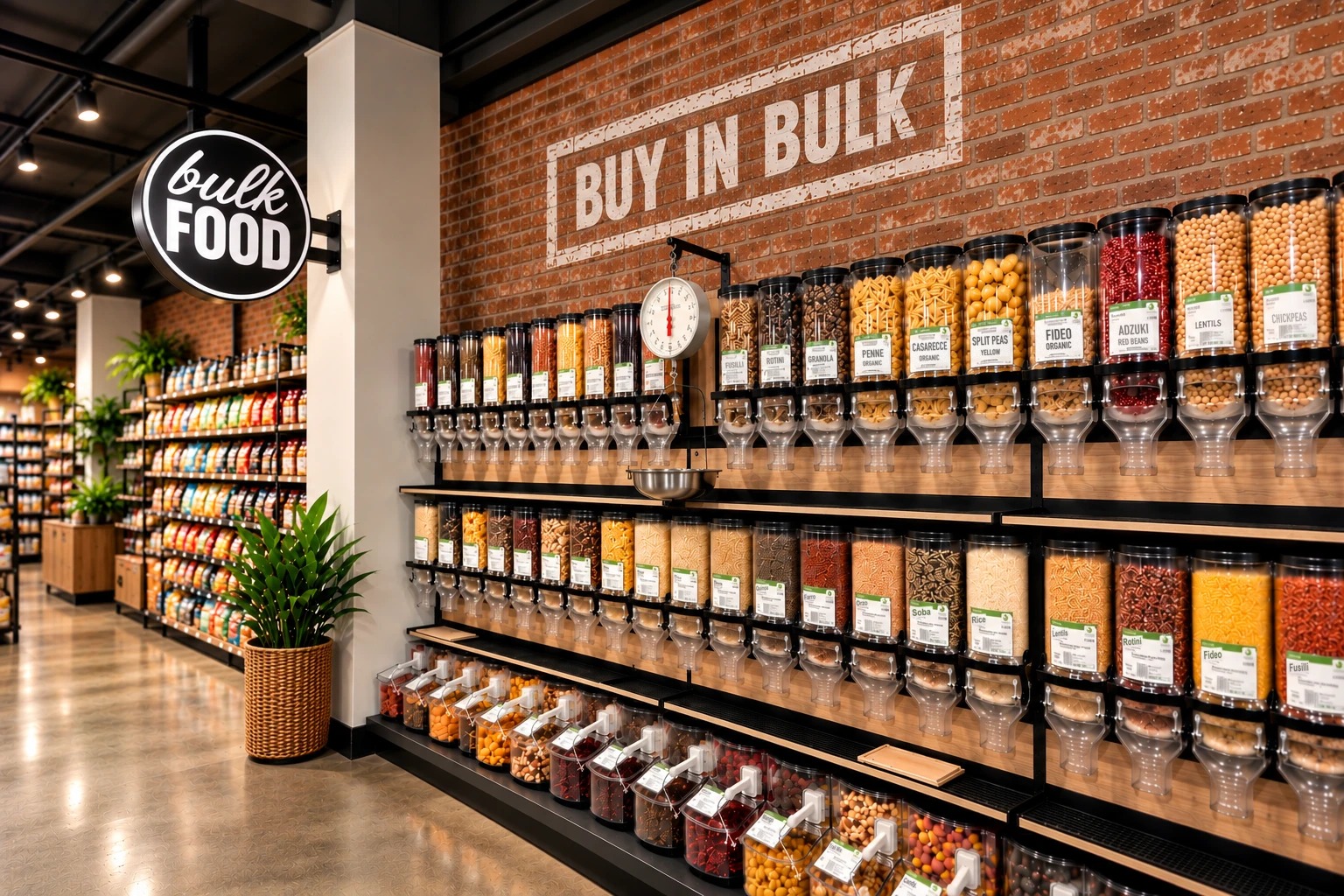
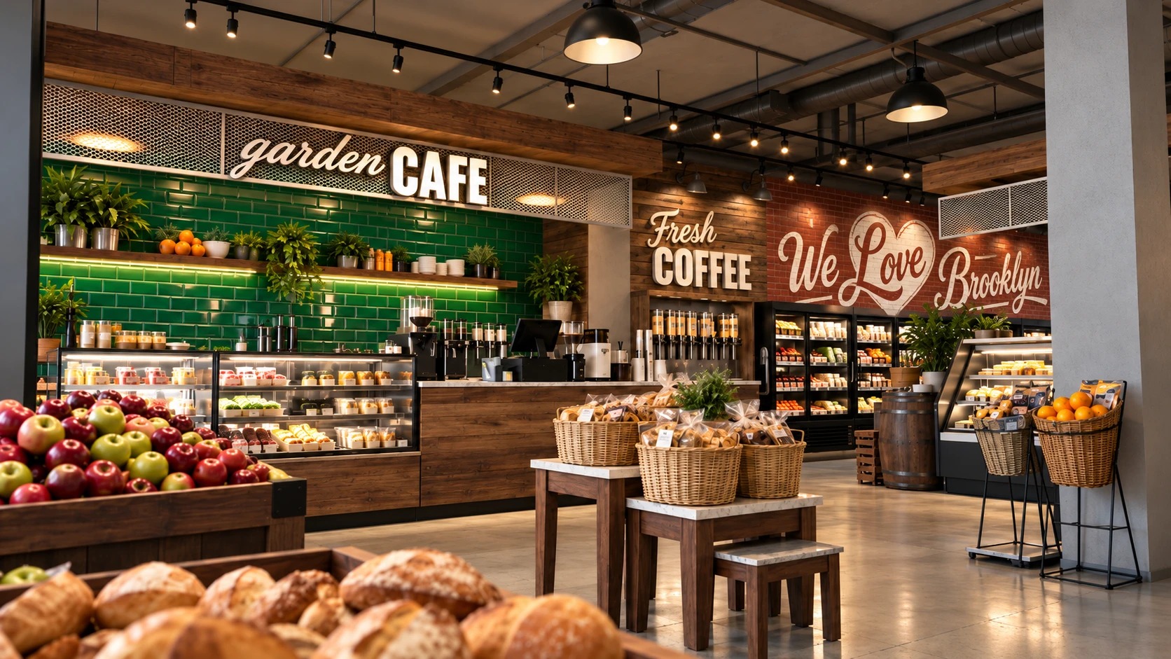
The materials palette at full size. Faux brick and black steel carry the bulk wall, where every gravity bin and scoop bin wears the same green-banded label. The café is emerald subway tile under expanded mesh, with weathered wood on the counter and the tables, so the coffee bar reads as part of the market rather than a concession inside it.

Own label
The mark goes onto the market’s own products too. A line of cold-pressed juices carries the circle and the stacked name over white botanical drawings of what is inside: orange, carrot and citrus; kale, apple and cucumber; hibiscus and berries; mango and pineapple. The bottle is clear, so the juice sets the colour and the label stays the same.
Have a product like this to launch?
Tell us what it is and roughly when you need it. We reply within two working days.
Start a project ↗