

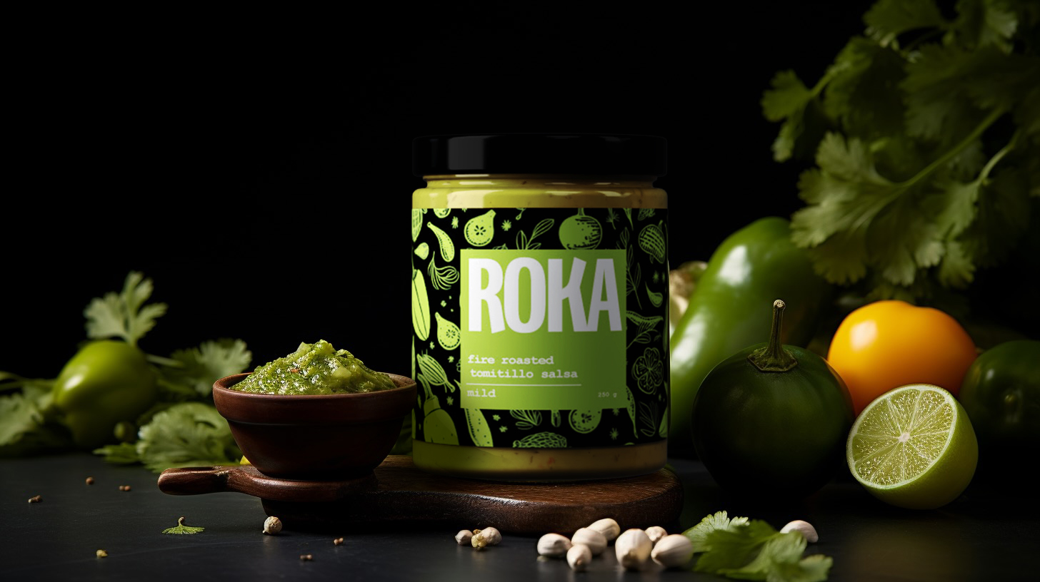
Roka Salsa
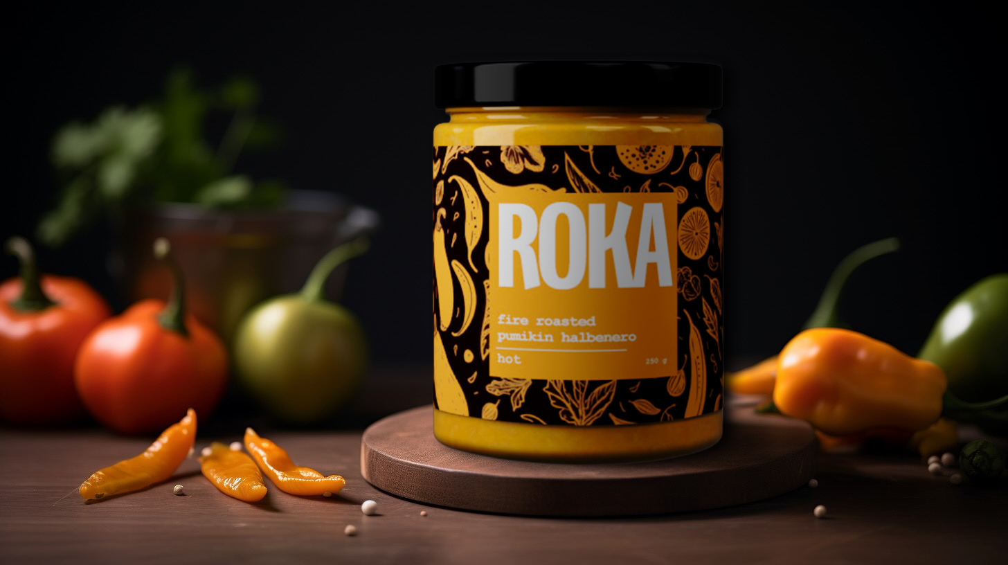
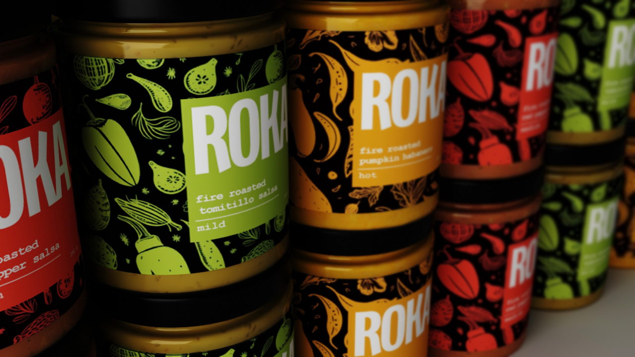
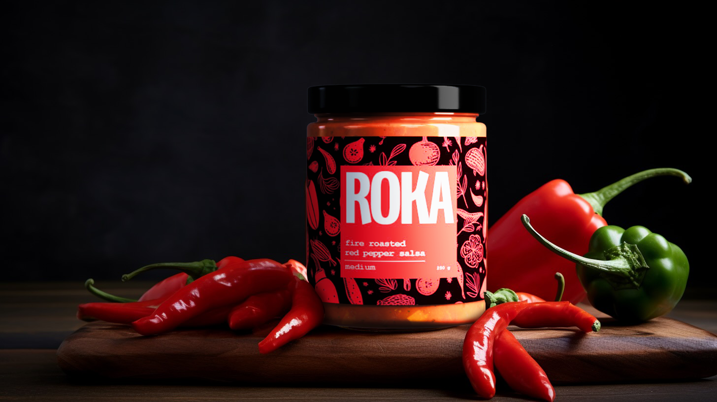
A packaging redesign for ROKA’s salsas. Each heat level gets its own colour and its own hand-drawn pattern, so the range looks made by hand and a shopper can tell mild from hot at a glance.
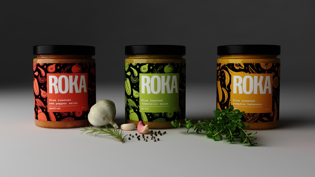
Colour-coded heat
Each jar is wrapped in a dense, hand-drawn pattern of peppers and leaves, in a colour that tells the heat at a glance: green for mild, red for medium, orange for hot. The ROKA name sits over the pattern in heavy condensed capitals, large enough to read from the end of an aisle.
The jar, in 3D
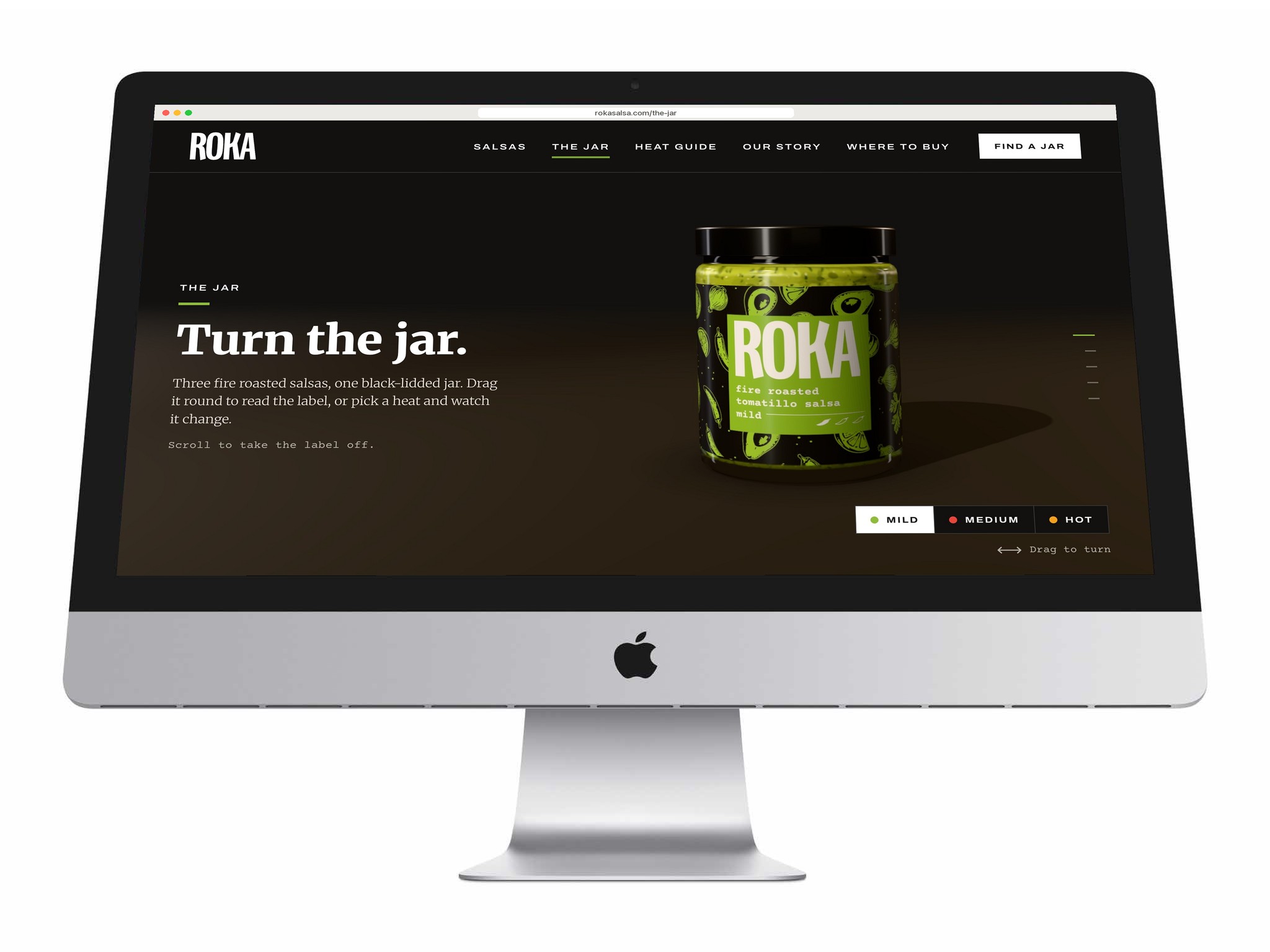
- Drag to turn it; pick a heat
- Scroll to take the label off
- Built from the label artwork
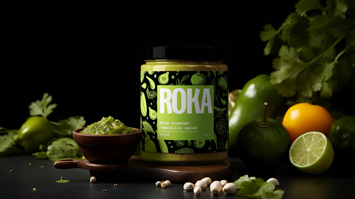
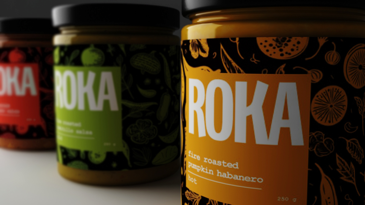
The website has a page for the jar itself, drawn in three dimensions as you watch. The glass, the salsa and the black lid are modelled on the jar from the brand board, and the label is the packaging artwork, the hand-drawn produce and the ROKA panel, bent around it.
Drag the jar to turn it, or choose Mild, Medium or Hot: the jar spins once and comes round in the new label. Scroll, and the camera comes in on the front panel, the label comes loose and opens out flat above the bare jar of salsa, the camera runs along the drawing, and the three heats line up; click one to bring it forward. Where a browser can’t draw 3D, photographs of the jars and the flat label stand in.
Have a product like this to launch?
Tell us what it is and roughly when you need it. We reply within two working days.
Start a project ↗