

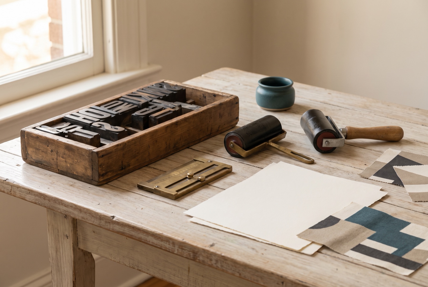
Typography is one of the most powerful, and most overlooked, parts of a brand identity. Before anyone reads a word, the shape of the letters sets a tone: elegant or friendly, classic or technical, playful or serious. Consistent, well-chosen type makes a brand feel professional and recognisable.
Understand the main categories
- Serif typefaces have small strokes at the ends of letters. They often feel traditional, literary, refined or trustworthy.
- Sans-serif typefaces lack those strokes. They often feel modern, clean and approachable.
- Slab serifs have heavy, block-like serifs. They feel sturdy, confident and sometimes retro.
- Script typefaces mimic handwriting or calligraphy. They can feel personal, elegant or playful, but are harder to read.
- Display typefaces are designed for large sizes and strong personality. Use sparingly.
These are tendencies, not rules. A well-chosen serif can feel modern; a sans-serif can feel warm.
Choose by personality and purpose
Start with your brand’s personality. Then consider where the type will be used: packaging, signage, websites, documents, social media. A typeface needs to work in all of them.
Keep it to two
Most brands need no more than two typefaces:
- A primary typeface for headlines and brand expression
- A secondary typeface for body text and information
Some brands use a single family with multiple weights — a simple, consistent approach.
Pair with contrast
Pairings work when typefaces are clearly different but share a sensibility. A common approach is a serif headline with a sans-serif body, or vice versa. Avoid pairing two typefaces that are similar but not quite the same — it looks like a mistake.
Check legibility
- Test at small sizes, like ingredient lists and captions
- Test on screens and in print
- Check numerals and special characters you will need
- Make sure body text is comfortable to read in longer passages
Mind the details
- Weights and styles: choose a family with enough options — light, regular, bold, italic.
- Language support: make sure the typeface supports any languages you need.
- Spacing: adjust letter spacing for headlines and all-caps text.
Licensing matters
Fonts are software, and they come with licences. Check that your licence covers:
- Desktop use for design
- Web use on your website
- App or digital product use, if relevant
- Commercial use on packaging
Free fonts are available, but check their licence terms too.
Custom lettering
For a distinctive wordmark, consider custom lettering rather than a standard typeface. The Kelley & Co wordmark, for example, is a high-contrast serif with a drawn ampersand whose swash carries the whole lockup. It is artwork, not a typeface — and the brand guide is explicit that it must never be retyped.
Document your choices
Record typefaces, weights, sizes and usage rules in your brand guide. Consistency across every touchpoint is what builds recognition.
If you want help choosing type that sounds like your brand, get in touch.