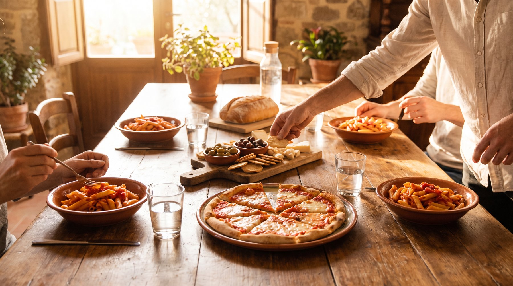
Good food.
Good company.
Zia Nina believes the most memorable meals aren’t complicated. They are generous, flavorful, made for sharing, and always a little joyful.
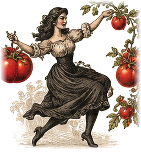
Zia means aunt.
Nina is the aunt everyone has, or wishes they had: the one who dances round the kitchen and sends you home with a jar.
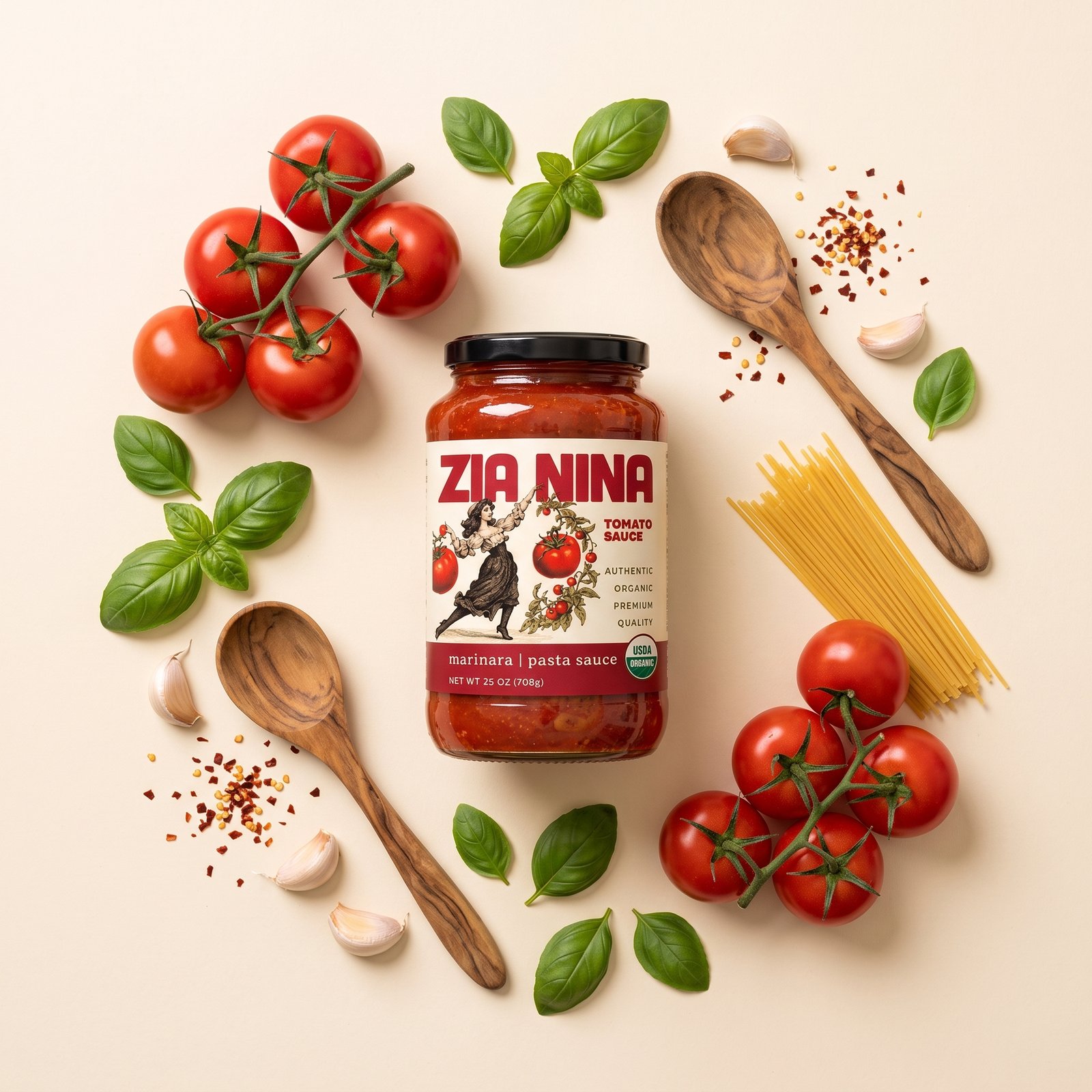
She is on every pack, mid-step, with the tomatoes, the wheat or the olives of whatever is inside. Old-world charm on a clear, contemporary label: one unmistakable family across the grocery aisle.
What we stand for.
Nostalgic character, modern confidence, genuinely welcoming energy.
- 01Warmth
Family recipes and food meant to be passed around.
- 02Flavor
Flavor-first products with simple, unmistakable names.
- 03Character
A spirited vintage figure makes the brand memorable.
- 04Trust
Clear ingredients, plain names and the same quality cues on every pack.
A little
vintage magic.
Hand-engraved storytelling, ripe produce and movement. Fine etched linework, rustic natural pigments, archival paper and a playful step.
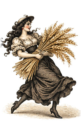 The wheat sheaf
 Rosemary
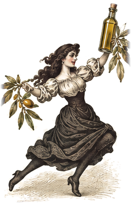 Olive oil
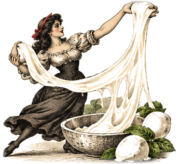 Mozzarella
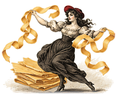 Lasagna sheets
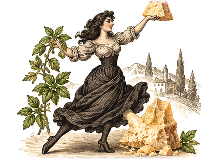 Parmesan
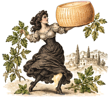 The cheese wheel
 Sea salt
A colour for
every flavor.
A warm master palette that never changes, and a flavor band on every pack that does.
- Zia RedThe name, always
- ParmesanThe label ground
- Olive LeafHerbs and pesto
- Golden WheatDry pasta
- Terra CottaRoasted and spicy
- EggplantSpecialty and savory
- Pass the good stuff.
- Made for gathering.
- Italian comfort, anytime.
- Bring everyone to the table.
Designed by Lacoura.
The Zia Nina identity, the lady illustration system, the packaging across all six aisles and this website were designed by Lacoura.